
Article Categories
- All Categories
-
 Data Structure
-
 Networking
-
 RDBMS
RDBMS
-
 Operating System
-
 Java
Java
-
 MS Excel
-
 iOS
iOS
-
 HTML
HTML
-
 CSS
CSS
-
 Android
-
 Python
-
 C Programming
-
 C++
C++
-
 C#
C#
-
 MongoDB
-
 MySQL
MySQL
-
 Javascript
-
 PHP
PHP
-
 Economics & Finance
Selected Reading
How to display Y-axis with Euro sign using ggplot2 in R?
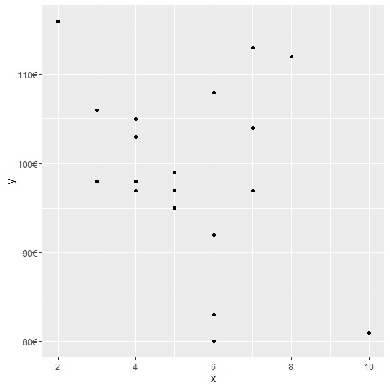
When we have a Euro currency column in an R data frame as a response variable then we might to display the Euro sign in the plot created by using ggplot2 package. For this purpose, we can use scales package and the scale for Y axis will be changed by using the command scale_y_continuous(labels=dollar_format(suffix="€",prefix="")) to the plot command.
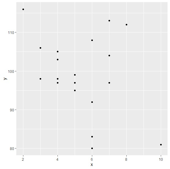
Consider the below data frame −
Example
x<-rpois(20,5)
y<-rpois(20,100)
df<-data.frame(x,y)
df
Output
   x   y
1  8   112
2  10  81
3  4   97
4  7   104
5  4   98
6  5   99
7  5   97
8  7   97
9  5   95
10 3   98
11 6   92
12 6   80
13 6   92
14 6  108
15 7  113
16 4  103
17 3  106
18 2  116
19 4  105
20 6  83
Loading ggplot2 package and creating a scatterplot between x and y −
Example
library(ggplot2)
ggplot(df,aes(x,y))+geom_point()
Output
Loading scales package and creating the scatterplot with Euro sign displayed with Y-axis labels −
Example
library(scales)
ggplot(df)+geom_point(aes(x,y))+scale_y_continuous(labels=dollar_format(suffix="€",prefix=""))
Output

Updated on: 2026-03-11T22:50:55+05:30
1K+ Views

Advertisements