
Article Categories
- All Categories
-
 Data Structure
-
 Networking
-
 RDBMS
RDBMS
-
 Operating System
-
 Java
Java
-
 MS Excel
-
 iOS
iOS
-
 HTML
HTML
-
 CSS
CSS
-
 Android
-
 Python
-
 C Programming
-
 C++
C++
-
 C#
C#
-
 MongoDB
-
 MySQL
MySQL
-
 Javascript
-
 PHP
PHP
-
 Economics & Finance
How to make a cumulative average chart in excel?
In this article, the user will learn how to make a cumulative average chart in Excel. The different types of charts are presented in MS Excel to visualize the data and interpret the result. This article contains an example to calculate the cumulative average chart, as required in the provided task. The cumulative average chart denotes the average of all previous values up to that certain point. If the new data points would be added then the cumulative average would be recalculated.
Example 1: To calculate the average of cumulative sum chart in excel
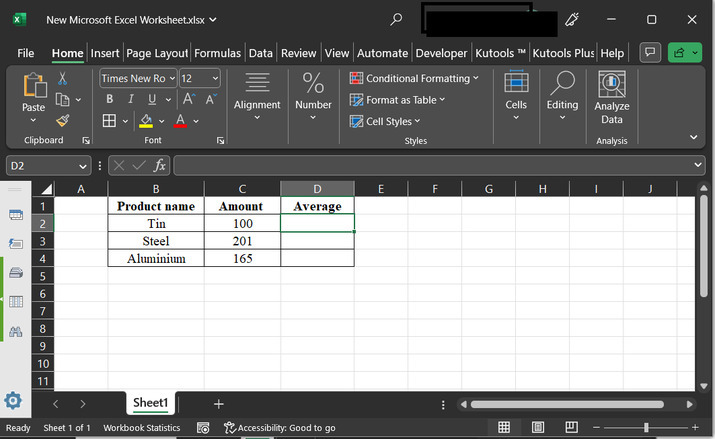
Step 1
Assume the provided Excel sheet that contains two columns. The first column contains data for the product name, while the second column contains data for the amount. Finally, the third column contains space to store the newly calculated average data.
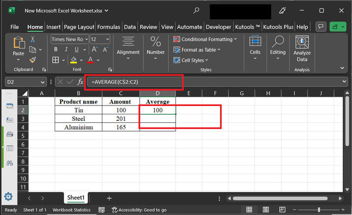
Step 2
Click on the D2 cell and type the formula "= AVERAGE (C$2:C2)", and press the "Enter" key. This will generate the below-given result.
The explanation for required formula:
C$2 ? The dollar sign before the row number "2" (C$2) shows an absolute reference. This simply means that the row number will remain fixed when the formula is copied or filled down to other cells. In this case, it refers to cell C2.
C2 ? This is a relative reference to cell C2. The row number is not fixed, so when the formula is copied or filled down to other cells, the row number will adjust accordingly.
AVERAGE(C$2:C2) ? This part of the formula specifies the range of cells for which the user wants to calculate the average. It starts from the fixed cell C$2 and includes all the cells in the C column up to the current row, which is represented by C2.
The purpose of this formula is to calculate a running or cumulative average in Excel. As you copy or fill down the formula to other cells, the range being averaged expands.
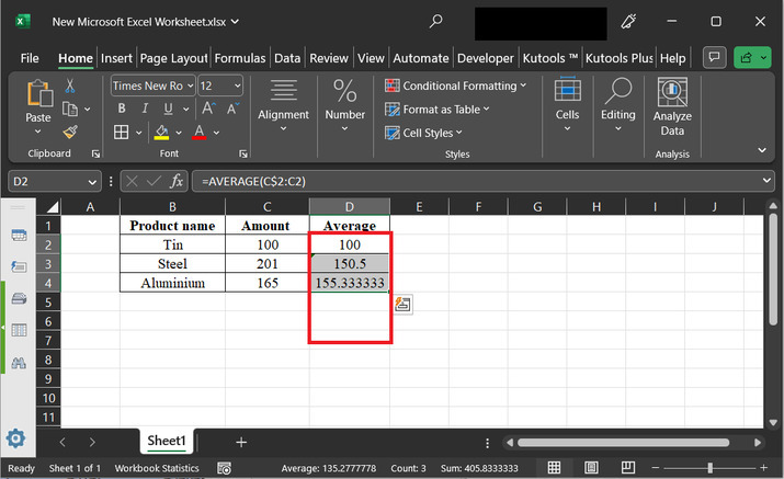
Step 3
Drag the fill handle to copy the same formula, to other available rows. This will generate the below-depicted output ?
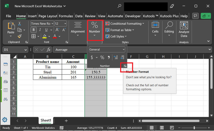
Step 4
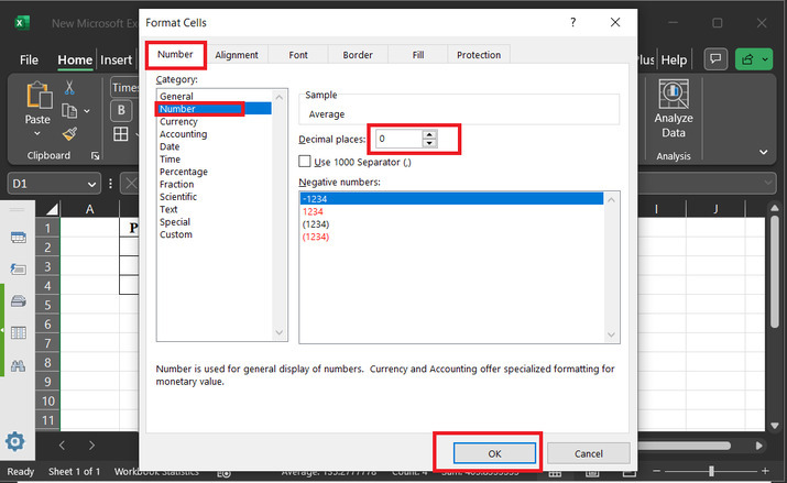
Here, the user needs to change the decimal number to an absolute integer. So, a chart can be created with easy and clean digits. To do so, click on the "Number" , and then click on the bottom provided arrow, as shown below?
Step 5
The above step will open a dialog box named "Format Cells". Choose the "Number" tab, and then from the provided list choose the data for "Number". Go to the "decimal number" label, and enter 0, there. Finally, click on the "OK" button, as depicted below?
Step 6
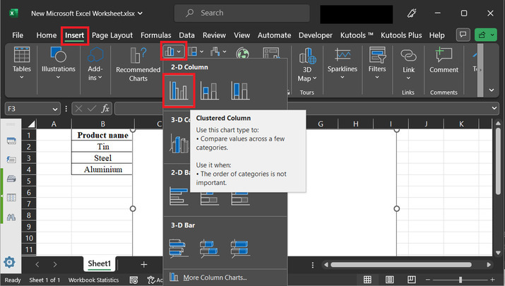
After that go to the "Insert" tab, and then click on the chart option highlighted in the below picture. Further select the "2D column" option, as provided below?
Step 7
The above step will generate the below depicted graph ?
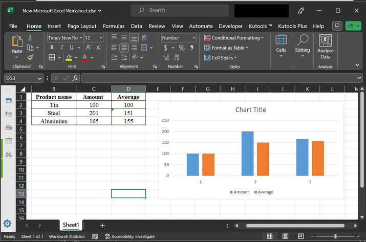
Step 8
This will display a chart, on the right-hand side. Use right-click to obtain the required list of options. Among the available options list select the option of "Change Series Chart Type..".
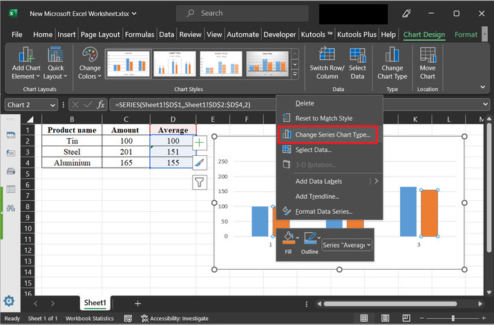
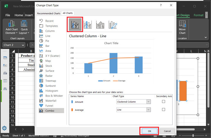
Step 9
The above step will open a "Change Chart Type" option. From the menu bar, select the option "Combo". After that select the first appeared option. After that click on the "OK" button.
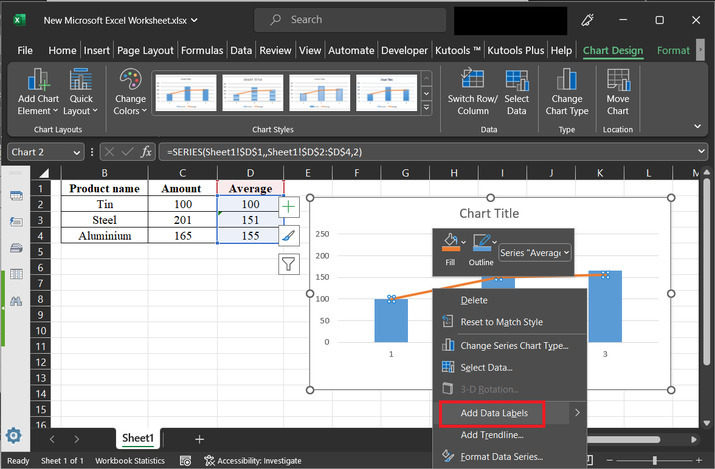
Step 10
The above step will display a trendline, as shown below. Use right-click to select the option "Add Data Labels". Consider the below-depicted image for reference ?
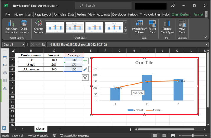
Step 11
The above step will display the data labels to the trendline.
Conclusion
In this article, the user will learn the process of calculating the cumulative average chart. All the guided steps are detailed and thorough. This example contains a brief and detailed explanation of all the provided steps.

4K+ Views
