
- MS Excel Basics
- Excel - Home
- Excel - Getting Started
- Excel - Explore Window
- Excel - Backstage
- Excel - Entering Values
- Excel - Move Around
- Excel - Save Workbook
- Excel - Create Worksheet
- Excel - Copy Worksheet
- Excel - Hiding Worksheet
- Excel - Delete Worksheet
- Excel - Close Workbook
- Excel - Open Workbook
- Excel - Context Help
- Editing Worksheet
- Excel - Insert Data
- Excel - Select Data
- Excel - Delete Data
- Excel - Move Data
- Excel - Rows & Columns
- Excel - Copy & Paste
- Excel - Find & Replace
- Excel - Spell Check
- Excel - Zoom In-Out
- Excel - Special Symbols
- Excel - Insert Comments
- Excel - Add Text Box
- Excel - Undo Changes
- Formatting Cells
- Excel - Setting Cell Type
- Excel - Setting Fonts
- Excel - Text Decoration
- Excel - Rotate Cells
- Excel - Setting Colors
- Excel - Text Alignments
- Excel - Merge & Wrap
- Excel - Borders and Shades
- Excel - Apply Formatting
- Formatting Worksheets
- Excel - Sheet Options
- Excel - Adjust Margins
- Excel - Page Orientation
- Excel - Header and Footer
- Excel - Insert Page Breaks
- Excel - Set Background
- Excel - Freeze Panes
- Excel - Conditional Format
- Working with Formula
- Excel - Creating Formulas
- Excel - Copying Formulas
- Excel - Formula Reference
- Excel - Using Functions
- Excel - Builtin Functions
- Advanced Operations
- Excel - Data Filtering
- Excel - Data Sorting
- Excel - Using Ranges
- Excel - Data Validation
- Excel - Using Styles
- Excel - Using Themes
- Excel - Using Templates
- Excel - Using Macros
- Excel - Adding Graphics
- Excel - Cross Referencing
- Excel - Printing Worksheets
- Excel - Email Workbooks
- Excel- Translate Worksheet
- Excel - Workbook Security
- Excel - Data Tables
- Excel - Pivot Tables
- Excel - Simple Charts
- Excel - Pivot Charts
- Excel - Keyboard Shortcuts
- MS Excel Resources
- Excel - Quick Guide
- Excel - Useful Resources
- Excel - Discussion
How to Adjust a Bar Chart to Make the Bars Wider in Excel?
In Excel, a bar graph is a type of chart that represents data by placing bars vertically in the graph. We can analyse the difference between the many values using the bar graphs. We occasionally believe that the width of the bar graph is too narrow and wish to change it. In this tutorial, we will show a simple way to change the width of the bars in a bar graph in Excel.
Adjusting a Bar Chart to Make the Bars Wider
First, we'll make the chart, and then we'll change the bar width from the formatted data series. Let us see a simple process to know how we can adjust the bar chart to make bars wider in Excel.
Step 1
First, we need to create a bar graph in order to adjust the width of the bar.
To create the bar graph, select the data and click on insert; then, select the bar graph under the bar graph menu, as shown in the below image.

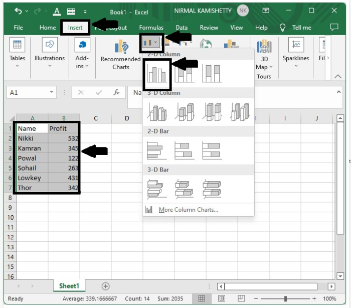
The bar graph will be successfully created, as represented in the below screenshot.
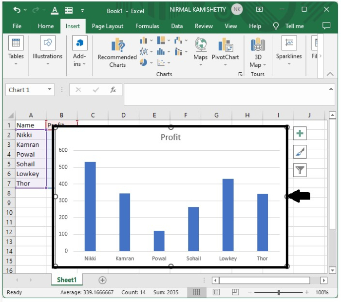
Step 2
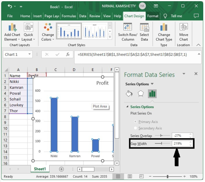
To change the width of the bars, right-click on one of them in the graph and select the format data series option from the popped-up menu box; a format menu will then appear on the right side of the excel.
Then, as shown in the figure below, select the image that looks like bars and adjust the gap width to increase or decrease the width between the bars.
To increase the width, reduce the gap width, and to decrease the width of the bar, increase the gap width.

Step 3
Now close the Format Data Series tab after adjusting the graph width, and we get our final output as shown in the below figure.

Conclusion
In this tutorial, we used a simple example to demonstrate how we can adjust the bar width in a bar graph in Excel to highlight a particular set of data.
- Related Articles
- How to determine the order of bars in a matplotlib bar chart?
- How to Adjust the Bubble Size in a Bubble Chart in Excel?
- How to remove gaps between bars in Matplotlib bar chart?
- How to change the order of bars in bar chart in R?
- How to Add Up/Down Bars to a Line Chart in Excel?
- How to sort bars in increasing order in a bar chart in matplotlib?
- How to decrease the width of bars for plotly bar chart in R?
- How do I get all the bars in a Matplotlib bar chart?
- How to Add Vertical/Average Line to Bar Chart in Excel?
- How to create plotly bar chart with values on top of bars in R?
- How to create a horizontal bar chart using ggplot2 with labels at inside end of the bars in R?
- Conditional formatting stacked bar chart in Excel
- How to create a bar chart using ggplot2 with dots drawn at the center of top edge of the bars in R?
- How to add a chart title in Excel?
- How to add a scrollbar to a chart in Excel
