
Article Categories
- All Categories
-
 Data Structure
-
 Networking
-
 RDBMS
RDBMS
-
 Operating System
-
 Java
Java
-
 MS Excel
-
 iOS
iOS
-
 HTML
HTML
-
 CSS
CSS
-
 Android
-
 Python
-
 C Programming
-
 C++
C++
-
 C#
C#
-
 MongoDB
-
 MySQL
MySQL
-
 Javascript
-
 PHP
PHP
-
 Economics & Finance
How to add a horizontal average line to chart in Excel?
There are some circumstances in which you might want to create a horizontal line on another chart so that you can evaluate the current values in relation to the goal that you have set for yourself. It is possible to finish the challenge by plotting two distinct kinds of data points on the same graph.
In earlier versions of Excel, combining two different chart types into a single chart was a laborious process that required multiple steps. The special Combo chart type that is included in Microsoft Excel 2013, Excel 2016, and Excel 2019 makes the process so astonishingly simple that you might find yourself wondering how it was ever done.
If you want to add a horizontal average line to a chart, you should first compute the average of the data, and then design the chart. This is the order in which the steps should be completed.
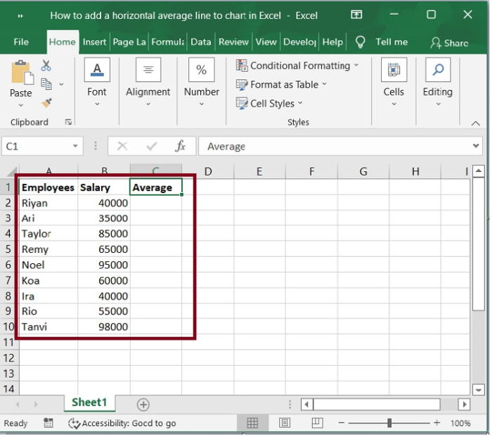
Step 1
In the first, we must create a sample data for calculating average as shown in the below screenshot.
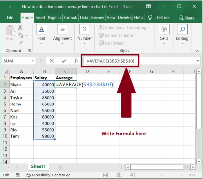
Step 2
You can determine the average of the data by using the Average function. For instance, in Average Column C2 you could put the following formula.
=Average($B$2:$B$10)
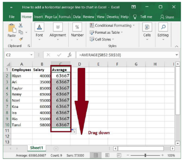
Step 3
Next, drag the AutoFill handle of this cell to the range that you required. Refer the following screenshot.
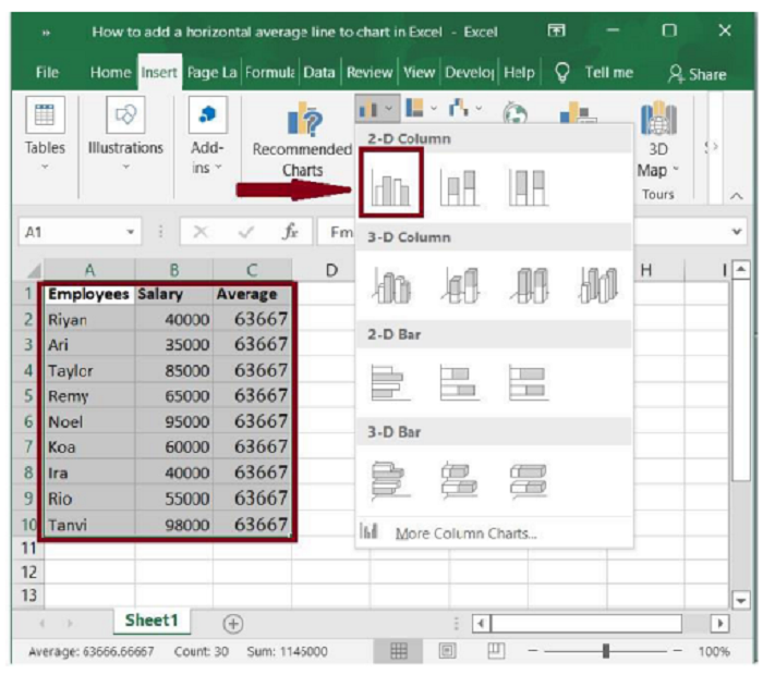
Step 4
Then, under the Insert tab, select this range and one chart format that you wish to insert, such as 2-D Column. See the following screenshot.
Step 5
A chart will be created, as shown in the following screenshot.
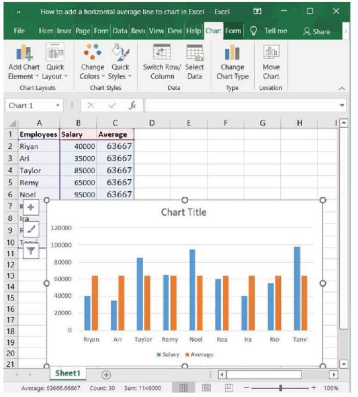
Step 6
Now, right-click on one of the average data columns (the orange bar) on the chart, select Change Series Chart Type from the context menu. See the screenshot below.
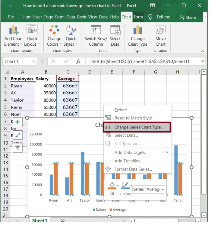
Step 7
In the Change Chart Type dialogue that appears, click to highlight the Combo in the left bar, then click the box behind the Average, and then choose a line chart style from the drop-down list. See the following screenshot.
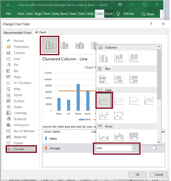
Step 8
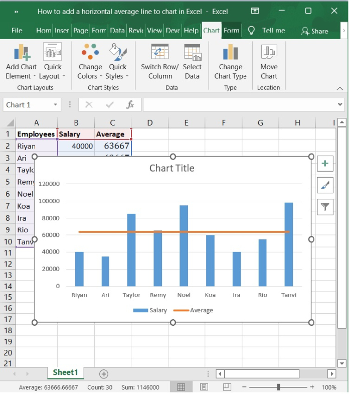
Press the OK button. In your chart, you now see a horizontal line showing the average. Refer to the below screenshot.
Conclusion
In this tutorial, we explained how to add a horizontal average line to a chart which is created in Excel. This feature helps the users to analyze the overview of the chart in a single frame.

4K+ Views
