
Article Categories
- All Categories
-
 Data Structure
-
 Networking
-
 RDBMS
RDBMS
-
 Operating System
-
 Java
Java
-
 MS Excel
-
 iOS
iOS
-
 HTML
HTML
-
 CSS
CSS
-
 Android
-
 Python
-
 C Programming
-
 C++
C++
-
 C#
C#
-
 MongoDB
-
 MySQL
MySQL
-
 Javascript
-
 PHP
PHP
-
 Economics & Finance
How to make a cumulative sum chart in excel?
A cumulative sum chart, also known as a cumulative line chart or cumulative frequency chart, is a graphical representation that shows the cumulative sum or total of a series of values over time or another dimension. It is commonly used to analyze and visualize the accumulation or progression of data.
The cumulative sum chart plots the cumulative values on the y-axis and the corresponding time or another variable on the x-axis. Each data point on the chart represents the sum of all previous values up to a certain point, starting from an initial value. As new data points are added, the cumulative sum increases and the line on the chart progressively rises.
This article contains a brief explanation of an example to calculate the cumulative sum chart, as required in the provided task.
Example 1: To calculate the sum of cumulative sum chart in excel.
Step 1
To understand the process of creating a cumulative sum chart in Excel, assume the provided Excel sheet. This Excel sheet contains two columns. The first column contains data for product name, while the second column contains data for cost. Finally, the third column contains space.
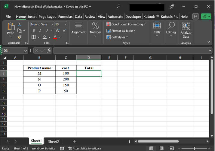
Step 2
Click on the D3 cell, and type the formula "=SUM(C$3:C3)", and press "enter" key. This will generate the below given result.
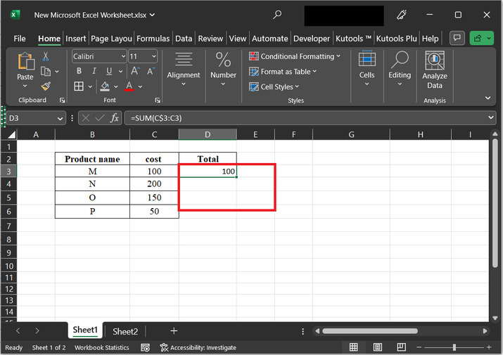
The explanation for the required formula
C$3? The dollar sign before the row number "3" (C$3) indicates an absolute reference. It means that the row number will remain fixed when the formula is copied or filled down to other cells. In this case, it refers to cell C3.
C3? This is a relative reference to cell C3. The row number is not fixed, so when the formula is copied or filled down to other cells, the row number will adjust accordingly.
SUM(C$3:C3)? This part of the formula specifies the range of cells to be summed. It starts from the fixed cell C$3 and includes all the cells in the C column up to the current row, which is represented by C3.
As the user copy or fill down the formula to other cells, the range being summed expands. The result in each cell will display the cumulative sum of the values in the specified range
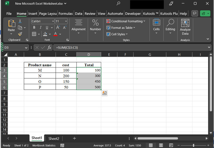
Step 3
Drag the fill handle to copy same formula, to other available rows. This will generate the below-depicted output ?
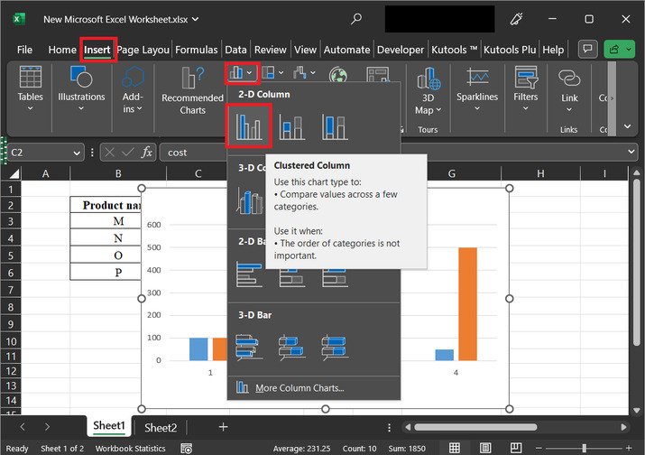
Step 4
After that go to the "Insert" tab, and then click on the chart option highlighted in the below picture. Further select the "2D column" option, as provided below ?
Step 5
This will display a chart, on the right hand side. Use right click to obtain the required list of options. Among the available options list select the option of "Change Series Chart Type..".
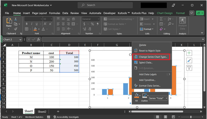
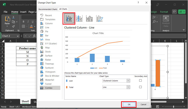
Step 6
The above step will open a "Change Chart Type" option. From the menu bar, select the option "combo". After that select the first appeared option. After that click on the "OK" button.
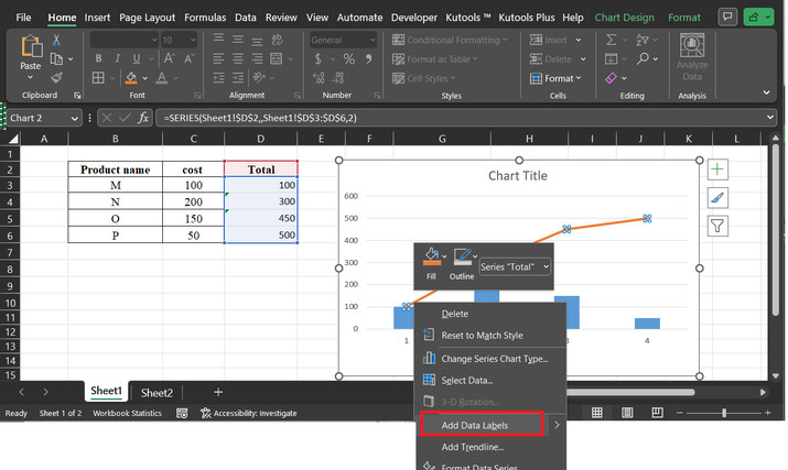
Step 7
The above step will display a trendline, as shown below. Use right click to select the option "Add Data Lables". Consider below depicted image for reference ?
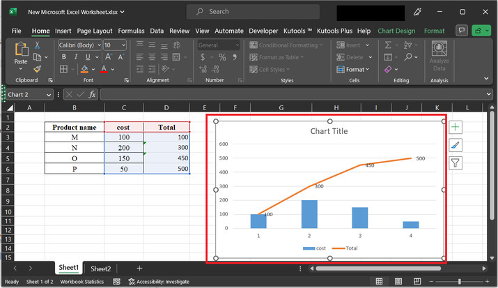
Step 8
The above step will display the data labels to the trendline.
Conclusion
In this article, the user will learn the process of calculating the cumulative sum chart. This example contains a brief and detailed explanation of all the provided steps. All the described steps are detailed and thorough.

14K+ Views
