
Article Categories
- All Categories
-
 Data Structure
-
 Networking
-
 RDBMS
RDBMS
-
 Operating System
-
 Java
Java
-
 MS Excel
-
 iOS
iOS
-
 HTML
HTML
-
 CSS
CSS
-
 Android
-
 Python
-
 C Programming
-
 C++
C++
-
 C#
C#
-
 MongoDB
-
 MySQL
MySQL
-
 Javascript
-
 PHP
PHP
-
 Economics & Finance
How to add a note in an Excel chart?
Your data-filled cells can be rapidly converted into a visual representation using the quick-format chart and graph functions offered by Microsoft Excel. Examples of such visual representations include pie charts and bar graphs. However, there are situations when the charts that Excel generates do not include sufficient information, or you require additional language to describe what readers are seeing.
There are multiple ways for Excel users to add notes to Excel charts, some of which are automatic while others require a small amount of manual intervention to get your notes in the correct position.
Let?s understand step by step with an example.
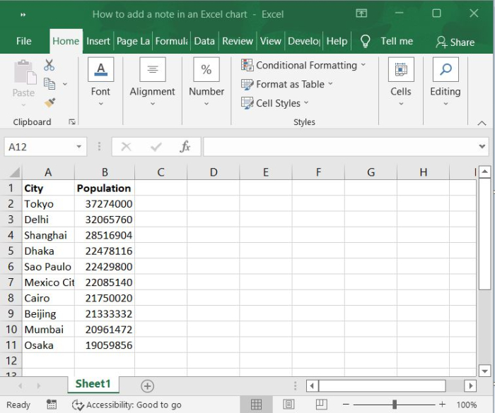
Step 1
In our example, we have cities and their population in an excel sheet in columnar format. Refer the following screenshot.
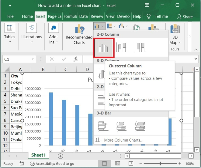
Step 2
Click the Insert tool bar and select bar chart to display the graph for the above source data.
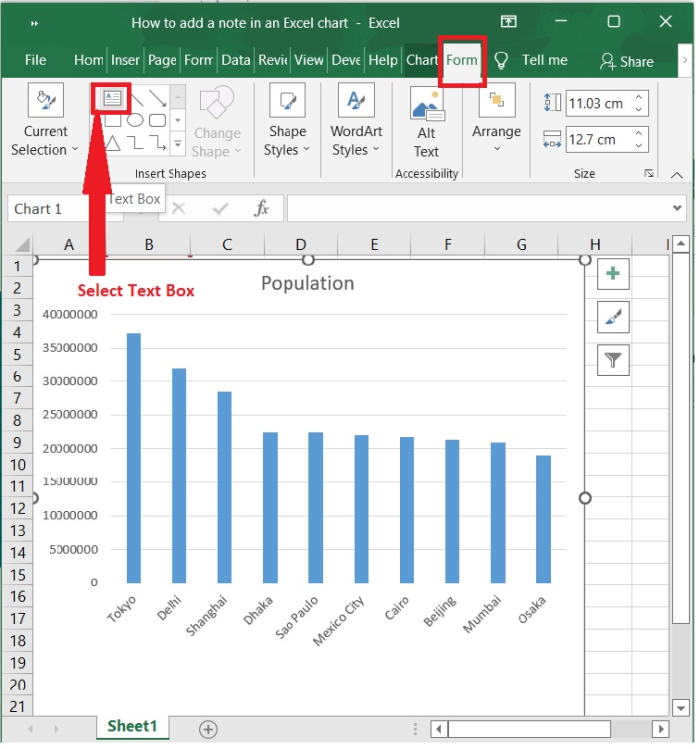
Step 3
Now, click the chart to enable the chart tools.
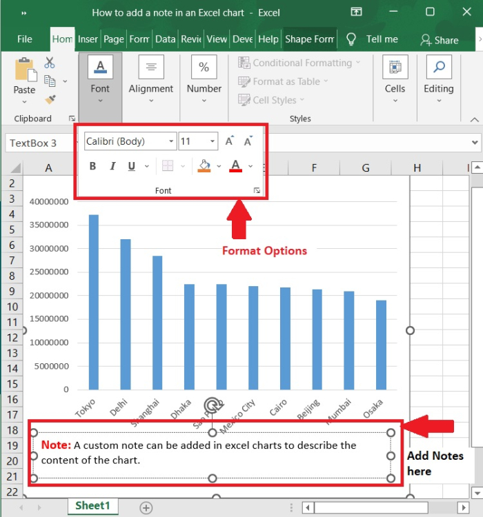
Select Format tool bar and then click the Text box which is under insert shapes option to insert text box anywhere on the chart area.
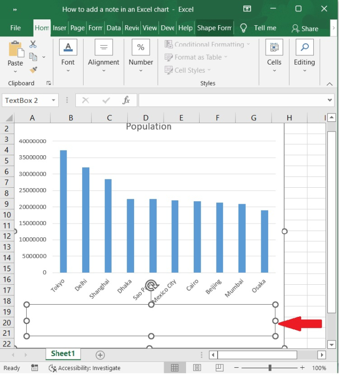
Step 4
Now, draw the text box anywhere in the chart area.
Step 5
Enter the note content which you need in the text box.
We can use the Format options like size, colour, font, bold, underline etc. under home tab to format the text inside the tool box. In the following screenshot, the options are highlighted.
Conclusion
Adding notes in chart area will be useful to describe the chart functionality and explain the numbers form the chart. In this tutorial, we explained how you can add custom notes in Excel charts.

6K+ Views
