
Article Categories
- All Categories
-
 Data Structure
-
 Networking
-
 RDBMS
RDBMS
-
 Operating System
-
 Java
Java
-
 MS Excel
-
 iOS
iOS
-
 HTML
HTML
-
 CSS
CSS
-
 Android
-
 Python
-
 C Programming
-
 C++
C++
-
 C#
C#
-
 MongoDB
-
 MySQL
MySQL
-
 Javascript
-
 PHP
PHP
-
 Economics & Finance
How to Create a Control Chart in Excel?
Control charts are effective tools for tracking and analysing data over time in statistical process control. They assist in identifying and tracking process changes and determining whether they fall within allowable bounds. Excel offers a practical platform for creating control charts and gaining insights into process performance thanks to its robust spreadsheet capabilities. In this lesson, we'll walk you step-by-step through the process of making an Excel control chart. This lesson will provide you the skills and information you need to properly visualise and analyse data using control charts, whether you're new to control charts or an experienced Excel user wishing to advance your expertise.
To make sure you can easily follow along, we will provide clear instructions and screenshots throughout the course. We'll also go through how to read control chart patterns, spot process changes, and spot out-of-control situations. By the end of this session, you will be able to use Excel to make control charts that look polished, allowing you to keep track of and enhance processes in a variety of fields and situations. So, let's get started and learn how effective Excel's control charts are!
Create a Control Chart
Here we will first prepare the data, then create a line chart, and then add the data to the chart to complete the task. So let us see a simple process to learn how you can create a control chart in Excel.
Step 1
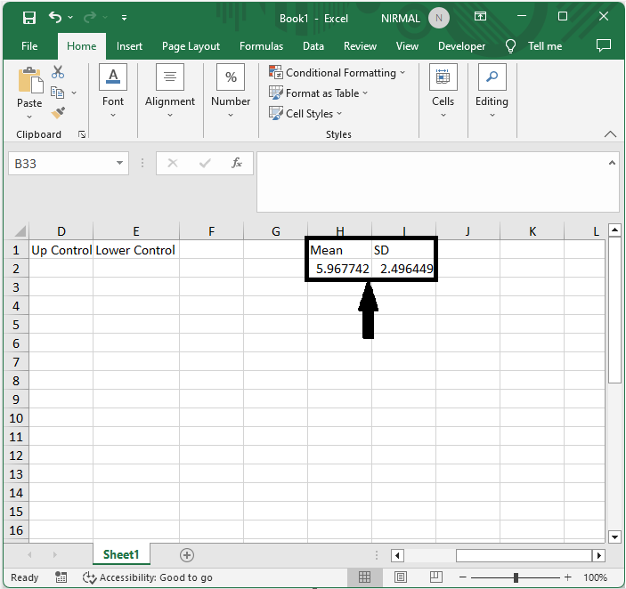
Consider an Excel sheet where you have required data to create control chart.
First, enter formulas as =AVERAGE(B2:B32) and =STDEV.S(B2:B32) in two empty cells and click enter.
Step 2
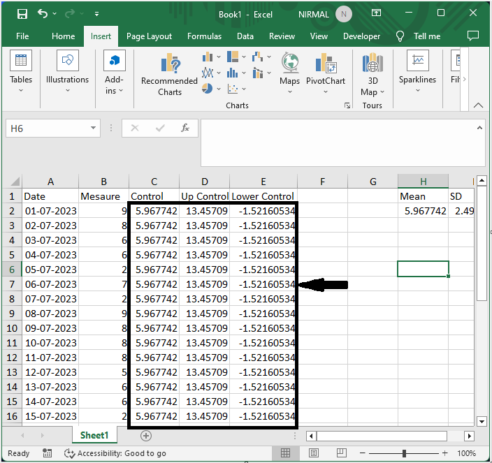
Then in cell C2, enter the formula as =$H$2, =H$1+(H$2*3) in D2, =$H$1-($H$2*3) in E2 and click enter, then drag down using the autofill handle.
Cell C2 > Formula > Enter > Drag.
Step 3
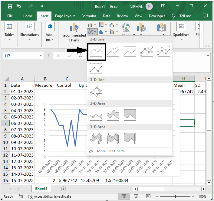
Then select the range of cells then click on Insert and select a line chart.
Step 4
Then right-click on the chart and click on select data, then click on add under legend entries. Then select the series name in cell C1 and the series values in the below cells.
Right-click > Select Data > Add > Series Name > Series Values.
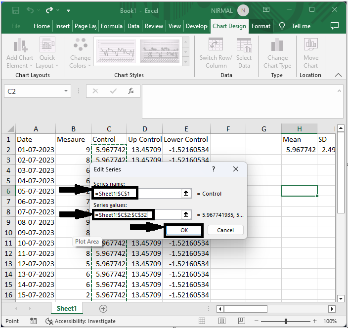
Then repeat the step for the other two columns. Then you will see that a chart will be created.
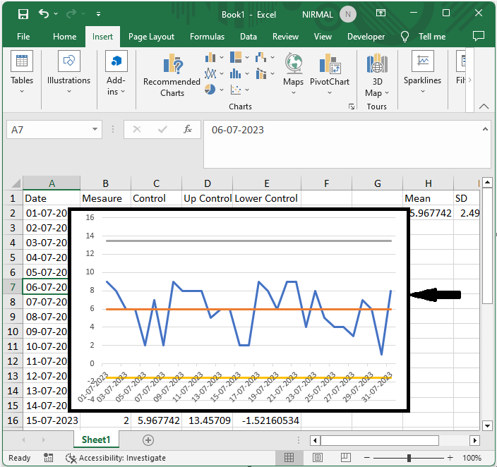
This is how you can create a control chart in Excel.
Conclusion
In this tutorial, we have used a simple example to demonstrate how you can create a control chart in Excel to highlight a particular set of data.

748 Views
