
 Data Structure
 Networking
 RDBMS
RDBMS Operating System
 Java
Java MS Excel
 iOS
iOS HTML
HTML CSS
CSS Android
 Python
 C Programming
 C++
C++ C#
C# MongoDB
 MySQL
MySQL Javascript
 PHP
PHP
- Selected Reading
- UPSC IAS Exams Notes
- Developer's Best Practices
- Questions and Answers
- Effective Resume Writing
- HR Interview Questions
- Computer Glossary
- Who is Who
How to label points in scatterplot created by using xyplot in R?
To label points in scatterplot created by using xyplot, we can follow the below steps −
- First of all, creating two numerical and one categorical vector.
- Loading lattice package and creating scatterplot.
- Creating the scatterplot with points labelled using categorical vector by panel.xyplot and ltext function.
Creating the vectors
Create three vectors, one categorical and two numerical −
x<-sample(1:10,5)
y<-sample(1:10,5)
Dots<-c("A","B","C","D","E")
x
y
Dots
On executing, the above script generates the below output(this output will vary on your system due to randomization) −
[1] 7 3 2 10 5
[1] 1 2 5 4 8
[1] "A" "B" "C" "D" "E"
Loading lattice package and creating scatterplot
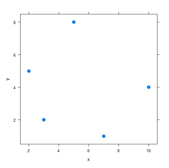
Use xyplot function to create the scatterplot between x and y −
library(lattice)
xyplot(y~x,data=data.frame(x,y),pch=20,cex=2)
Output
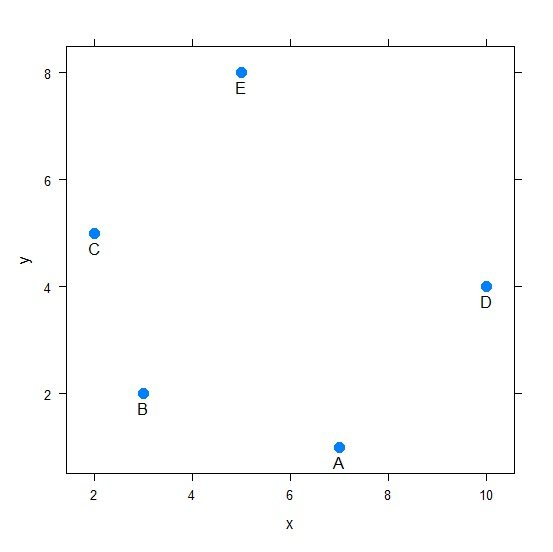
Creating the scatterplot with labels
Use panel.xyplot and ltext to create the scatterplot with labels −
x<-sample(1:10,5)
y<-sample(1:10,5)
Dots<-c("A","B","C","D","E")
xyplot(y~x,data=data.frame(x,y),pch=20,cex=2,panel=function(x,y,...){
+ panel.xyplot(x,y,...);
+ ltext(x=x,y=y,labels=Dots,pos=1)})
Output

Updated on: 2021-08-13T11:52:25+05:30
472 Views

Advertisements