
 Data Structure
 Networking
 RDBMS
RDBMS Operating System
 Java
Java MS Excel
 iOS
iOS HTML
HTML CSS
CSS Android
 Python
 C Programming
 C++
C++ C#
C# MongoDB
 MySQL
MySQL Javascript
 PHP
PHP
- Selected Reading
- UPSC IAS Exams Notes
- Developer's Best Practices
- Questions and Answers
- Effective Resume Writing
- HR Interview Questions
- Computer Glossary
- Who is Who
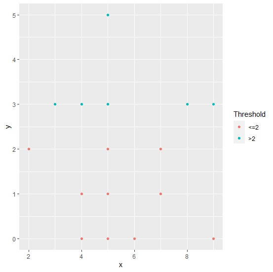
How to color scatterplot points based on a threshold using ggplot2 in R?
To color scatterplot points based on a threshold using ggplot2, we first need to define a column with the threshold value and then we can use that column inside aes for coloring. The column with threshold can be created by using cut function.
Check out the example given below to understand how it can be done.
Example
Following snippet creates a sample data frame −
x<-rpois(20,5)
y<-rpois(20,2)
df<-data.frame(x,y)
df
Output
The following dataframe is created −
   x  y
1  6  0
2  5  5
3  7  2
4  4  0
5  4  1
6  5  0
7  9  3
8  4  1
9  7  1
10 5  2
11 4  3
12 8  3
13 4  0
14 9  0
15 5  1
16 3  3
17 7  1
18 2  2
19 5  3
20 5  1
To create a threshold column based on values in column y, add the following code to the above snippet −
x<-rpois(20,5)
y<-rpois(20,2)
df<-data.frame(x,y)
df$Threshold<-cut(df$y,breaks=c(-Inf,2,Inf),labels=c("<=2",">2"))
df
Output
If you execute all the above given snippets as a single program, it generates the following Output −
   x  y Threshold
1  6  0  <=2
2  5  5  >2
3  7  2  <=2
4  4  0  <=2
5  4  1  <=2
6  5  0  <=2
7  9  3  >2
8  4  1  <=2
9  7  1  <=2
10 5  2  <=2
11 4  3  >2
12 8  3  >2
13 4  0  <=2
14 9  0  <=2
15 5  1  <=2
16 3  3  >2
17 7  1  <=2
18 2  2  <=2
19 5  3  >2
20 5  1  <=2
To load ggplot2 package and create scatterplot between x and y with different color of points based on threshold column, add the following code to the above snippet −
library(ggplot2)
ggplot(df,aes(x,y,color=Threshold))+geom_point()
Output
If you execute all the above given snippets as a single program, it generates the following Output −

2K+ Views
