- Trending Categories
Data Structure
Networking
RDBMS
Operating System
Java
MS Excel
iOS
HTML
CSS
Android
Python
C Programming
C++
C#
MongoDB
MySQL
Javascript
PHP
Physics
Chemistry
Biology
Mathematics
English
Economics
Psychology
Social Studies
Fashion Studies
Legal Studies
- Selected Reading
- UPSC IAS Exams Notes
- Developer's Best Practices
- Questions and Answers
- Effective Resume Writing
- HR Interview Questions
- Computer Glossary
- Who is Who
How to add a mathematical expression in axis label in a plot created by using plot function in R?
When we create a plot using plot function in R, the axes titles are either chosen by R automatically based on the vectors passed through the function or we can use ylab or xlab for particular axes. To add a mathematical expression in an axis label, we can use title function with expression function to define the mathematical expression.
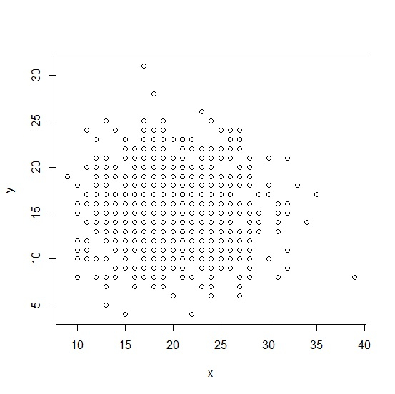
Consider the below vectors and create scatterplot between the two −
Example
set.seed(111) x<-rpois(1000,20) y<-rpois(1000,15) plot(x,y)
output
Now suppose, we want to remove y from the Y-axis and put alpha square then it can be done as shown below −
Example
plot(x,y,ylab="") title(ylab=expression(alpha^2))
- Related Articles
- How to add a citation in a plot created by using ggplot2 in R?
- How to change the background color of a plot created by using plot function in R?
- How to create gridlines that matches with Y-axis values in the plot created by using plot function in R?
- How to add a shared x-label and y-label to a plot created with Pandas' plot? (Matplotlib)
- How to reduce the size of the area covered by legend in R for a plot created by using plot function?
- How to add a horizontal line to the plot created by ggplot2 in R?
- How to remove ticks in a plot created by using gglot2 in R?
- How to represent the legend in a plot created by using plot function with colored straight lines or stars in R?
- How to change the title of a graph to italic created by using plot function in R?
- How to change the color and size of the axes labels of a plot created by using plot function in R?
- How to convert the X-axis label in a bar plot to italic using ggplot2 in R?
- How to change the position of the title of a plot which is created using plot function in R?
- How to highlight text inside a plot created by ggplot2 using a box in R?
- How to change legend values in a bar plot created by using ggplot2 in R?
- How to display regression slope using model in a plot created by ggplot2 in R?

Advertisements