
Article Categories
- All Categories
-
 Data Structure
-
 Networking
-
 RDBMS
RDBMS
-
 Operating System
-
 Java
Java
-
 MS Excel
-
 iOS
iOS
-
 HTML
HTML
-
 CSS
CSS
-
 Android
-
 Python
-
 C Programming
-
 C++
C++
-
 C#
C#
-
 MongoDB
-
 MySQL
MySQL
-
 Javascript
-
 PHP
PHP
-
 Economics & Finance
Selected Reading
How to display ID column values in a scatterplot created with ggplot2 in R?
To display ID column values in a scatterplot created with ggplot2 in R, we can follow the below steps −
- First of all, create a data frame.
- Then, create the scatterplot using ggplot2.
- After that, create the same plot with label argument inside aes and add the geom_text function.
Create the data frame
Let's create a data frame as shown below −
> ID<-1:10
> x<-rnorm(10)
> y<-rnorm(10)
> df<-data.frame(ID,x,y)
> df
On executing, the above script generates the below output(this output will vary on your system due to randomization) −
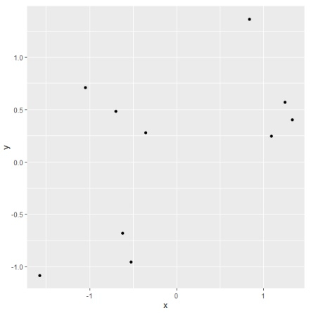
  ID     x         y
1 1   -0.6980655  0.4815529
2 2    1.0943027  0.2476090
3 3    1.3299122  0.4023055
4 4   -1.5713752 -1.0870443
5 5   -0.5254172 -0.9559608
6 6    1.2467670  0.5690500
7 7   -0.6193448 -0.6816401
8 8   -0.3558055  0.2776055
9 9    0.8396879  1.3638565
10 10 -1.0508085  0.7066900
Create the scatterplot using ggplot2
Using geom_point function of ggplot2 package to create the scatterplot −
> ID<-1:10
> x<-rnorm(10)
> y<-rnorm(10)
> df<-data.frame(ID,x,y)
> library(ggplot2)
> ggplot(df,aes(x,y))+geom_point()
Output
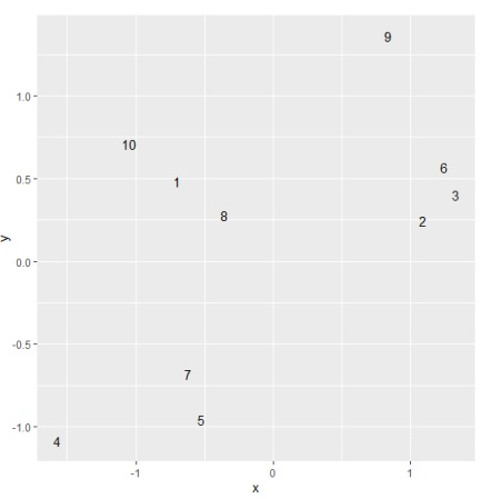
Create the scatterplot with ID column values displayed on the plot
Using geom_text function and use label argument inside aes of ggplot function to create the scatterplot with ID column values displayed on the plot −
> ID<-1:10
> x<-rnorm(10)
> y<-rnorm(10)
> df<-data.frame(ID,x,y)
> library(ggplot2)
> ggplot(df,aes(x,y,label=ID))+geom_text()
Output

Updated on: 2026-03-11T22:50:57+05:30
1K+ Views

Advertisements