
Article Categories
- All Categories
-
 Data Structure
-
 Networking
-
 RDBMS
RDBMS
-
 Operating System
-
 Java
Java
-
 MS Excel
-
 iOS
iOS
-
 HTML
HTML
-
 CSS
CSS
-
 Android
-
 Python
-
 C Programming
-
 C++
C++
-
 C#
C#
-
 MongoDB
-
 MySQL
MySQL
-
 Javascript
-
 PHP
PHP
-
 Economics & Finance
Selected Reading
How to display NA group values in scatterplot created with ggplot2 using color brewer in R?
To display NA group values in scatterplot created with ggplot2 using color brewer in R, we can follow the below steps −
- First of all, create a data frame.
- Then, create the scatterplot with default colors.
- After that, use scale_color_brewer function to create the scatterplot with color of points (including NA) based on color palette given in scale_color_brewer.
Create the data frame
Let's create a data frame as shown below −
x<-sample(1:50,25)
y<-sample(1:50,25)
Group<-sample(c("First","Second","NA"),25,replace=TRUE)
df<-data.frame(x,y,Group)
df
On executing, the above script generates the below output(this output will vary on your system due to randomization) −
   x  y  Group
1  46 11 NA
2  32 47 NA
3  23 26 NA
4  26 28 First
5  3  36 First
6  33 49 NA
7  38 3  Second
8  14 10 Second
9  30 39 Second
10 11 14 Second
11 34 8  NA
12 18 21 NA
13 2  31 First
14 9  32 First
15 20 38 First
16 5  50 Second
17 29 34 Second
18 19 43 NA
19 4  20 First
20 17 46 First
21 31 4  First
22 1  24 Second
23 24 6  Second
24 42 29 NA
25 15 41 Second
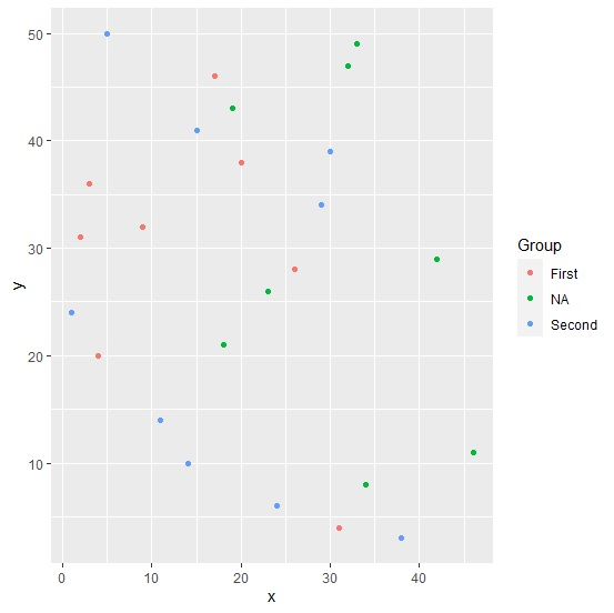
Create the scatterplot with default colors
Using geom_point function of ggplot2 package to create the scatterplot between x and y −
x<-sample(1:50,25)
y<-sample(1:50,25)
Group<-sample(c("First","Second","NA"),25,replace=TRUE)
df<-data.frame(x,y,Group)
library(ggplot2)
ggplot(df,aes(x,y,col=Group))+geom_point()
Output
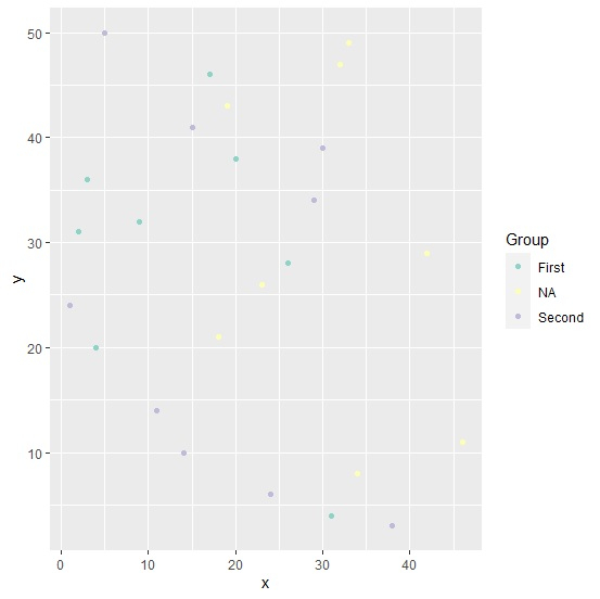
Create the scatterplot with points color based on color palette in scale_color_brewer
Adding scale_color_brewer function ggplot function and creating the scatterplot −
x<-sample(1:50,25)
y<-sample(1:50,25)
Group<-sample(c("First","Second","NA"),25,replace=TRUE)
df<-data.frame(x,y,Group)
library(ggplot2)
ggplot(df,aes(x,y,col=Group))+geom_point()+scale_color_brewer(palette="Set3")
Output

Updated on: 2026-03-11T22:50:58+05:30
574 Views

Advertisements