
Article Categories
- All Categories
-
 Data Structure
-
 Networking
-
 RDBMS
RDBMS
-
 Operating System
-
 Java
Java
-
 MS Excel
-
 iOS
iOS
-
 HTML
HTML
-
 CSS
CSS
-
 Android
-
 Python
-
 C Programming
-
 C++
C++
-
 C#
C#
-
 MongoDB
-
 MySQL
MySQL
-
 Javascript
-
 PHP
PHP
-
 Economics & Finance
Selected Reading
How to create a scatterplot with dark points using ggplot2 in R?
To create a scatterplot with low intensity of points using ggplot2, we can follow the below steps −
- First of all, create a data frame.
- Then, create the scatterplot.
- Create the scatterplot with scale_color_hue function for dark points.
Create the data frame
Let's create a data frame as shown below −
x<-sample(1:100,25)
y<-sample(1:100,25)
Factor<-sample(c("Real","Imaginary"),25,replace=TRUE)
df<-data.frame(x,y,Factor)
df
On executing, the above script generates the below output(this output will vary on your system due to randomization) −
  x y    Factor
1 43 50 Imaginary
2 6 52  Imaginary
3 19 60 Real
4 42 24 Real
5 99 66 Imaginary
6 32 69 Real
7 11 91 Imaginary
8 97 93 Imaginary
9 16 99 Real
10 76 7 Real
11 95 89 Imaginary
12 13 4 Imaginary
13 74 49 Imaginary
14 40 94 Real
15 54 47 Imaginary
16 38 15 Real
17 96 74 Real
18 20 72 Imaginary
19 34 23 Real
20 57 87 Imaginary
21 82 2 Real
22 36 59 Imaginary
23 98 67 Real
24 1 98 Real
25 65 62 Real
Create the scatterplot
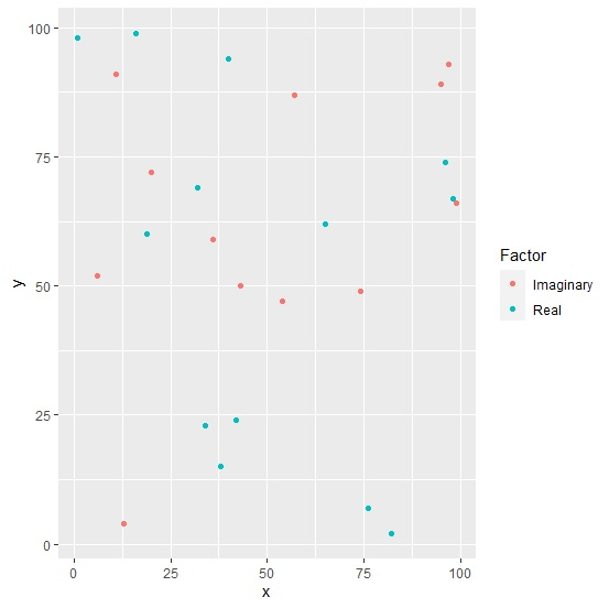
Use geom_point function of ggplot2 package to create the scatterplot −
x<-sample(1:100,25)
y<-sample(1:100,25)
Factor<-sample(c("Real","Imaginary"),25,replace=TRUE)
df<-data.frame(x,y,Factor)
library(ggplot2)
ggplot(df,aes(x,y,color=Factor))+geom_point()
Output
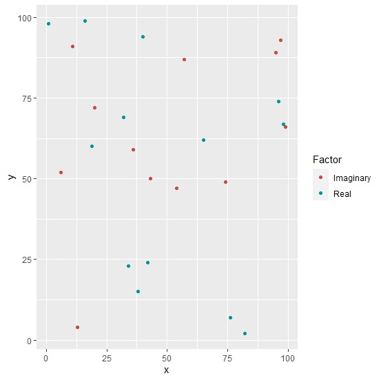
Create the scatterplot with dark points
Use scale_color_hue function of ggplot2 package with l argument to create the scatterplot with dark points(the default values for l is 65) −
x<-sample(1:100,25)
y<-sample(1:100,25)
Factor<-sample(c("Real","Imaginary"),25,replace=TRUE)
df<-data.frame(x,y,Factor)
library(ggplot2)
ggplot(df,aes(x,y,color=Factor))+geom_point()+scale_color_hue(l=50)
Output

Updated on: 2026-03-11T22:50:58+05:30
374 Views

Advertisements