
Article Categories
- All Categories
-
 Data Structure
-
 Networking
-
 RDBMS
RDBMS
-
 Operating System
-
 Java
Java
-
 MS Excel
-
 iOS
iOS
-
 HTML
HTML
-
 CSS
CSS
-
 Android
-
 Python
-
 C Programming
-
 C++
C++
-
 C#
C#
-
 MongoDB
-
 MySQL
MySQL
-
 Javascript
-
 PHP
PHP
-
 Economics & Finance
Selected Reading
How to write a long line for the X-label of a scatterplot in R using ggplot2?
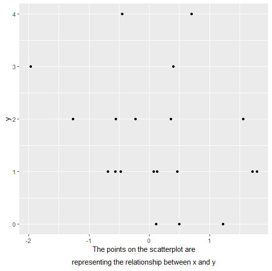
When we create a plot in R, the variable names are automatically plotted as axes labels but sometimes we want to give a brief detail of the X-label or a Y-label. If that brief is not small so that the expression function can contain the length of the label then it becomes difficult but it can be done with the help of atop inside expression.
Example
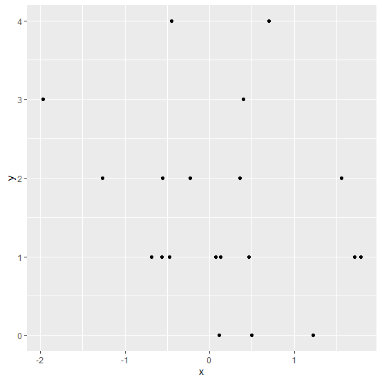
Consider the below data frame −
set.seed(123)
x<-rnorm(20)
y<-rpois(20,2)
df<-data.frame(x,y)
df
Output
    x    y
1 -0.56047565 1
2 -0.23017749 2
3 1.55870831 2
4 0.07050839 1
5 0.12928774 1
6 1.71506499 1
7 0.46091621 1
8 -1.26506123 2
9 -0.68685285 1
10 -0.44566197 4
11 1.22408180 0
12 0.35981383 2
13 0.40077145 3
14 0.11068272 0
15 -0.55584113 2
16 1.78691314 1
17 0.49785048 0
18 -1.96661716 3
19 0.70135590 4
20 -0.47279141 1
library(ggplot2)
ggplot(df,aes(x,y))+geom_point()
Output
Creating the plot with lengthy X-label −
ggplot(df,aes(x,y))+geom_point()+
+ xlab(expression(atop("The points on the scatterplot are",paste("representing the relationship between x and y"))))
Output

Updated on: 2026-03-11T22:50:51+05:30
201 Views

Advertisements