
Article Categories
- All Categories
-
 Data Structure
-
 Networking
-
 RDBMS
RDBMS
-
 Operating System
-
 Java
Java
-
 MS Excel
-
 iOS
iOS
-
 HTML
HTML
-
 CSS
CSS
-
 Android
-
 Python
-
 C Programming
-
 C++
C++
-
 C#
C#
-
 MongoDB
-
 MySQL
MySQL
-
 Javascript
-
 PHP
PHP
-
 Economics & Finance
Selected Reading
How to create regression model line in a scatterplot created by using ggplot2 in R?
To add a regression model line in a scatterplot created by using ggplot2, we need to use geom_smooth function to define the line for linear model. For example, if we have a data frame df that contains independent variable x and the dependent variable y then the regression line can be created by using the code −
ggplot(df,aes(x,y))+geom_point()+geom_smooth(method="lm")
Example
Consider the below data frame −
set.seed(133)
x<-rnorm(20,5,0.375)
y<-rnorm(20,10,2)
df<-data.frame(x,y)
df
Output
      x       y
1 5.033896 9.383918
2 5.130221 11.829104
3 4.702206 9.917457
4 5.110479 7.629133
5 5.464191 8.825002
6 4.982272 10.948461
7 5.382662 11.926883
8 4.961799 8.531400
9 4.936903 11.334979
10 4.489832 7.950781
11 5.518205 13.898027
12 5.458050 12.322746
13 4.567242 12.939460
14 5.312169 12.133224
15 4.764677 8.614166
16 5.444759 6.995418
17 4.946610 7.791502
18 5.204590 13.769303
19 4.613702 11.185987
20 4.894561 8.297381
Loading ggplot2 package and creating regression model line in the scatterplot −
Example
library(ggplot2)
ggplot(df,aes(x,y))+geom_point()+geom_smooth(method="lm")
`geom_smooth()` using formula 'y ~ x'
Output
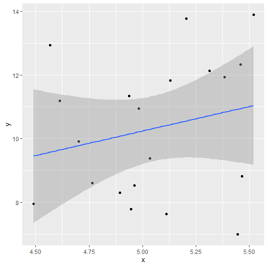
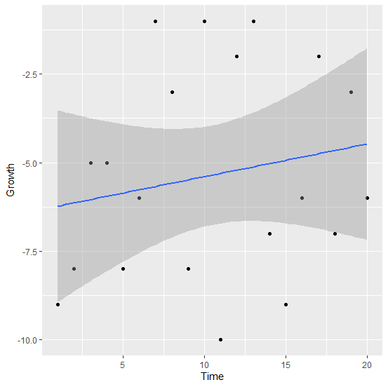
Let’s have a look at another example −
Example
Time<-1:20
Growth<-sample(-10:-1,20,replace=TRUE)
df_growthstudy<-data.frame(Time,Growth)
df_growthstudy
Output
 Time Growth
1  1    -9
2  2    -8
3  3    -5
4  4    -5
5  5    -8
6  6    -6
7  7    -1
8  8    -3
9  9    -8
10 10   -1
11 11   -10
12 12   -2
13 13   -1
14 14   -7
15 15   -9
16 16   -6
17 17   -2
18 18   -7
19 19   -3
20 20   -6
Example
ggplot(df_growthstudy,aes(Time,Growth))+geom_point()+geom_smooth(method="lm")
`geom_smooth()` using formula 'y ~ x'
Output

Updated on: 2026-03-11T22:50:52+05:30
472 Views

Advertisements