
Article Categories
- All Categories
-
 Data Structure
-
 Networking
-
 RDBMS
RDBMS
-
 Operating System
-
 Java
Java
-
 MS Excel
-
 iOS
iOS
-
 HTML
HTML
-
 CSS
CSS
-
 Android
-
 Python
-
 C Programming
-
 C++
C++
-
 C#
C#
-
 MongoDB
-
 MySQL
MySQL
-
 Javascript
-
 PHP
PHP
-
 Economics & Finance
Selected Reading
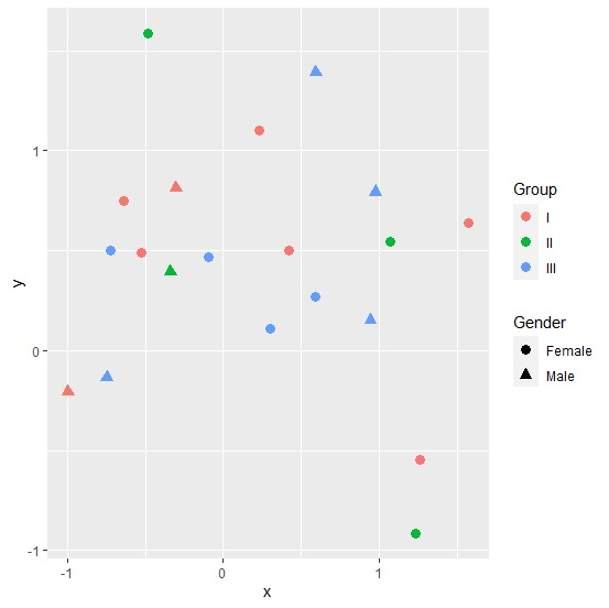
How to create a scatterplot with two legends using ggplot2 in R?
If we want to create a scatterplot with two legends then we must be having two categorical or factor columns. This can be done by using the below steps −
- Creating a data frame with two numerical and two categorical columns
- Creating the scatterplot with shape and color argument of geom_point function of ggplot2 package
Create the data frame
Let's create a data frame as shown below −
x<-rnorm(20)
y<-rnorm(20)
Gender<-sample(c("Male","Female"),20,replace=TRUE)
Group<-sample(c("I","II","III"),20,replace=TRUE)
df<-data.frame(x,y,Gender,Group)
df
On executing, the above script generates the below output(this output will vary on your system due to randomization) −
        x          y   Gender Group
1 -0.4799690 1.5891955 Female II
2 0.9413427 0.1495437 Male    III
3 0.2321381 1.1012327 Female  I
4 0.9742311 0.7938336 Male    III
5 -0.3035013 0.8117990 Male   I
6 1.2574545 -0.5482740 Female I
7 0.2966496 0.1084953 Female  III
8 0.5882950 0.2693988 Female  III
9 1.2275719 -0.9168983 Female II
10 -0.3383743 0.3960809 Male  II
11 -0.0976704 0.4654153 Female III
12 -0.5239506 0.4893968 Female I
13 1.0714197 0.5457905 Female  II
14 1.5720266 0.6403787 Female  I
15 -0.6347866 0.7467298 Female I
16 0.4176001 0.5003941 Female  I
17 -0.7211758 0.5015195 Female III
18 -0.9957714 -0.2087898 Male  I
19 0.5924078 1.3892832 Male   III
20 -0.7466664 -0.1326818 Male III
Creating scatterplot with two legends
Loading ggplot2 package and creating the scatterplot with shape defined by Gender and color defined by Group −
library(ggplot2)
x<-rnorm(20)
y<-rnorm(20)
Gender<-sample(c("Male","Female"),20,replace=TRUE)
Group<-sample(c("I","II","III"),20,replace=TRUE)
df<-data.frame(x,y,Gender,Group)
ggplot(df,aes(x,y))+geom_point(aes(shape=Gender,color=Group),size=3)
Output

Updated on: 2026-03-11T22:50:58+05:30
1K+ Views

Advertisements