
Article Categories
- All Categories
-
 Data Structure
-
 Networking
-
 RDBMS
RDBMS
-
 Operating System
-
 Java
Java
-
 MS Excel
-
 iOS
iOS
-
 HTML
HTML
-
 CSS
CSS
-
 Android
-
 Python
-
 C Programming
-
 C++
C++
-
 C#
C#
-
 MongoDB
-
 MySQL
MySQL
-
 Javascript
-
 PHP
PHP
-
 Economics & Finance
Selected Reading
How to create scatterplot for categories with grey color palette using ggplot2 in R?
To create scatterplot for categories with grey color palette using ggplot2, we can follow the below steps −
- First of all, create a data frame.
- Then, create the scatterplot for categories with default color of points.
- Create the scatterplot for categories with color of points in grey palette.
Create the data frame
Let's create a data frame as shown below −
x<-rnorm(25)
y<-rnorm(25)
Group<-sample(c("First","Second","Third"),25,replace=TRUE)
df<-data.frame(x,y,Group)
df
On executing, the above script generates the below output(this output will vary on your system due to randomization) −
       x           y        Group
1   0.03036902  -1.08989993 First
2  -1.36496321  -1.28054928 Third
3   0.23855417  -0.12276306 Third
4   0.52709378  -0.19730924 First
5  -1.24295750  -1.48467998 First
6  -0.57012334   0.70429757 Third
7  -2.23872847  -0.20110399 Third
8   0.51140516   0.14296460 First
9   0.55635303   0.20972904 Third
10  -0.24455115 -0.41292120 Third
11  0.38049399  -0.99364419 First
12  0.71502187   0.18136820 Third
13  -0.65251508 -0.09298097 First
14  -0.88401096  0.19342739 First
15  1.66023122   0.32843555 Second
16  -0.58101208 -0.49223091 First
17  -1.17912751 -0.69346144 Third
18  -0.75448095 -1.63278740 Third
19  -1.01581774 -0.05109014 Third
20  0.18852503  -2.13195617 First
21  -0.10338979  0.71512367 Second
22  1.83279352  -1.37538539 Second
23  -0.71975579 0.52236441  Third
24   0.12262292  0.81983890 First
25  -0.26669515 0.77764427  Second
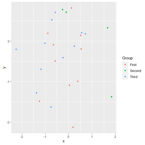
Create the scatterplot for categories
Loading ggplot2 package and creating scatterplot for categories based on Group values −
library(ggplot2)
x<-rnorm(25)
y<-rnorm(25)
Group<-sample(c("First","Second","Third"),25,replace=TRUE)
df<-data.frame(x,y,Group)
ggplot(df,aes(x,y,color=Group))+geom_point()
Output
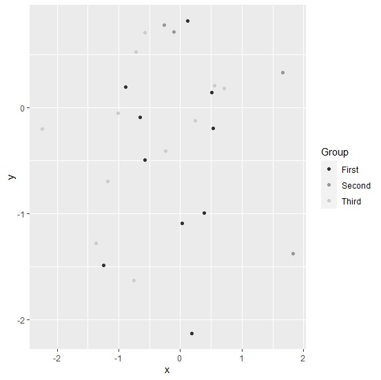
Create the scatterplot for categories with grey color palette
Use scale_color_grey function to create the scatterplot for points of categories colored in grey palette −
library(ggplot2)
x<-rnorm(25)
y<-rnorm(25)
Group<-sample(c("First","Second","Third"),25,replace=TRUE)
df<-data.frame(x,y,Group)
ggplot(df,aes(x,y,color=Group))+geom_point()+scale_color_grey()
Output

Updated on: 2026-03-11T22:50:58+05:30
369 Views

Advertisements