
Article Categories
- All Categories
-
 Data Structure
-
 Networking
-
 RDBMS
RDBMS
-
 Operating System
-
 Java
Java
-
 MS Excel
-
 iOS
iOS
-
 HTML
HTML
-
 CSS
CSS
-
 Android
-
 Python
-
 C Programming
-
 C++
C++
-
 C#
C#
-
 MongoDB
-
 MySQL
MySQL
-
 Javascript
-
 PHP
PHP
-
 Economics & Finance
How to create a scatterplot with white background and no gridlines using ggplot2 in R?
Practically, the scatterplots are well visualized on white background just like on white paper. If we want to create a scatterplot with white background and without gridlines using ggplot2 then we can apply classic theme to the plot.
Check out the below given example to understand how it can be done.
Example
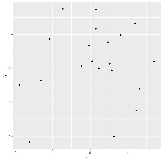
Following snippet creates a sample data frame −
xThe following dataframe is created −
x y 1 1.31568665 -0.606920458 2 0.15326695 1.160784530 3 0.15085999 1.729299362 4 -0.72411523 1.752459403 5 0.63320670 -2.007432892 6 -0.02838092 0.666850263 7 0.47622500 0.773645227 8 -1.31266392 -0.364087710 9 -0.23533956 0.066300263 10 0.23250476 0.002910826 11 0.05144478 0.209315785 12 1.19896603 1.322499122 13 -1.61145699 -2.178898953 14 0.57492214 -0.056533058 15 -1.88213380 -0.489842212 16 0.52139560 0.130411415 17 1.23015725 -1.240335481 18 1.70217355 0.204177146 19 -1.07961144 0.866155470 20 0.81058282 0.978253536To load ggplot2 package and create point chart between x and y, add the following code to the above snippet −
library(ggplot2) ggplot(df,aes(x,y))+geom_point()Output
If you execute all the above given snippets as a single program, it generates the following output −
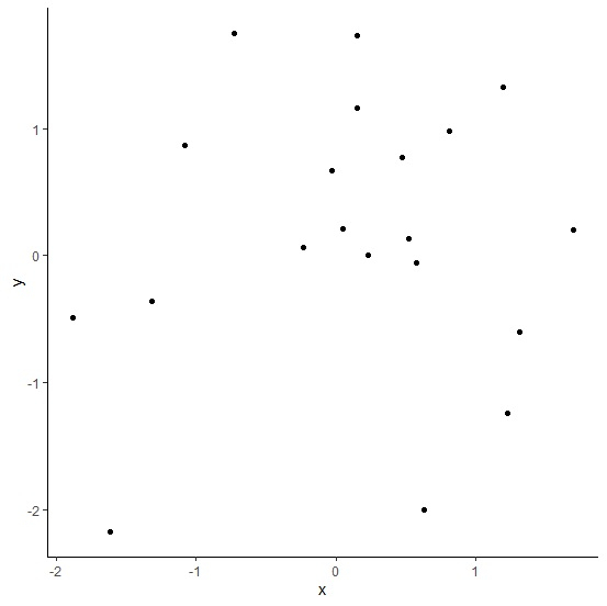
To create point chart between x and y with white background and no gridlines, add the following code to the above snippet −
ggplot(df,aes(x,y))+geom_point()+theme_classic()Output
If you execute all the above given snippets as a single program, it generates the following output −

412 Views
