
Article Categories
- All Categories
-
 Data Structure
-
 Networking
-
 RDBMS
RDBMS
-
 Operating System
-
 Java
Java
-
 MS Excel
-
 iOS
iOS
-
 HTML
HTML
-
 CSS
CSS
-
 Android
-
 Python
-
 C Programming
-
 C++
C++
-
 C#
C#
-
 MongoDB
-
 MySQL
MySQL
-
 Javascript
-
 PHP
PHP
-
 Economics & Finance
Selected Reading
How to create scatterplot by standardizing the columns of a data frame using ggplot2 R?
To create scatterplot by standardizing the columns of a data frame using ggplot2 R, we can follow the below steps −
First of all, create a data frame.
Then, create the scatterplot using ggplot2 with raw values.
After that, create the scatterplot with scale function.
Create the data frame
Let’s create a data frame as shown below −
x<-sample(1:100,25)
y<-sample(1:100,25)
df<-data.frame(x,y)
df
On executing, the above script generates the below output(this output will vary on your system due to randomization) −
Output
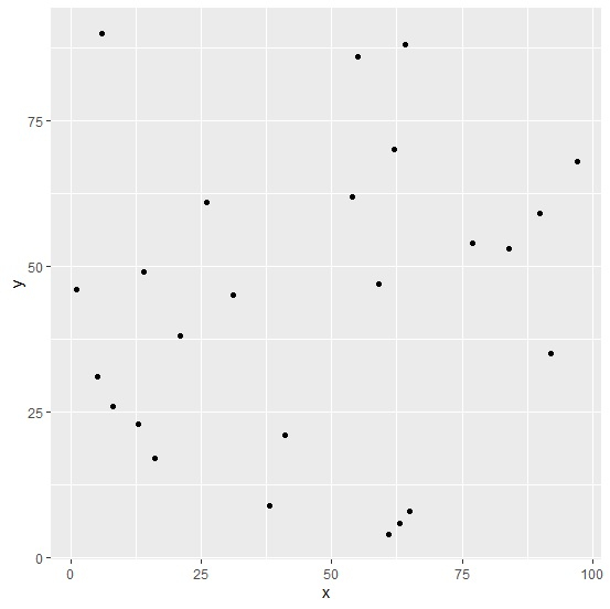
   x  y
1  61 4
2  26 61
3  5  31
4  1  46
5  31 45
6  92 35
7  64 88
8  63 6
9  90 59
10 54 62
11 55 86
12 16 17
13 97 68
14 62 70
15 8 26
16 38 9
17 65 8
18 21 38
19 77 54
20 6 90
21 13 23
22 59 47
23 14 49
24 41 21
25 84 53
Create the scatterplot
Using geom_point function of ggplot2 package to create the scatterplot between x and y −
x<-sample(1:100,25)
y<-sample(1:100,25)
df<-data.frame(x,y)
library(ggplot2)
ggplot(df,aes(x,y))+geom_point()
Output
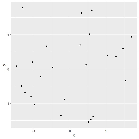
Create the scatterplot after standardizing the columns
Using scale function inside aes of geom_point to create the scatterplot between standardized values of x and y −
x<-sample(1:100,25)
y<-sample(1:100,25)
df<-data.frame(x,y)
library(ggplot2)
ggplot(df,aes(x,y))+geom_point(aes(scale(x),scale(y)))
Output

Updated on: 2026-03-11T22:50:58+05:30
271 Views

Advertisements