
Article Categories
- All Categories
-
 Data Structure
-
 Networking
-
 RDBMS
RDBMS
-
 Operating System
-
 Java
Java
-
 MS Excel
-
 iOS
iOS
-
 HTML
HTML
-
 CSS
CSS
-
 Android
-
 Python
-
 C Programming
-
 C++
C++
-
 C#
C#
-
 MongoDB
-
 MySQL
MySQL
-
 Javascript
-
 PHP
PHP
-
 Economics & Finance
How to change the abline colour created using ggplot2 in R?
To change the abline color created using ggplot2 in R, we can follow the below steps −
First of all, create a data frame.
Then, use ggplot2 to create the regression line with given slope and intercept.
After that, create the same plot with colour argument to change the abline colour.
Example
Create the data frame
Let’s create a data frame as shown below −
x<-rnorm(25)
y<-rnorm(25)
df<-data.frame(x,y)
df
Output
On executing, the above script generates the below output(this output will vary on your system due to randomization) −
        x            y
1   -0.51902492 -0.79354642
2   -0.42864943 -0.25896843
3    0.57382031  0.95552909
4   -1.68136435  0.19044111
5   -0.69830456 -0.01767888
6   -0.76028497 -0.19016998
7   -0.16044373  0.30392163
8   -1.30390581  0.00911881
9   -0.92685295 -0.63172007
10   2.05518766 -0.70310776
11   0.40343320  1.14764580
12  -1.01411102  0.29829312
13  -0.39075157  0.06896220
14   1.71747493  0.18522334
15   0.73520133 -0.01642746
16   0.19556420  0.55860325
17  -1.45367281  0.01375643
18  -2.42102756  0.63214669
19   0.16466908 -1.25939472
20  -0.88376161 -1.02222998
21  -0.68787689 -0.85754925
22  -0.33156054  0.38232947
23   0.14147640 -0.04030800
24   0.39239316 -0.46167568
25  -0.09390706 -0.27455582
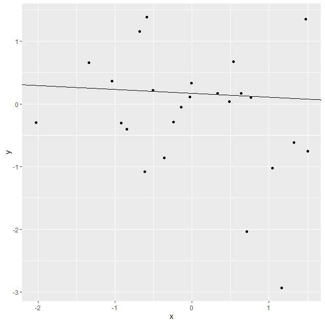
Create the regression line plot
Using ggplot2 to create the regression line with given slope and intercept as shown below −
x<-rnorm(25)
y<-rnorm(25)
df<-data.frame(x,y)
library(ggplot2)
ggplot(df,aes(x,y))+geom_point()+geom_abline(slope=-0.062712, intercept=0.165886)
Output

Create the regression line plot with different line colour
Using ggplot2 to create the regression line with given slope and intercept having different line colour as shown below −
x<-rnorm(25)
y<-rnorm(25)
df<-data.frame(x,y)
library(ggplot2)
ggplot(df,aes(x,y))+geom_point()+geom_abline(slope=-0.062712,
intercept=0.165886,colour="green")
Output

3K+ Views
