
Article Categories
- All Categories
-
 Data Structure
-
 Networking
-
 RDBMS
RDBMS
-
 Operating System
-
 Java
Java
-
 MS Excel
-
 iOS
iOS
-
 HTML
HTML
-
 CSS
CSS
-
 Android
-
 Python
-
 C Programming
-
 C++
C++
-
 C#
C#
-
 MongoDB
-
 MySQL
MySQL
-
 Javascript
-
 PHP
PHP
-
 Economics & Finance
Selected Reading
How to change the tick size using ggplot2 in R?
To change the tick size using ggplot2, we can use theme function with argument axis.ticks.length. For example, if we have a data frame called df that contains two columns say x and y then the scatterplot between x and y with larger size of tick marks can be created by using the below command −
ggplot(df,aes(x,y))+geom_point()+theme(axis.ticks.length=unit(0.8,"inch"))
Example
Consider the below data frame −
x<-rnorm(20)
y<-rnorm(20)
df<-data.frame(x,y)
df
Output
      x              y
1   2.5494830  -0.587904992
2  -0.5864972   0.006669457
3   0.9554755  -3.925291145
4   0.6686948  -2.326550523
5  -0.3267310   0.738981444
6  -0.8751193  -0.438232843
7   0.5477108   0.214512133
8  -0.4767738   0.451001999
9  -0.5364709   0.335897135
10   0.5853087 -0.665692002
11 -1.7818255   0.944527193
12 -0.9670748   0.639372414
13  0.4873353   0.466036727
14  0.3669196   2.732934553
15  0.9450203  -0.201909686
16 -1.1646289  -0.533447384
17 -1.8637459   1.186856615
18 -1.5751590  -1.154048208
19 -0.2266776   1.813758654
20 -0.7125976   0.251823020
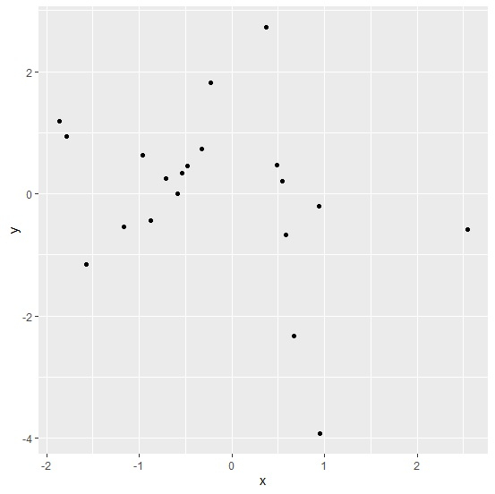
Loading ggplot2 package and creating scatterplot between x and y with default size of tick marks −
Example
library(ggplot2)
ggplot(df,aes(x,y))+geom_point()
Output
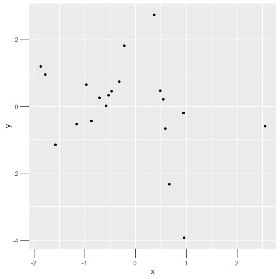
Creating scatterplot between x and y with larger size of tick marks −
Example
ggplot(df,aes(x,y))+geom_point()+theme(axis.ticks.length=unit(0.2,"inch"))
Output

Example
ggplot(df,aes(x,y))+geom_point()+theme(axis.ticks.length=unit(0.50,"cm"))
Output

Updated on: 2026-03-11T22:50:56+05:30
3K+ Views

Advertisements