
Article Categories
- All Categories
-
 Data Structure
-
 Networking
-
 RDBMS
RDBMS
-
 Operating System
-
 Java
Java
-
 MS Excel
-
 iOS
iOS
-
 HTML
HTML
-
 CSS
CSS
-
 Android
-
 Python
-
 C Programming
-
 C++
C++
-
 C#
C#
-
 MongoDB
-
 MySQL
MySQL
-
 Javascript
-
 PHP
PHP
-
 Economics & Finance
Selected Reading
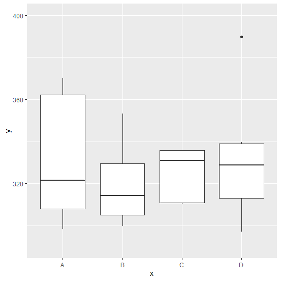
How to change the Y axis limit for boxplot created by using ggplot2 in R?
One of the most important aspects of a boxplot is Y-axis labels because these labels help us to understand the limit of the variable. Since R generate these labels automatically in a good way, we stick with that but we can change that using coord_cartesian function with ylim as shown in the below example.
Example
ggplot(df,aes(x,y))+geom_boxplot()+coord_cartesian(ylim=c(290,400))
Output

Updated on: 2026-03-11T23:22:53+05:30
2K+ Views

Advertisements