
Article Categories
- All Categories
-
 Data Structure
-
 Networking
-
 RDBMS
RDBMS
-
 Operating System
-
 Java
Java
-
 MS Excel
-
 iOS
iOS
-
 HTML
HTML
-
 CSS
CSS
-
 Android
-
 Python
-
 C Programming
-
 C++
C++
-
 C#
C#
-
 MongoDB
-
 MySQL
MySQL
-
 Javascript
-
 PHP
PHP
-
 Economics & Finance
Selected Reading
How to change legend values in a bar plot created by using ggplot2 in R?
How to change legend values in a bar plot created by using ggplot2 in R?
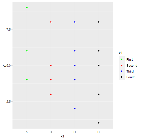
By default, the legend values are taken as the different levels of the categorical variable for which a bar plot is created using ggplot2 package and if we want to change those values then scale_color_manual function of the ggplot2 package can be used where we need to pass the values for color and labels for legend values.
Example
Consider the below data frame:
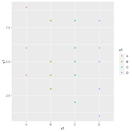
> set.seed(1214)
> x1<-sample(LETTERS[1:4],20,replace=TRUE)
> y1<-rpois(20,5)
> df1<-data.frame(x1,y1)
> df1
Output
  x1 y1
1  B  4
2  B  5
3  C  5
4  C  8
5  A  4
6  B  8
7  C  6
8  C  5
9  C  2
10 A  6
11 A  9
12 D  5
13 D  8
14 D  8
15 B  3
16 D  1
17 D  3
18 D  6
19 D  3
20 C  4
Loading ggplot2 package and creating bar plot for x1 with y1 as frequencies:
> library(ggplot2)
> ggplot(df1,aes(x1,y1,color=x1))+geom_point()
Creating the bar plot with different legend values:
> ggplot(df1,aes(x1,y1,color=x1))+geom_point()+scale_color_manual(values=c("green","red","blue","black"),labels=c("First","Second","Third","Fourth"))
Output:

Updated on: 2026-03-11T22:50:53+05:30
791 Views

Advertisements