
Article Categories
- All Categories
-
 Data Structure
-
 Networking
-
 RDBMS
RDBMS
-
 Operating System
-
 Java
Java
-
 MS Excel
-
 iOS
iOS
-
 HTML
HTML
-
 CSS
CSS
-
 Android
-
 Python
-
 C Programming
-
 C++
C++
-
 C#
C#
-
 MongoDB
-
 MySQL
MySQL
-
 Javascript
-
 PHP
PHP
-
 Economics & Finance
How to add leader lines to a chart in Excel?
You can use the features available in Excel to include leader lines in the Chart Series Labels of Column Charts, Line Charts, Bar Charts, Area Charts, XY Scatter Charts, and Pie Charts, which are among the most often used chart types.
In fact, you do not have to do anything out of the ordinary in order to get the leader lines; they will appear on your chart automatically when you add Data Labels to it. You may locate a leader line by just dragging and dropping a label onto your chart. Once you do this, you will see that the label is connected to your series by a line that extends to the data point on the chart.
Step 1
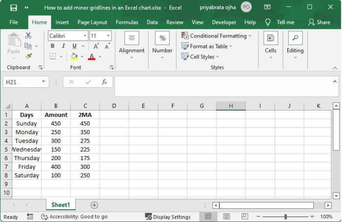
You are going to learn how to add minor gridlines to a line graph by looking at this little example. In order to get it done,
Step 2
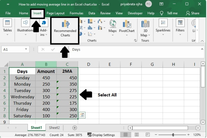
Choose the data from the source, being sure to include the Average column (A1:C8).
Click "Recommended Charts" by going to the Insert tab, then clicking on the Charts group.
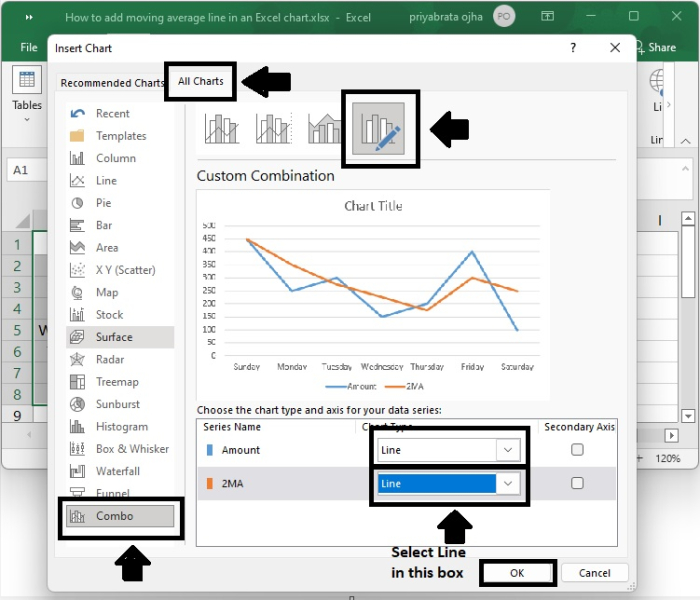
Step 3
Click the All Charts tab, then choose the Clustered Column - Line template, and then click the OK button.
If none of the standard combination charts meet your requirements, you may pick the Custom Combination type (the final template with the pen icon), and then choose the appropriate type for each of the data series.
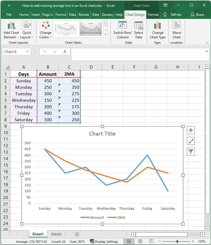
Step 4
The results of the line chart are as follows ?
Step 5
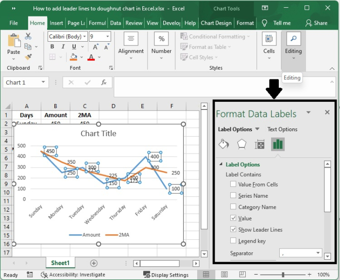
The formatting of data labels may be done in a variety of different ways. A data label may have its form altered, its size adjusted, and its labels connected to one another via the use of leader lines. The Format Data Labels task window is where all of these tasks are completed.
After you have added your data labels, you will need to pick the data to get there.
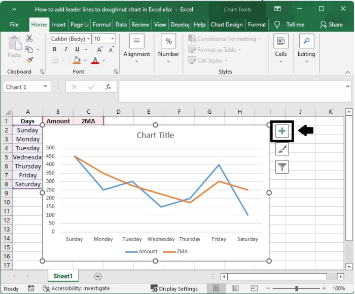
Step 6
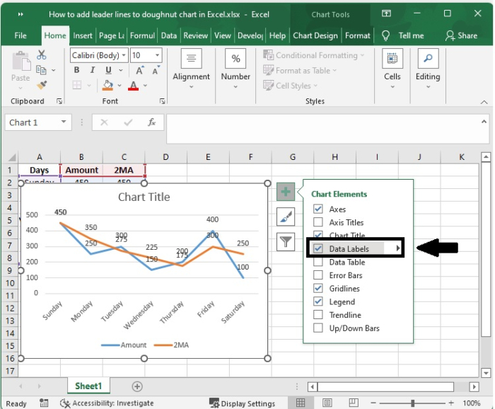
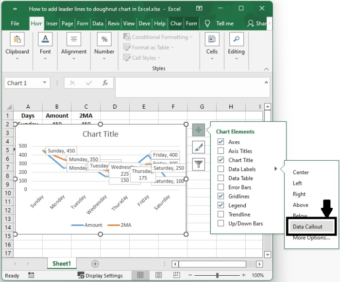
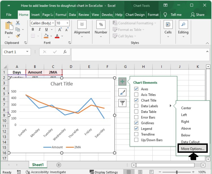
Click the label that you want to format, and then click the Chart Elements button followed by the Data Labels button followed by the More Options button.
Step 7
Clicking on any one of these icons?Fill & Line, Effects, Size & Properties (referred to as Layout & Properties in Outlook or Word), or Label Options?will take you to the section that is most relevant to your needs.
Step 8
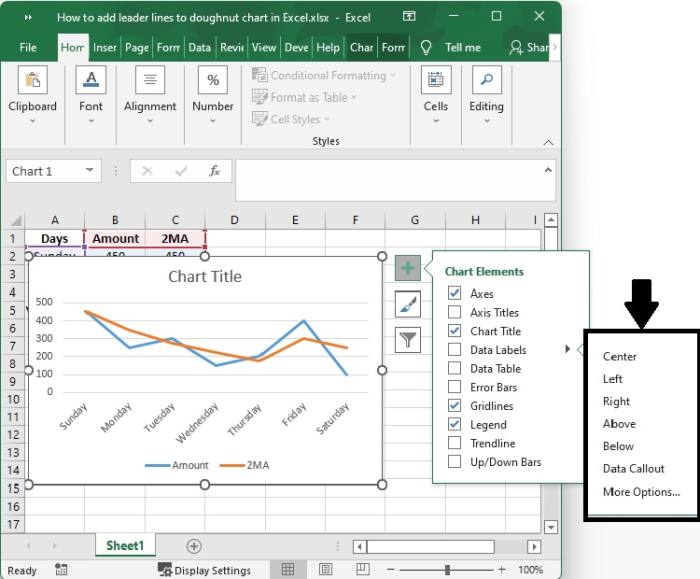
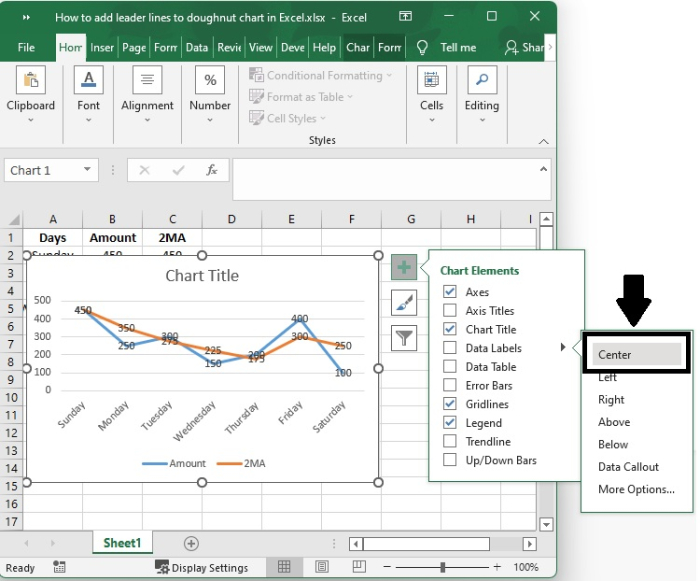
You can set the Data Labels at different positions, as shown in the following screenshots ?
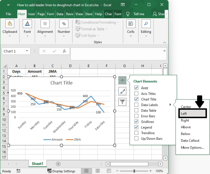
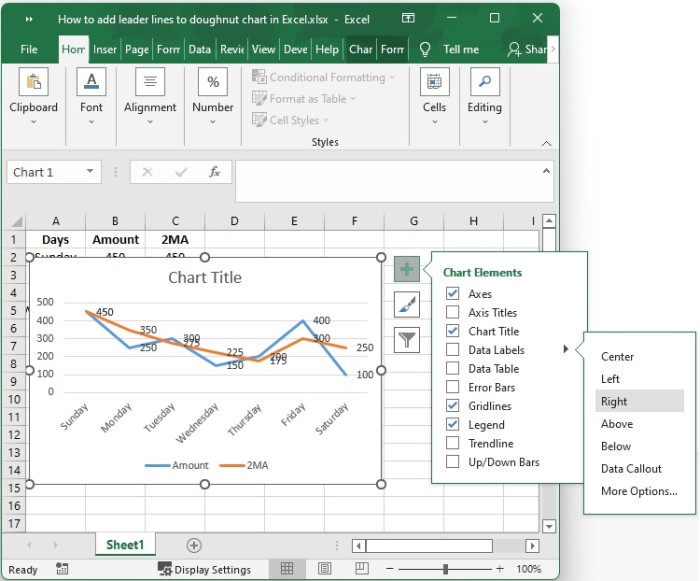
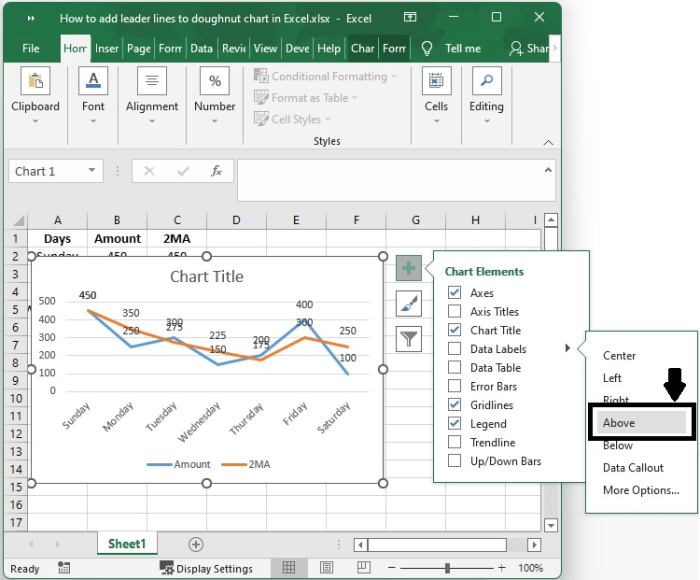
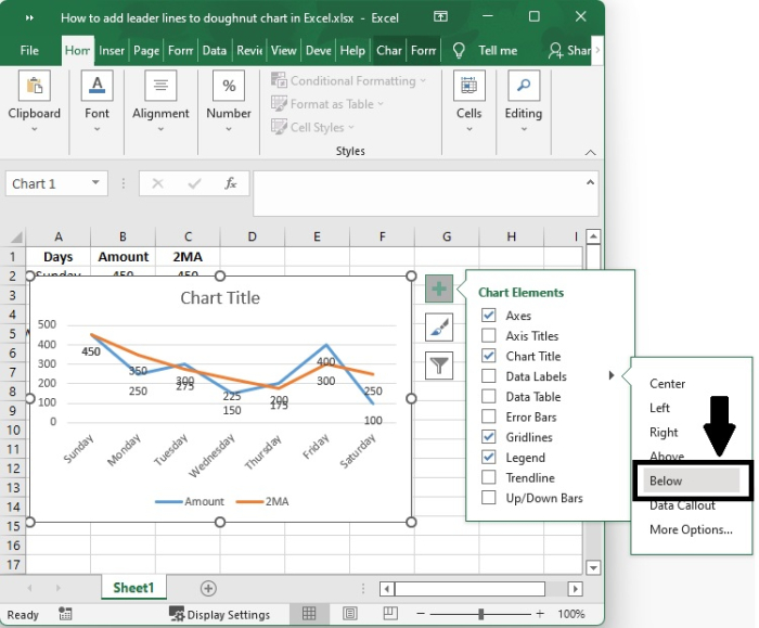
Step 9
Attempting to personalize the option that requires a click on more option?
Customize the Labels ? You can also customize the labels using the options as shown the following screenshot.
Conclusion
In this tutorial, we explained how you can add leader lines to a chart in Excel and how you can customize the labels.

2K+ Views
