
Article Categories
- All Categories
-
 Data Structure
-
 Networking
-
 RDBMS
RDBMS
-
 Operating System
-
 Java
Java
-
 MS Excel
-
 iOS
iOS
-
 HTML
HTML
-
 CSS
CSS
-
 Android
-
 Python
-
 C Programming
-
 C++
C++
-
 C#
C#
-
 MongoDB
-
 MySQL
MySQL
-
 Javascript
-
 PHP
PHP
-
 Economics & Finance
How to Add or Move Data Labels in an Excel Chart?
The tools that are used to represent the set of data in a pictorial form that will help us understand the data better are known as charts in Excel. They can also be called graphs. There are various kinds of graphs based on their structure and their uses. The small numerical number that can be used to show the value of a component of a graph is known as a "Data label." Data labels help the user analyse the graph in a better way. This tutorial helps the Excel user know how to add or move data labels in Excel.
Adding Data Labels in an Excel Chart
Here we will first create a chart and then add the data labels from the right-click menu. Let us see a simple process to know how we can add data labels to an Excel chart in different ways.
Step 1
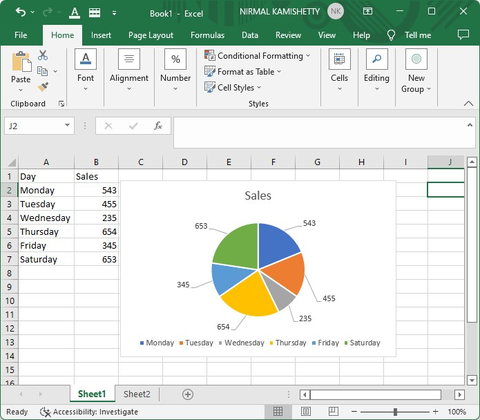
Let us consider the data that is shown in the below image.
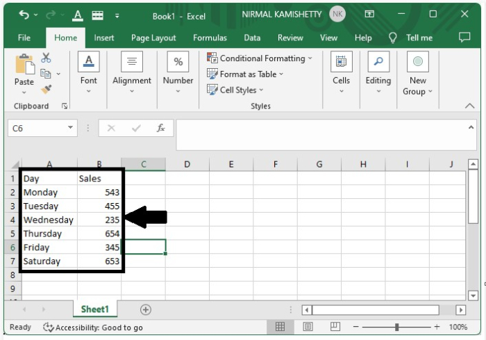
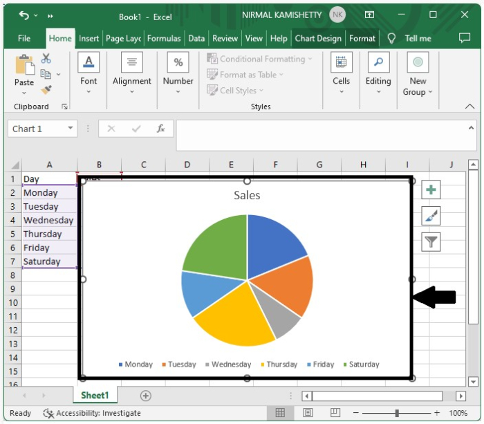
To create the chart, select the data and click on Insert, then select Pie chart under 2D pie, and our chart will look like the below screen shot.
Step 2
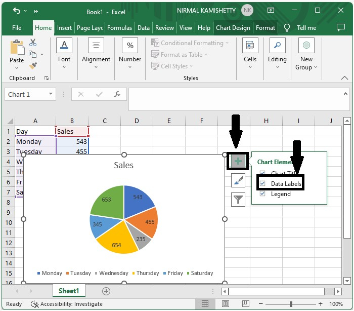
The easy and simple way to add data labels is to click on the "+" symbol of the graph and select the check box beside data labels, and our data labels will be represented successfully as shown in the below screen shot.
Step 3
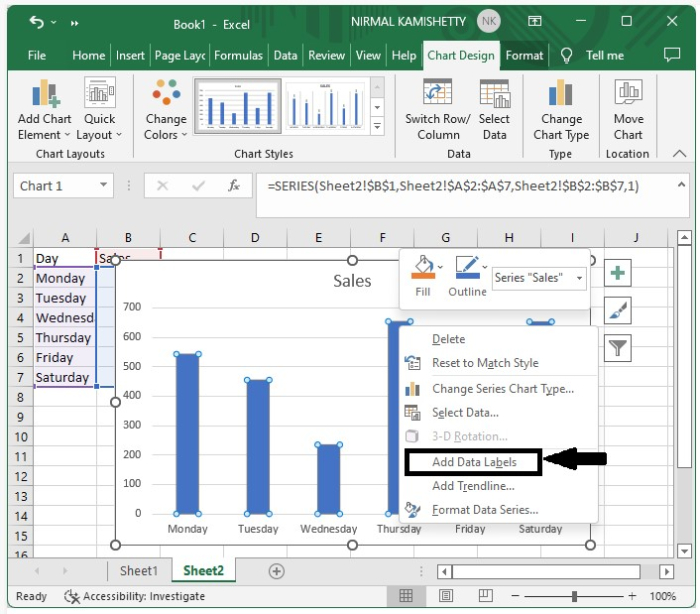
The other way of adding data labels is to right-click on the bar and select "Add data labels," and the data labels will be successfully added.
Moving Data Labels in an Excel Chart
Here, we can move data labels using the mouse cursor. Moving data labels is a very simple process compared to adding data labels.
To move data labels, just click on the labels and drag them wherever you want them to be placed. Repeat this process for all the data labels individually.
Conclusion
In this tutorial, we used a simple example to demonstrate how we can move or add data labels in an Excel chart to highlight a particular set of data.

2K+ Views
