
Article Categories
- All Categories
-
 Data Structure
-
 Networking
-
 RDBMS
RDBMS
-
 Operating System
-
 Java
Java
-
 MS Excel
-
 iOS
iOS
-
 HTML
HTML
-
 CSS
CSS
-
 Android
-
 Python
-
 C Programming
-
 C++
C++
-
 C#
C#
-
 MongoDB
-
 MySQL
MySQL
-
 Javascript
-
 PHP
PHP
-
 Economics & Finance
How to add comment to a data point in an Excel chart?
You have decided that you would like to make a comment on a particular data point in the chart. if you have a chart that you made in Excel and you would now like to include a personalised comment in the chart, your data-filled cells may be rapidly converted into a visual representation using the quick-format chart and graph functions that are available in Microsoft Excel. If you have a chart that you made in Excel and you would now like to include a personalised comment in the chart, you can use Microsoft Excel to do so.
Add comment to a data point
Using this approach, you will be walked through the process of adding a remark to a data point in an existing Excel chart. Kindly proceed as described below ?
Step 1
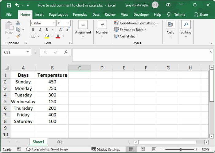
This is an example of utilising temperature. Make a graph of the data.
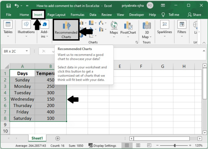
Step 2
Click the Recommended Charts button under the Insert tab after selecting the data that will be used to build the chart.
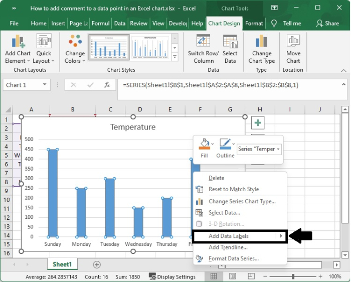
Step 3
Create a chart in whichever format you choose depending on your specific requirements. Please have a look at the bar chart that is shown further down.

Step 4
To add data labels, right-click the set of data in the chart, then pick the Add Data Labels option in Add Data Labels from the context menu. This will bring up a new window.
Step 5
This is the data label that is being shown as a comment inside the chart at the moment.
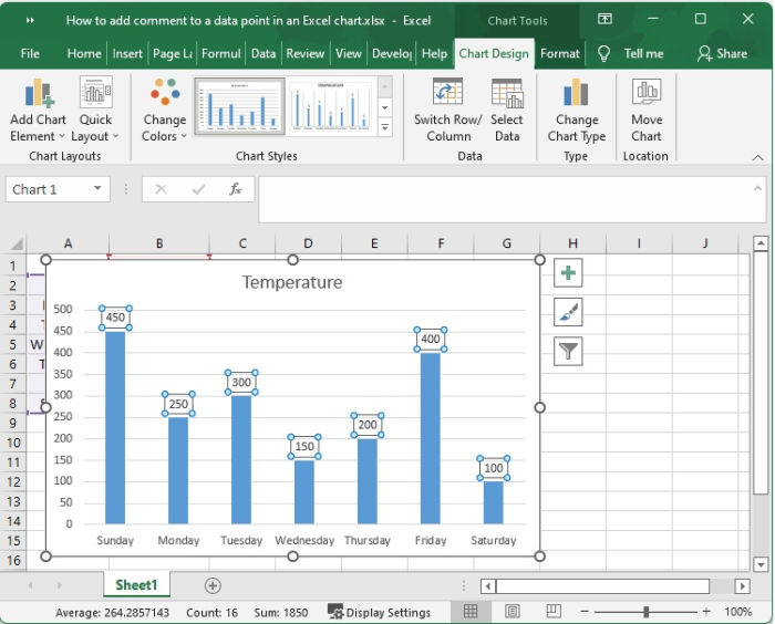
Next, the data label is placed directly above the data point that was provided. Please move the data label to the location that best suits your needs by dragging it.
Step 6
You may change the shape of the data label by right-clicking it, accessing the context menu, and selecting Change Data Label Shape. After that, you can choose a shape from the submenu. Additionally, you have the ability to adjust the fill, border, and colour.
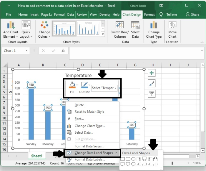
You may customise the content of the comment by typing it into the data label form.
Step 7
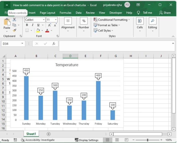
You will now see that a comment has been added for the data point that you requested on the chart that was previously shown.
Conclusion
In this tutorial, we used an example to show how you can add comment to a data point in an Excel chart.

1K+ Views
