- Chart.js - Home
- Chart.js - Introduction
- Chart.js - Installation
- Chart.js - Syntax
- Chart.js - Basics
- Chart.js - Color
- Chart.js - Options
- Chart.js - Interactions
- Chart.js - Legend
- Chart.js - Title
- Chart.js - Animation
- Chart.js - Tooltip
- Chart.js - Line Chart
- Chart.js - Bar Chart
- Chart.js - Radar Chart
- Chart.js - Doughnut Chart
- Chart.js - Pie Chart
- Chart.js - Polar Area Chart
- Chart.js - Bubble Chart
- Chart.js - Scatter Chart
- Chart.js - Mixed Chart
- Chart.js - Cartesian Axis
- Chart.js - Category Axis
- Chart.js - Radial Axis
- Chart.js Useful Resources
- Chart.js - Quick Guide
- Chart.js - Useful Resources
- Chart.js - Discussion
Chart.js - Quick Guide
Chart.js Introduction
What is Chart.js?
Chart.js, a popular open-source data visualization framework, enables us to generate the following chart types −
- Scatter Plot
- Line Chart
- Bar Chart
- Pie Chart
- Donut Chart
- Bubble Chart
- Area Chart
- Radar Chart
- Mixed Chart
Chart.js is a community-maintained free JavaScript library for making HTML-based charts. While working with Chart.js the user just needs to indicate where on page he wants the graph to be displayed and what sort of graph he wants. Once done with that, the user needs to supply Chart.js with data, labels, and some other settings. Rest of the things will be managed by library itself.
Chart.js Features
Below are the features of Chart.js −
Open-source free library − Chart.js is a free open-source community-maintained library which you can use either in offline or online mode.
Canvas − It provides us canvas element for dynamic images.
Built-in charts − It provides the user various built-in charts such as Line, Bar, Horizontal Bar, Radar, Bubble etc., to be used.
Extendable to Custom Charts − You can create a custom charts using Chart.js library.
Supports Modern Browsers − Chart.js supports all the modern browsers.
Extensive Documentation − Chart.js documentation is well organized that provides detailed information about each feature. It makes it easy to understand and use even for novice users.
Chart.js - Advantages
The advantages of Chart.js are as follows −
Chart.js provides the user 6 different animated views to visualize the data.
It provides lots of customization options as well as interactivity extensions.
It provides various types of interactive charts to display data.
It is totally free to use.
The update, remove, and modification of data from a chart is easy and hustle-free.
Chart.js due to its simple structure can store maximum data in minimum space.
Chart.js uses several y-axes due to which it can stores multiple data in a single graph.
Chart.js charts are fully responsive.
Many plugins are available for use via NPM. In fact, you can write your own plugins as well.
Chart.js - Limitations
Apart from various advantages, Chart.js is having the following limitations −
Chart.js displays only similar type of data with variations.
An installation of Chart.js only supports display of graphs and charts. It lacks the flexibility offered by other options.
The canvas element is bitmap based. It shares the same issues as non-vector formats.
Comparison with Google Chart and Plotly.js
Chart.js has main competition with two other JavaScript charting libraries namely plotly.js and Google chart.
Google chart uses web services to create charts. Although it offers maximum charts, but they do not offer enough customization and interactivity. On the other hand, Chart.js, is a free JavaScript charting library, which provides less charts but with great customization and interactivity options. To summarize if you need charts without any complex interaction then go for Google Charts. And if you need simple set of charts with least configurations then Chart.js would be the choice for you.
Chart.js and Plotly.js both are open-source free to use tools for charting. Chart.js is animated, HTML5 based and responsive whereas Plotly.js is an online chart editor that supports MatLab, Python, and R programming languages with full interactivity. The documentation of chart.js is easy than the plotly.js.
Chart.js - Installation
Prerequisites
Before installing and start using Chart.js library, you need to have the basic understanding of the following programs −
Basics of Hypertext Markup Language (HTML) and Cascading Style Sheets (CSS)
Basic understanding of JavaScript especially Object-Oriented Programming (OOP) concepts and Arrays.
Installation
Before start working with Chart.js, we need to first install it. Below are the couple of ways you can use to install Chart.js −
Method 1 − Using NPM
You can use NPM to install Chart.js. Copy and paste the following command to download Chart.js in your project −
npm install chart.js --save
Method 2 − Using a CDN
Using a CDN to install and use Chart.js in your project is one of the fastest and easiest way. First grab the latest CDN link from CDN website: https://cdnjs.com . Now, copy the URL that has Chart.min.js at the end.
Method 3 − Using GitHub
You can use GitHub to download the latest version of the chart.js library. The link https://github.com helps to get the Chart.js library.
Method 4 − Using jsDelivr
You can also use jsDelivr to download the latest version of the chart.js library. The link https://www.jsdelivr.com/ helps to get the Chart.js built files.
Setup Project with Chart.js
Using CDN − To set up your project with chart.js, include a script tag in your HTML that links to the chart.js CDN. In other words, load the CDN into the body section as follows −
<html>
<body>
   <script type="text/javascript" src="https://cdnjs.cloudflare.com/ajax/libs/Chart.js/3.1.1/chart.min.js"></script>
</body>
</html>
Using jsDelivr − You can follow the below steps to setup chart.js for your project using jsDelivr −
Step 1 − Create a file and save the name with the "js" keyword. For example: firstchart.js.
Step 2 − Now download chart.js library from the jsDelivr. The downloaded library saves in the filename.js file. Copy and paste the link https://cdn.jsdelivr.net in the .js file.
Step 3 − Next, create a HTML file and write the code. Put the script tag in the <body> </body> section.
Step 4 − Last, add this file into the script tag with the path <script src = "path/folder/firstchart.js"></script>
Chart.js - Syntax
To create a chart using chart.js library, we need to know the following details regarding the chart −
- Position of the chart
- Type of graph
- Chart configuration
- Responsiveness
Let's take a simple chart.js example and understand how you can supply this data in your code −
Example
In this example, we will create a basic chart using the chart.js library −
<!DOCTYPE>
<html>
<head>
   <meta charset- "UTF-8" />
   <meta name="viewport" content="width=device-width, initial-scale=1" />
   <title>chart.js</title>
</head>
<body>
   <script src="https://cdnjs.cloudflare.com/ajax/libs/Chart.js/3.1.1/chart.min.js"></script>
   <script src="https://cdnjs.cloudflare.com/ajax/libs/Chart.js/3.1.1/helpers.esm.min.js"></script>
   <canvas id="graph" aria - label="chart" height="350" width="580"></canvas>
   <script>
      var chrt = document.getElementById("graph");
      var graph = new Chart(chrt, {
         type: 'bar',
         data: {
            labels: ["HTML", "CSS", "JAVASCRIPT", "CHART.JS", "JQUERY", "BOOTSTRP"],
            datasets: [{
               label: "online tutorial subjects",
               data: [9, 8, 10, 7, 6, 12],
            }],
         },
         options: {
            responsive: true,
         },
      });
   </script>
</body>
</html>
Use the "Edit and Run" option and run this code to see the kind of chart it produces.
Description
Given below is the description of various object used in chart.js syntax −
Canvas − It help us to select a position of the graph or chart. You can provide the height and width of your chart.
Chart − As name implies, this object will create a chart or graph using the canvas id.
Type − It provides various types of the graph and charts such as Pie chart, Bar chart, Bubble chart, etc. You can choose the types of graphs as per your requirement.
Labels − The labels assign heading to different elements of the graph or chart. For example, HTML, CSS, JAVASCRIPT, etc. are the labels in above given example.
Label − Like Labels, object label assigns heading to the graph or chart itself.
Data − The Data object provides values of the graph elements. For example, 9, 8, 10, 7, 12 etc. is the data assigned for various labels in the above given example.
Options − The options object adds are the features like animation, integration, responsive to our graph or chart.
Chart.js - Basics
To understand the basics of chart.js, lets go step-by-step and see how to create a simple bar chart using chart.js library −
Step 1 − First we need to create a canvas id using canvas object. Here we can add various styles and HTML elements. We also need to provide the height and width of our graph or chart. Lets see how we can create it −
<canvas id="chartId" aria-label = "chart" height="500" width = "500"></canvas>
Step 2 − Now, we need to access the canvas Id and chart.js object as follows −
var chrt = document.getElementById("chartId").getContext("2d");
Step 3 − Next use the Chart.js Type object to specify what type of chart or graph you need. There are various types of graphs you can choose from.
type: 'bar',
Step 4 − If you want to give labels to the elements of the graph or chart, you can use Chart.js "labels" object as follows −
labels: ["HTML", "CSS", "JAVASCRIPT", "CHART.JS", "JQUERY", "BOOTSTRP"],
Likewise, you can also provide the label of the graph or chart using the label object as follows −
label: "Online Tutorial Subjects"
Step 5 − For graph, give the values of elements of your graph or chart. It can be done with the help of data object as follows −
data: [20, 40, 30, 10, 40, 20]
Step 6 − You can also apply some advance features like animation, responsive etc. by using the options object as follows −
options: {
   responsive: false,
},
Example
In this example, we will create a bar graph showing various subjects for online tutorials.
<!DOCTYPE>
<html>
<head>
   <meta charset- "UTF-8" />
   <meta name="viewport" content="width=device-width, initial-scale=1" />
   <title>chart.js</title>
</head>
<body>
   <canvas id="chartId" aria-label="chart" height="350" width="580"></canvas>
   <script src="https://cdnjs.cloudflare.com/ajax/libs/Chart.js/3.1.1/chart.min.js"></script>
   <script src="https://cdnjs.cloudflare.com/ajax/libs/Chart.js/3.1.1/helpers.esm.min.js"></script>
   <script>
      var chrt = document.getElementById("chartId").getContext("2d");
      var chartId = new Chart(chrt, {
         type: 'bar',
         data: {
            labels: ["HTML", "CSS", "JAVASCRIPT", "CHART.JS", "JQUERY", "BOOTSTRP"],
            datasets: [{
               label: "Online Tutorial Subjects",
               data: [20, 40, 30, 35, 30, 20],
            }],
         },
         options: {
            responsive: false,
         },
      });
   </script>
</body>
</html>
Output
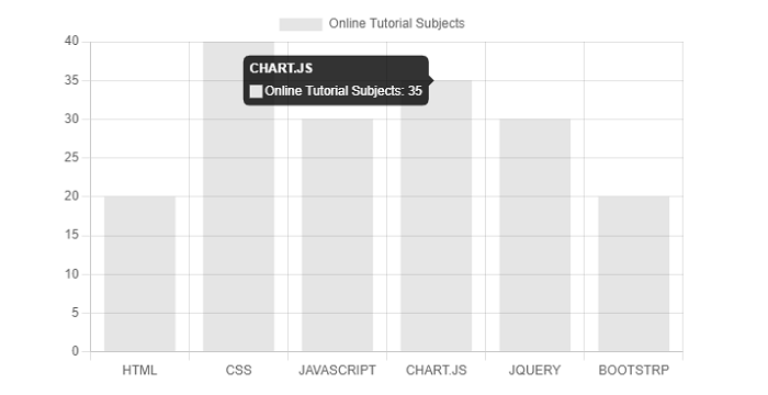
Chart.js - Color
Chart.js library provides us various format with the help of which we can easily supply the colors to the chart or graph options. You can specify the color as string in the following notations −
- Hexadecimal
- RGB
- HSL
Chart.js will use the global default color, if you havent specified any color and if the chart needed color. The following table provides the 3 color options that are stored in "Chart.defaults" −
| Name | Type | Default | Description |
|---|---|---|---|
| backgroundColor | Color | rgba(0, 0, 0, 0.1) | Background color |
| borderColor | Color | rgba(0, 0, 0, 0.1) | Border color |
| Color | Color | #666 | Font color |
Example
Lets take an example in which we will set the color in our chart −
<!DOCTYPE>
<html>
<head>
   <meta charset- "UTF-8" />
   <meta name="viewport" content="width=device-width, initial-scale=1" />
   <title>chart.js</title>
</head>
<body>
   <canvas id="chartId" aria-label="chart" height="350" width="580"></canvas>
   <script src="https://cdnjs.cloudflare.com/ajax/libs/Chart.js/3.1.1/chart.min.js"></script>
   <script>
      var chrt = document.getElementById("chartId").getContext("2d");
      var chartId = new Chart(chrt, {
         type: 'bar',
         data: {
            labels: ["HTML", "CSS", "JAVASCRIPT", "CHART.JS", "JQUERY", "BOOTSTRP"],
            datasets: [{
               label: "online tutorial subjects",
               data: [20, 40, 30, 35, 30, 20],
               backgroundColor: ['yellow', 'aqua', 'pink', 'lightgreen', 'lightblue', 'gold'],
               borderColor: ['red', 'blue', 'fuchsia', 'green', 'navy', 'black'],
               borderWidth: 2,
            }],
         },
         options: {
            responsive: false,
         },
      });
   </script>
</body>
</html>
Output
This HTML code will produce the following chart having graph elements with different colors −
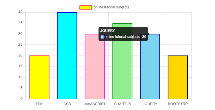
Chart.js - Options
In Chart.js, using a context dependent route, the Options are resolved from top of the code to the bottom of it. We have different levels of options as shown below −
Chart Level Options
We have three chart level options −
- options
- overrides
- defaults
Dataset Level Options
Chart.js provides us below options to be used at dataset level −
- dataset
- options.datasets
- options
- overrides
- defaults.datasets
- defaults
Dataset Animation Options
Chart.js provides us below options to be used at dataset animation level −
- Dataset.animation
- options.datasets.animation
- options.animation
- overrides.datasets.animation
- defaults.datasets.animation
- defaults.animation
Dataset Element Level Options
Chart.js provides us below options to be used at dataset element level −
- Dataset
- options.datasets
- options.datasets.elements
- options.elements
- options
- overrides.datasets
- overrides.datasets.elements
- defaults.datasets
- defaults.datasets.elements
- defaults.elements
- defaults
Scale Options
Chart.js provides us below scale options −
- options.scale
- overrides.scales
- overrides.datasets.elements
- defaults.scales
- defaults.scale
Plugin Options
Chart.js provides us below plugin options that provides array of paths to additionally look for its options in −
- options.scale
- options.plugins[plugin.id]
- (options.[...plugin.additionalOptionScopes])
- overrides[config.type].plugins[plugin.id]
- defaults.plugins[plugin.id]
- (defaults.[...plugin.additionalOptionScopes])
Example
Lets take an example in which we will use various Options in our chart −
<!DOCTYPE>
<html>
<head>
   <meta charset- "UTF-8" />
   <meta name="viewport" content="width=device-width, initial-scale=1" />
   <title>chart.js</title>
</head>
<body>
   <canvas id="chartId" aria-label="chart" height="350" width="580"></canvas>
   <script src="https://cdnjs.cloudflare.com/ajax/libs/Chart.js/3.1.1/chart.min.js"></script>
   <script>
      var chrt = document.getElementById("chartId").getContext("2d");
      var chartId = new Chart(chrt, {
         type: 'bar',
         data: {
            labels: ["HTML", "CSS", "JAVASCRIPT", "CHART.JS", "JQUERY", "BOOTSTRP"],
            datasets: [{
            label: "online tutorial subjects",
            data: [20, 40, 30, 35, 30, 20],
            backgroundColor: ['yellow', 'aqua', 'pink', 'lightgreen', 'lightblue', 'gold'],
            borderColor: ['red', 'blue', 'fuchsia', 'green', 'navy', 'black'],
            borderWidth: 2,
            }],
         },
         options: {
            responsive: false,
            layout: {
               padding: {
                  left: 40,
                  right: 40,
               }
            },
            plugins: {
               legend: {
                  labels: {
                     font: {
                        size: 25,
                        family: 'Helvetica',
                        style: 'bold',
                     }
                  }
               }
            }
         },
      });
   </script>
</body>
</html>
Output
The following output chart shows padding of the element and font style −
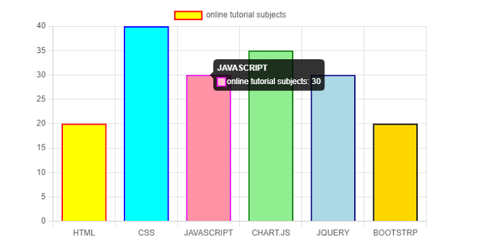
Chart.js - Interactions
Chart.js interactions help us to communicate with the elements of our chart. You can apply these interactions using both the hover and tooltip. The table below gives the descriptions of various kinds of interactions we can use −
| Name | Type | Default | Description |
|---|---|---|---|
| Mode | string | 'nearest' | It will set which elements appear in the interaction. |
| Intersect | Boolean | true | Intersect can be used to set the mouse position. If you keep this true, the interaction mode only applies when the mouse position intersects an item on the chart else not. |
| Axis | string | 'x' | Axis can be set to 'x', 'y', 'xy' or 'r'. It defines the directions are used in calculating distances. For index mode the default value is 'x'. Whereas 'xy' is the default value for 'nearest' modes. |
| includeInvisible | Boolean | false | if false, the invisible points that are outside of the chart area will not be included when evaluating interactions. |
The namespace to use interactions in our charts is "options.interactions".
On the similar note, the following table gives the descriptions how the chart will interact with events −
| Name | Type | Default | Description |
|---|---|---|---|
| Events | string[] | ['mousemove', 'mouseout', 'click', 'touchstart', 'touchmove'] | This option defines the browser events that the chart should listen. |
| onHover | function | Null | This event will be called when any of the events fire over our chartArea.). |
| onClick | function | Null | This event will be called if the event is of type
'mouseup', 'click' or 'contextmenu' over our chartArea. |
Syntax
The interaction syntax is given below −
interaction: {
   mode: 'nearest',
}
And the Chart.js event syntax is given below −
events: ['click'],
Example
Lets take an example in which we will use various interactions and events in our chart −
<!DOCTYPE>
<html>
<head>
   <meta charset- "UTF-8" />
   <meta name="viewport" content="width=device-width, initial-scale=1" />
   <title>chart.js</title>
</head>
<body>
   <canvas id="chartId" aria-label="chart" height="350" width="580"></canvas>
   <script src="https://cdnjs.cloudflare.com/ajax/libs/Chart.js/3.1.1/chart.min.js"></script>
   <script>
      var chrt = document.getElementById("chartId").getContext("2d");
      var chartId = new Chart(chrt, {
         type: 'bar',
         data: {
            labels: ["HTML", "CSS", "JAVASCRIPT", "CHART.JS", "JQUERY", "BOOTSTRP"],
            datasets: [{
               label: "online tutorial subjects",
               data: [20, 40, 30, 35, 30, 20],
               backgroundColor: ['coral', 'aqua', 'pink', 'lightgreen', 'lightblue', 'crimson'],
               borderColor: ['red', 'blue', 'fuchsia', 'green', 'navy', 'black'],
               borderWidth: 2,
            }],
         },
         options: {
            responsive: false,
            events: ['click'],
            interaction: {
               mode: 'nearest',
            }
         },
      });
   </script>
</body>
</html>
Output
It will produce the following chart having various interactions and events −
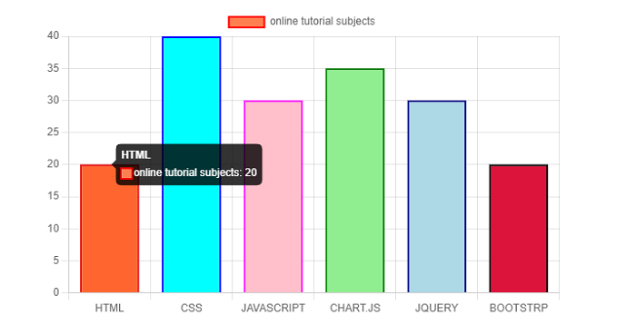
Chart.js - Legend
Chart.js legend displays that data about the dataset which is going to be seen on our chart or graph. The namespace for Legend configuration options is options.plugins.legend whereas, the global option for the chart legend is defined in Chart.defaults.plugins.legend.
The table below gives the descriptions of various kinds of configuration options we can use with chart legend −
| Name | Type | Default | Description |
|---|---|---|---|
| Display | Boolean | true | If true, it will show the legend, else NOT. |
| Position | string | 'top' | It is used to set the position of the legend. The default is top position. |
| Align | string | 'center' | It is used to set the alignment of the legend. The default is center position. |
| maxHeight | number | It will set the maximum height of the legend in pixels. | |
| maxWidth | number | It will set the maximum width of the legend in pixels | |
| fullSize | Boolean | true | As name implies, if true, the box will take the full width/height of the canvas. |
| onClick | function | It is a callback function which is called when you register a click event on a label item. | |
| onHover | function | It is a callback function which is called when you register a 'mousemove' event on the top of a label item. | |
| onLeave | function | It is a callback function which is called when you register a 'mousemove' event outside of a previously hovered label item. | |
| Reverse | Boolean | false | As name implies, with this configuration, the legend will show datasets in reverse order. The default value if false. |
| Labels | object | You can use various Legend Label Configurations such as color, font, padding, boxWidth, boxHeight, etc. | |
| Rtl | Boolean | If true, the legend will render from right to left. | |
| textDirection | string | canvas' default | As name implies, this configuration will force the text direction 'rtl' or 'ltr' on the canvas for rendering the legend, regardless of the css specified on the canvas |
| Title | object | You can use various Legend Title Configurations such as color, font, padding, text, display, etc. |
Syntax
The Chart Legend syntax is given below −
legend: {
   display: true,
   position: 'bottom',
   labels: { color: 'darkred', }
}
The legend enabled property must be true to display the data label. If it sets to false, then the legend becomes deactivated.
Example
Lets take an example in which we will be using various Legend configurations −
<!DOCTYPE html>
<html>
<head>
   <meta charset- "UTF-8" />
   <meta name="viewport" content="width=device-width, initial-scale=1" />
   <title> chart.js</title>
</head>
<body>
   <canvas id="toolTip" aria-label="chart" height="350" width="580"></canvas>
   <script src="https://cdnjs.cloudflare.com/ajax/libs/Chart.js/3.1.1/chart.min.js"></script>
   <script>
      var chartTooltip = document.getElementById("toolTip").getContext("2d");
      var toolTip = new Chart(chartTooltip, {
         type: "line",
         data: {
            labels: ["HTML", "CSS", "JAVASCRIPT", "CHART.JS", "JQUERY", "BOOTSTRP"],
            datasets: [{
               label: "online tutorial subjects",
               data: [20, 40, 30, 35, 30, 20],
               backgroundColor: ['coral', 'aqua', 'pink', 'lightgreen', 'lightblue', 'crimson'],
               borderColor: [
                  "black",
               ],
               borderWidth: 1,
               pointRadius: 5,
            }],
         },
         options: {
               responsive: false,
               plugins: {
                  legend: {
                     display: true,
                     position: 'bottom',
                     align: 'center',
                     labels: {
                        color: 'darkred',
                        font: {
                           weight: 'bold'
                        },
                     }
                  }
               }
            }
         });
   </script>
</body>
</html>
Output
Take a look at the output. It shows the various Legend configurations −
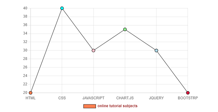
Chart.js - Title
Chart.js title defines which text is going to be seen at the top of our chart or graph. The namespace for Title configuration is options.plugins.title whereas the global option for the chart title is defined in Chart.defaults.plugins.title.
The table below gives the descriptions of various kinds of configuration options we can use with chart title −
| Name | Type | Default | Description |
|---|---|---|---|
| align | string | 'center' | As name implies, with this configuration you can set the alignment of the title. |
| color | Color | Chart.defaults.color | It will define the color of text. |
| display | Boolean | false | If true, it will show the title, else NOT. |
| fullSize | Boolean | true | As name implies, if true, the box will take the full width/height of the canvas. |
| position | string | 'top' | It is used to set the position of the title. The default is top position. |
| font | Font | {weight: 'bold'} | You can use various fonts. The options are in "Chart.defaults.font". |
| padding | Padding | 10 | It is use for padding to be applied around the title. |
| text | string|string[] | '' | As name implies, it is use for the title text to display. |
Syntax
The Chart Title syntax is given below −
title: {
   display: true,
   text: 'write heading here',
   color: 'navy',
   position: 'bottom',
}
The title enabled property must be true to display the data label. If it is set to false, then the title becomes deactivated.
Example
Lets take an example in which we will be using various Title configurations −
<!DOCTYPE>
<html>
<head>
   <meta charset- "UTF-8" />
   <meta name="viewport" content="width=device-width, initial-scale=1" />
   <title>chart.js</title>
</head>
<body>
   <canvas id="chartId" aria-label="chart" height="350" width="580"></canvas>
   <script src="https://cdnjs.cloudflare.com/ajax/libs/Chart.js/3.1.1/chart.min.js"></script>
   <script>
      var chrt = document.getElementById("chartId").getContext("2d");
      var chartId = new Chart(chrt, {
         type: 'bar',
         data: {
            labels: ["HTML", "CSS", "JAVASCRIPT", "CHART.JS", "JQUERY", "BOOTSTRP"],
            datasets: [{
               label: "online tutorial subjects",
               data: [20, 40, 30, 35, 30, 20],
               backgroundColor: ['coral', 'aqua', 'pink', 'lightgreen', 'lightblue', 'crimson'],
               borderColor: ['red', 'blue', 'fuchsia', 'green', 'navy', 'black'],
               borderWidth: 2,
            }],
         },
         options: {
            responsive: false,
            plugins: {
               title: {
                  display: true,
                  text: 'Web Application Technologies',
                  color: 'navy',
                  position: 'bottom',
                  align: 'center',
                  font: {
                     weight: 'bold'
                  },
                  padding: 8,
                  fullSize: true,
               }
            }
         },
      });
   </script>
</body>
</html>
Output
The following output chart shows the various Title configurations −
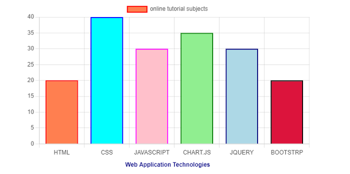
Chart.js - Animation
Chart.js animations are used to animate the charts or graphs. It provides us various options to configure the animations and to set the time for how much time animation will be shown. The namespace for Animation configuration is "options.animation".
The table below gives the descriptions of various kinds of configuration options we can use with chart animation −
| Name | Type | Default | Description |
|---|---|---|---|
| duration | number | 1000 | It will set the number of milliseconds an animation in the chart takes. |
| easing | string | 'easeOutQuart' | It is the easing function which we will use for animations. Some options are linear, easeInQuad, easeOutQuad, easeInOutBounce, etc. |
| delay | number | undefined | As name implies, it represents the delay before starting the animations. |
| loop | Boolean | undefined | If true, the animations in chart will loop endlessly. |
Syntax
The Chart Animation syntax is given below −
animations: {
   tension: {
      duration: 750,
      easing: 'easeInBounce',
      from: 1,
      to: 0,
      loop: true
   }
},
scales: {
   y: {
      min: 0,
      max: 45,
   }
}
The animation "loop" property must be true to animate. If it sets to false, then the "animation" becomes deactivated.
Example
Lets take an example in which we will be using various Animation configurations −
<!DOCTYPE>
<html>
<head>
   <meta charset- "UTF-8" />
   <meta name="viewport" content="width=device-width, initial-scale=1" />
   <title> chart.js</title>
</head>
<body>
   <canvas id="toolTip" aria-label="chart" height="350" width="580"></canvas>
   <script src="https://cdnjs.cloudflare.com/ajax/libs/Chart.js/3.1.1/chart.min.js"></script>
   <script>
      var chartTooltip = document.getElementById("toolTip").getContext("2d");
      var toolTip = new Chart(chartTooltip, {
         type: "line",
         data: {
            labels: ["HTML", "CSS", "JAVASCRIPT", "CHART.JS", "JQUERY", "BOOTSTRP"],
            datasets: [{
            label: "online tutorial subjects",
            data: [20, 40, 30, 35, 30, 20],
            backgroundColor: ['coral', 'aqua', 'pink', 'lightgreen', 'lightblue', 'crimson'],
            borderColor: [
            "black",
            ],
            borderWidth: 1,
            pointRadius: 5,
            }],
         },
         options: {
            responsive: false,
            animations: {
               tension: {
               duration: 750,
               easing: 'easeInBounce',
               from: 1,
               to: 0,
               loop: true
               }
            },
            scales: {
               y: {
                  min: 0,
                  max: 45,
               }
            }
         }
      });
   </script>
</body>
</html>
Output
Use the "Edit and Run" option to run the code and see how the chart behaves with the applied animations.
The following output chart shows the various Animations configurations −
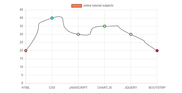
Chart.js - Tooltip
Chart.js Tooltip provides us an option to show tooltip text in our chart. Tooltip is a graphical UI element that provides extra information as we hover the mouse over the chart elements. The namespace for Animation configuration is options.plugins.tooltip.
Syntax
The Chart Tooltip syntax is given below −
options: {
   plugins: {
      tooltip: {
         enabled: true,
         (Write tooltip's style element)
      },
   }
}
The tooltip enabled property must be true to display the data label. If it sets to false, then the tooltip becomes deactivated.
Example
Lets take an example in which we will be using various Tooltip configurations −
<!DOCTYPE>
<html>
<head>
   <meta charset- "UTF-8" />
   <meta name="viewport" content="width=device-width, initial-scale=1" />
   <title>chart.js</title>
</head>
<body>
   <canvas id="chartId" aria-label="chart" height="350" width="580"></canvas>
   <script src="https://cdnjs.cloudflare.com/ajax/libs/Chart.js/3.1.1/chart.min.js"></script>
   <script src="https://cdnjs.cloudflare.com/ajax/libs/Chart.js/3.1.1/helpers.esm.min.js"></script>
   <script>
      var chrt = document.getElementById("chartId").getContext("2d");
      var chartId = new Chart(chrt, {
         type: 'bar',
         data: {
            labels: ["HTML", "CSS", "JAVASCRIPT", "CHART.JS", "JQUERY", "BOOTSTRP"],
            datasets: [{
               label: "online tutorial subjects",
               data: [20, 40, 30, 35, 30, 20],
               backgroundColor: ['coral', 'aqua', 'pink', 'lightgreen', 'lightblue', 'crimson'],
               borderColor: ['red', 'blue', 'fuchsia', 'green', 'navy', 'black'],
               borderWidth: 2,
            }],
         },
         options: {
            responsive: false,
            plugins: {
               tooltip: {
                  enabled: true,
                  usePointStyle: true,
                  titleAlign: 'center',
                  titleColor: 'gold',
                  titleSpacing: 3,
                  TitleFont: {
                     weight: 'bold'
                  },
                  backgroundColor: 'midnightblue',
                  bodyColor: 'orange',
                  bodyAlign: 'center',
                  bodyFont: {
                     weight: 'italic'
                  },
                  callbacks: {
                     labelPointStyle: function(context) {
                        return {
                           pointStyle: 'circle',
                           rotation: 0
                        };
                     },
                  }
               }
            }
         },
      });
   </script>
</body>
</html>
Use the "Edit and Run" option to execute the code online and then hover the mouse over the bars and observe the styling of the tooltips.
Output
The following output chart shows the various Tooltip configurations −
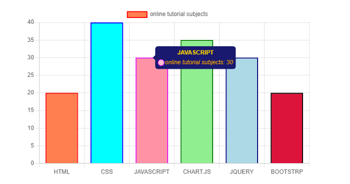
Chart.js - Line Chart
Chart.js line chart, as name implies is a method to plot the data points on a line. In most of the case, line charts are used to show the trend of data or a comparison between data sets.
Following are the namespaces to be used in line chart for dataset properties −
data.datasets[index] − It provides options for this dataset only.
options.datasets.line − It provides options for all the line datasets.
options.elements.line − It provides options for all the line elements.
options.elements.point − It provides options for all the point elements.
Options − It provides options for the whole chart
We need to use "type: line" for creating the line chart.
Example
Lets take an example with the help of which we will create a line chart −
<!DOCTYPE>
<html>
<head>
   <meta charset- "UTF-8" />
   <meta name="viewport" content="width=device-width, initial-scale=1" />
   <title>chart.js</title>
</head>
<body>
   <canvas id="chartId" aria-label="chart" heigth="350" width="580"></canvas>
   <script src="https://cdnjs.cloudflare.com/ajax/libs/Chart.js/3.1.1/chart.min.js"></script>
   <script>
      var chrt = document.getElementById("chartId").getContext("2d");
      var chartId = new Chart(chrt, {
         type: 'line',
         data: {
            labels: ["HTML", "CSS", "JAVASCRIPT", "CHART.JS", "JQUERY", "BOOTSTRP"],
            datasets: [{
               label: "online tutorial subjects",
               data: [20, 40, 30, 35, 30, 20],
               backgroundColor: ['yellow', 'aqua', 'pink', 'lightgreen', 'lightblue', 'gold'],
               borderColor: ['black'],
               borderWidth: 2,
               pointRadius: 5,
            }],
         },
         options: {
            responsive: false,
         },
      });
   </script>
</body>
</html>
Output
The following output shows the creation of a line chart −
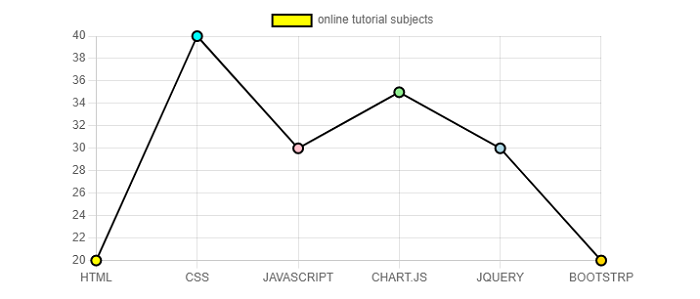
Chart.js - Bar Chart
Chart.js bar chart, as the name implies, is a method to plot the data values as vertical bars. In most of the case, line charts are used to show the trend of data and a comparison between more than two data sets side by side.
Below are the namespaces to be used in bar chart for dataset properties −
data.datasets[index] − It provides options for this dataset only.
options.datasets.bar − It provides options for all the bar datasets.
options.elements.bar − It provides options for all the bar elements.
Options − It provides options for the whole chart
We need to use type: bar for creating the bar chart.
Example
Lets take an example with the help of which we will create a bar chart −
<!DOCTYPE>
<html>
<head>
   <meta charset- "UTF-8" />
   <meta name="viewport" content="width=device-width, initial-scale=1" />
   <title>chart.js</title>
</head>
<body>
   <canvas id="chartId" aria-label="chart" height="350" width="580"></canvas>
   <script src="https://cdnjs.cloudflare.com/ajax/libs/Chart.js/3.1.1/chart.min.js"></script>
   <script src="https://cdnjs.cloudflare.com/ajax/libs/Chart.js/3.1.1/helpers.esm.min.js">
   </script>
   <script>
      var chrt = document.getElementById("chartId").getContext("2d");
      var chartId = new Chart(chrt, {
         type: 'bar',
         data: {
            labels: ["HTML", "CSS", "JAVASCRIPT", "CHART.JS", "JQUERY", "BOOTSTRP"],
            datasets: [{
               label: "online tutorial subjects",
               data: [20, 40, 30, 35, 30, 20],
               backgroundColor: ['yellow', 'aqua', 'pink', 'lightgreen', 'lightblue', 'gold'],
               borderColor: ['red', 'blue', 'fuchsia', 'green', 'navy', 'black'],
               borderWidth: 2,
            }],
         },
         options: {
            responsive: false,
         },
      });
   </script>
</body>
</html>
Output
By executing the above code, we will get the following output chart −
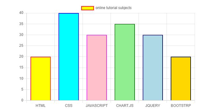
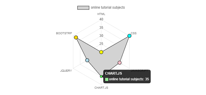
Chart.js - Radar Chart
Chart.js radar chart, as the name implies, is used to show multiple data points and the difference between those data points. With the help of radar chart, we can easily compare the points of two or more different datasets.
Following are the namespaces to be used in radar chart for dataset properties −
data.datasets[index] − It provides options for this dataset only.
options.datasets.line − It provides options for all the line datasets.
options.elements.line − It provides options for all the line elements.
options.elements.point − It provides options for all the point elements.
Options − It provides options for the whole chart
We need to use type: "radar" for creating the radar chart.
Example
Lets take an example with the help of which we will create a radar chart −
<!DOCTYPE>
<html>
<head>
   <meta charset- "UTF-8" />
   <meta name="viewport" content="width=device-width, initial-scale=1" />
   <title>chart.js</title>
</head>
<body>
   <canvas id="chartId" aria-label="chart" height="350" width="580"></canvas>
   <script src="https://cdnjs.cloudflare.com/ajax/libs/Chart.js/3.1.1/chart.min.js"></script>
   <script>
      var chrt = document.getElementById("chartId").getContext("2d");
      var chartId = new Chart(chrt, {
         type: 'radar',
         data: {
            labels: ["HTML", "CSS", "JAVASCRIPT", "CHART.JS", "JQUERY", "BOOTSTRP"],
            datasets: [{
               label: "online tutorial subjects",
               data: [20, 40, 33, 35, 30, 38],
               backgroundColor: ['lightgrey'],
               pointBackgroundColor: ['yellow', 'aqua', 'pink', 'lightgreen', 'lightblue', 'gold'],
               borderColor: ['black'],
               borderWidth: 1,
               pointRadius: 6,
            }],
         },
         options: {
            responsive: false,
            elements: {
               line: {
                  borderWidth: 3
               }
            }
         },
      });
   </script>
</body>
</html>
Output
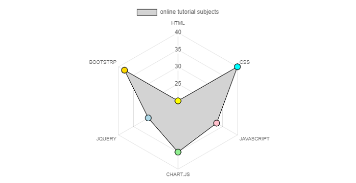
Chart.js - Doughnut Chart
Chart.js doughnut chart is one of the most used charts to represent the data sets. Doughnut charts divided into various segments in which the arc of each segment shows the proportional value of each piece of data. If you want to show the relational proportions between data, doughnut chart is an excellent choice.
Following are the namespaces to be used in doughnut chart for dataset properties −
data.datasets[index] − It provides options for this dataset only.
options.datasets.doughnut − It provides options for all doughnut datasets.
options.elements.arc − It provides options for all the arc elements.
Options − It provides options for the whole chart
We need to use type: doughnut for creating the doughnut chart.
Example
Lets take an example with the help of which we will create a doughnut chart −
<!DOCTYPE>
<html>
<head>
   <meta charset- "UTF-8" />
   <meta name="viewport" content="width=device-width, initial-scale=1" />
   <title>chart.js</title>
</head>
<body>
   <canvas id="chartId" aria-label="chart" height="350" width="580"></canvas>
   <script src="https://cdnjs.cloudflare.com/ajax/libs/Chart.js/3.1.1/chart.min.js"></script>
   <script>
      var chrt = document.getElementById("chartId").getContext("2d");
      var chartId = new Chart(chrt, {
         type: 'doughnut',
         data: {
            labels: ["HTML", "CSS", "JAVASCRIPT", "CHART.JS", "JQUERY", "BOOTSTRP"],
            datasets: [{
            label: "online tutorial subjects",
            data: [20, 40, 13, 35, 20, 38],
            backgroundColor: ['yellow', 'aqua', 'pink', 'lightgreen', 'gold', 'lightblue'],
            hoverOffset: 5
            }],
         },
         options: {
            responsive: false,
         },
      });
   </script>
</body>
</html>
Output

Chart.js - Pie Chart
Chart.js pie chart is another most used charts to represent the data sets. Like doughnut charts, pie charts are also divided into various segments in which the arc of each segment shows the proportional value of each piece of data. If you want to show the relational proportions between data, pie chart is also an excellent choice.
The difference between doughnut and pie chart is in their value of cutout that equates to what portion of the inner should be cut out. For pie charts, the default value of cutout is 0, whereas for doughnut charts, it is 50%.
Following are the namespaces to be used in pie chart for dataset properties −
data.datasets[index] − It provides options for this dataset only.
options.datasets.pie − It provides options for all pie datasets.
options.elements.arc − It provides options for all the arc elements.
Options − It provides options for the whole chart
We need to use type: "pie" for creating the pie chart.
Example
Lets take an example with the help of which we will create a pie chart −
<!DOCTYPE>
<html>
<head>
   <meta charset- "UTF-8" />
   <meta name="viewport" content="width=device-width, initial-scale=1" />
   <title>chart.js</title>
</head>
<body>
   <canvas id="chartId" aria-label="chart" height="350" width="580"></canvas>
   <script src="https://cdnjs.cloudflare.com/ajax/libs/Chart.js/3.1.1/chart.min.js"></script>
   <script>
      var chrt = document.getElementById("chartId").getContext("2d");
      var chartId = new Chart(chrt, {
         type: 'pie',
         data: {
            labels: ["HTML", "CSS", "JAVASCRIPT", "CHART.JS", "JQUERY", "BOOTSTRP"],
            datasets: [{
               label: "online tutorial subjects",
               data: [20, 40, 13, 35, 20, 38],
               backgroundColor: ['yellow', 'aqua', 'pink', 'lightgreen', 'gold', 'lightblue'],
               hoverOffset: 5
            }],
         },
         options: {
            responsive: false,
         },
      });
   </script>
</body>
</html>
Output
It will produce the following pie chart as the output −
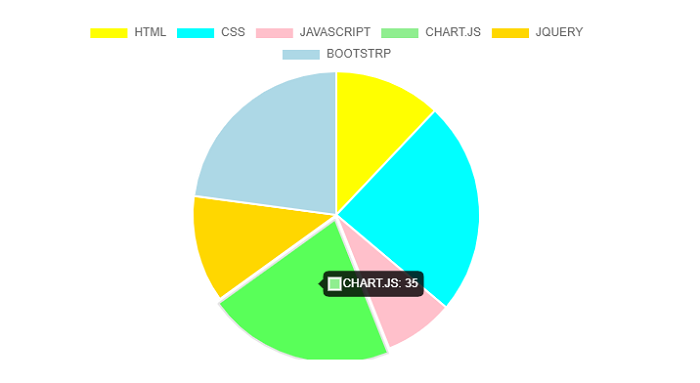
Chart.js - Polar Area Chart
Chart.js polar area charts are like pie charts. The only difference is that in polar area charts, each segment has the same angle i.e., the radius of the segment differs according to the value. If you want to show a comparison between data but also want to show a scale of values for context, polar area chart is an excellent choice.
Below are the namespaces to be used in polar area chart for dataset properties −
data.datasets[index] − It provides options for this dataset only.
options.datasets.polarArea − It provides options for all polarArea datasets.
options.elements.arc − It provides options for all the arc elements.
Options − It provides options for the whole chart
We need to use type: "polar" for creating the polar area chart.
Example
Lets take an example with the help of which we will create a polar area chart −
<!DOCTYPE>
<html>
<head>
   <meta charset- "UTF-8" />
   <meta name="viewport" content="width=device-width, initial-scale=1" />
   <title>chart.js</title>
</head>
<body>
   <canvas id="chartId" aria-label="chart" height="350" width="580"></canvas>
   <script src="https://cdnjs.cloudflare.com/ajax/libs/Chart.js/3.1.1/chart.min.js"></script>
   <script>
      var chrt = document.getElementById("chartId").getContext("2d");
      var chartId = new Chart(chrt, {
         type: 'polarArea',
         data: {
            labels: ["HTML", "CSS", "JAVASCRIPT", "CHART.JS", "JQUERY", "BOOTSTRP"],
            datasets: [{
               label: "online tutorial subjects",
               data: [20, 40, 15, 35, 25, 38],
               backgroundColor: ['yellow', 'aqua', 'pink', 'lightgreen', 'gold', 'lightblue'],
            }],
         },
         options: {
            responsive: false,
         },
      });
   </script>
</body>
</html>
Output

Chart.js - Bubble Chart
Chart.js provides us a way to display three dimensional of data at the same time with the help of bubble chart. First two dimensions of the bubble and corresponding horizontal and vertical axes determines the location of the bubble in chart. Whereas the third dimension is represented by the size of the bubble.
Below are the namespaces to be used in bubble chart for dataset properties −
data.datasets[index] − It provides options for this dataset only.
options.datasets.bubble − It provides options for all bubble datasets.
options.elements.point − It provides options for all the point elements.
Options − It provides options for the whole chart
We need to use type: "bubble" for creating the bubble chart.
Example
Lets take an example with the help of which we will create a bubble chart −
<!DOCTYPE>
<html>
<head>
   <meta charset- "UTF-8" />
   <meta name="viewport" content="width=device-width, initial-scale=1" />
   <title>chart.js</title>
</head>
<body>
   <canvas id="chartId" aria-label="chart" height="300" width="580"></canvas>
   <script src="https://cdnjs.cloudflare.com/ajax/libs/Chart.js/3.1.1/chart.min.js"></script>
   <script>
      var chrt = document.getElementById("chartId").getContext("2d");
      var chartId = new Chart(chrt, {
         type: 'bubble',
         data: {
            labels: ["HTML", "CSS", "JAVASCRIPT", "CHART.JS", "JQUERY", "BOOTSTRP"],
            datasets: [{
               label: "online tutorial subjects",
               data: [{
                     x: 20,
                     y: 21,
                     z: 20
                  },
                  {
                     x: 25,
                     y: 25,
                     z: 25
                  },
                  {
                     x: 13,
                     y: 11,
                     z: 25
                  },
                  {
                     x: 40,
                     y: 18,
                     z: 25
                  },
                  {
                     x: 31,
                     y: 28,
                     z: 25
                  },
                  {
                     x: 27,
                     y: 35,
                     z: 35
                  }
               ],
               backgroundColor: ['yellow', 'aqua', 'pink', 'lightgreen', 'gold', 'lightblue'],
               borderColor: ['black'],
               radius: 8,
            }],
         },
         options: {
         responsive: false,
         },
      });
   </script>
</body>
</html>
Output
Chart.js - Scatter Chart
Chart.js scatter charts are basically based on simple line charts but their X-axis is changed to a linear axis. While creating a scatter chart, you must pass the data as objects containing X and Y properties.
Following are the namespaces to be used in bubble chart for dataset properties −
data.datasets[index] − It provides options for this dataset only.
options.datasets.scatter − It provides options for all scatter datasets.
options.datasets.line − It provides options for all line datasets.
options.elements.point − It provides options for all the point elements.
Options − It provides options for the whole chart
We need to use type: "scatter" for creating the scatter chart.
Example
Lets take an example with the help of which we will create a scatter chart −
<!DOCTYPE>
<html>
<head>
   <meta charset- "UTF-8" />
   <meta name="viewport" content="width=device-width, initial-scale=1" />
   <title>chart.js</title>
</head>
<body>
   <canvas id="chartId" aria-label="chart" height="300" width="580"></canvas>
   <script src="https://cdnjs.cloudflare.com/ajax/libs/Chart.js/3.1.1/chart.min.js"></script>
   <script>
      var chrt = document.getElementById("chartId").getContext("2d");
      var chartId = new Chart(chrt, {
         type: 'scatter',
         data: {
            labels: ["HTML", "CSS", "JAVASCRIPT", "CHART.JS", "JQUERY", "BOOTSTRP"],
            datasets: [{
               label: "online tutorial subjects",
               data: [
                  {x:10, y:14},
                  {x:25, y:35},
                  {x:21, y:20},
                  {x:35, y:28},
                  {x:15, y:10},
                  {x:19, y:30},
               ],
               backgroundColor: ['yellow', 'aqua', 'pink', 'lightgreen', 'gold', 'lightblue'],
               borderColor: ['black'],
               radius: 8,
            }],
         },
         options: {
            responsive: false,
            scales: {
               x: {
                  type: 'linear',
                  position: 'bottom,'
               }
            }
         },
      });
   </script>
</body>
</html>
Output
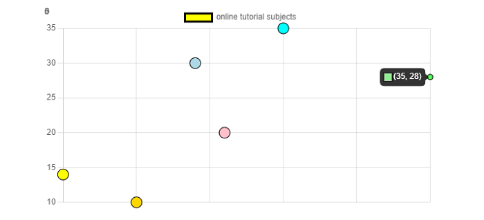
Chart.js - Mixed Chart
Chart.js also provides us a facility to create charts having combination of two or different chart types. Such charts are called mixed charts. One of the most common examples of chart.js mixed chart is a bar chart including a line dataset.
Syntax
The syntax for creating a mixed chart is given below −
type: 'scatter',
datasets: [
   { type: 'scatter', data: value, },
   { type: 'bar', data: value, },
]
Example
Lets take an example with the help of which we will create a mixed chart −
<!DOCTYPE>
<html>
<head>
   <meta charset- "UTF-8" />
   <meta name="viewport" content="width=device-width, initial-scale=1" />
   <title>chart.js</title>
</head>
<body>
   <canvas id="chartId" aria-label="chart" height="300" width="580"></canvas>
   <script src="https://cdnjs.cloudflare.com/ajax/libs/Chart.js/3.1.1/chart.min.js"></script>
   <script>
      var chrt = document.getElementById("chartId").getContext("2d");
      var chartId = new Chart(chrt, {
         type: 'scatter',
         data: {
            labels: ["HTML", "CSS", "JAVASCRIPT", "CHART.JS", "JQUERY", "BOOTSTRP"],
            datasets: [{
                  type: 'scatter',
                  label: "online tutorial subjects",
                  data: [
                     {x:10, y:14},
                     {x:25, y:35},
                     {x:21, y:20},
                     {x:35, y:28},
                     {x:15, y:10},
                     {x:19, y:30}
                  ],
                  backgroundColor: ['yellow', 'aqua', 'pink', 'lightgreen', 'gold', 'lightblue'],
                  borderColor: ['black'],
                  radius: 8,
               },
               {
                  type: 'polarArea',
                  label: "online tutorial exam",
                  data: [20, 40, 30, 35, 30, 20],
                  backgroundColor: ['navy', 'aqua', 'pink', 'lightgreen', 'lightblue', 'gold'],
                  borderColor: ['black'],
                  borderWidth: 2,
                  pointRadius: 5,
               }
            ],
         },
         options: {
            responsive: false,
            scales: {
               y: {
                  beginAtZero: true
               }
            }
         },
      });
   </script>
</body>
</html>
Output
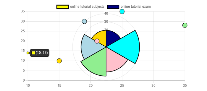
Chart.js - Cartesian Axis
For any chart or graph, axes are an integral part. Basically, axes are used to determine how our data maps to a pixel value on the chart. A cartesian chart uses 1 or more X-axis and 1 or more Y-axis to map the data points on to two-dimensional (2-D) canvas. These axes are called cartesian axes.
Cartesian axis uses "options.scales.axis" namespace. The syntax of using cartesian axes is given below −
scales: {
   x: {
      grid: {
         color: 'orange',
         borderColor: 'orange',
      }
   }
}
Example
Lets take an example in which we will use Cartesian axes for creating a chart −
<!DOCTYPE>
<html>
<head>
   <meta charset- "UTF-8" />
   <meta name="viewport" content="width=device-width, initial-scale=1" />
   <title>chart.js</title>
</head>
<body>
   <canvas id="chartId" aria-label="chart" height="300" width="580"></canvas>
   <script src="https://cdnjs.cloudflare.com/ajax/libs/Chart.js/3.1.1/chart.min.js"></script>
   </script>
   <script>
      var chrt = document.getElementById("chartId").getContext("2d");
      var chartId = new Chart(chrt, {
         type: 'bar',
         data: {
            labels: ["HTML", "CSS", "JAVASCRIPT", "CHART.JS", "JQUERY", "BOOTSTRP"],
            datasets: [{
               label: "online tutorial subjects",
               data: [20, 40, 30, 35, 30, 20],
               backgroundColor: ['coral', 'aqua', 'pink', 'lightgreen', 'lightblue', 'crimson'],
               borderColor: ['black'],
               borderWidth: 1,
               pointRadius: 4,
            }],
         },
         options: {
            responsive: false,
            indexAxis: 'y',
            scales: {
               x: {
                  grid: {
                     color: 'orange',
                     borderColor: 'orange',
                  }
               }
            }
         },
      });
   </script>
</body>
</html>
Output
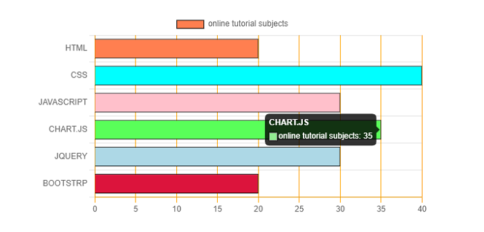
Chart.js - Category Axis
Axes are an integral part of any chart or graph. Like Cartesian axes, category axes are also an essential part of a chart.
The syntax of defining category axes globally is given below −
let chart = new Chart(ctx, {
   type: ...
   data: {
      labels: ['January', 'February', 'March', 'April', 'May', 'June'],
      datasets: ...
   }
});
We can define category axes as a part of axis as follows −
let chart = new Chart(ctx, {
   type: ...
   data: ...
   options: {
      scales: {
         x: {
            type: 'category',
            labels: ['January', 'February', 'March', 'April', 'May', 'June']
         }
      }
   }
});
Example
Lets take an example in which we will use category axes for creating a chart −
<!DOCTYPE>
<html>
<head>
   <meta charset- "UTF-8" />
   <meta name="viewport" content="width=device-width, initial-scale=1" />
   <title>chart.js</title>
</head>
<body>
   <canvas id="chartId" aria-label="chart" height="300" width="580"></canvas>
   <script src="https://cdnjs.cloudflare.com/ajax/libs/Chart.js/3.1.1/chart.min.js"></script>
   <script src="https://cdnjs.cloudflare.com/ajax/libs/Chart.js/3.1.1/helpers.esm.min.js"></script>
   <script>
      var chrt = document.getElementById("chartId").getContext("2d");
      var chartId = new Chart(chrt, {
         type: 'bar',
         data: {
            labels: ["HTML", "CSS", "JAVASCRIPT", "CHART.JS", "JQUERY", "BOOTSTRP"],
            datasets: [{
               label: "online tutorial subjects",
               data: [20, 40, 30, 35, 30, 20],
               backgroundColor: ['yellow', 'aqua', 'pink', 'lightgreen', 'lightblue', 'gold'],
               borderColor: ['black'],
               borderWidth: 1,
               pointRadius: 4,
            }],
         },
         options: {
            responsive: false,
            scales: {
               x: {
                  min: 'CSS',
                  max: 'JQUERY'
               }
            }
         },
      });
   </script>
</body>
</html>
Output
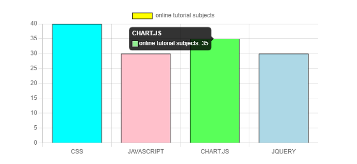
Chart.js - Radial Axis
Radial axis is used in a radial chart such as a radar chart or polar area chart. This radial axis is basically a single axis that maps points in the angular and radial directions. Rather than being positioned on one of the edges of chart, radial axes overlay the chart area.
Example
Lets take an example in which we will use radial axes for creating a chart −
<!DOCTYPE>
<html>
<head>
   <meta charset- "UTF-8" />
   <meta name="viewport" content="width=device-width, initial-scale=1" />
   <title>chart.js</title>
</head>
<body>
   <canvas id="chartId" aria-label="chart" height="300" width="580"></canvas>
   <script src="https://cdnjs.cloudflare.com/ajax/libs/Chart.js/3.1.1/chart.min.js"></script>
   <script>
      var chrt = document.getElementById("chartId").getContext("2d");
      var chartId = new Chart(chrt, {
         type: 'radar',
         data: {
            labels: ["HTML", "CSS", "JAVASCRIPT", "CHART.JS", "JQUERY", "BOOTSTRP"],
            datasets: [{
               label: "online tutorial subjects",
               data: [20, 40, 33, 35, 30, 38],
               backgroundColor: ['lightgrey'],
               pointBackgroundColor: ['yellow', 'aqua', 'pink', 'lightgreen', 'lightblue', 'gold'],
               borderColor: ['black'],
               borderWidth: 1,
               pointRadius: 6,
            }],
         },
         options: {
            responsive: false,
            scales: {
               r: {
                  suggestedMin: 40,
                  suggestedMax: 40
               }
            }
         },
      });
   </script>
</body>
</html>
Output