- Tableau Tutorial
- Tableau - Home
- Tableau - Overview
- Tableau - Environment Setup
- Tableau - Get Started
- Tableau - Navigation
- Tableau - Design Flow
- Tableau - File Types
- Tableau - Data Types
- Tableau - Show Me
- Tableau - Data Terminology
- Tableau Data Sources
- Tableau - Data Sources
- Tableau - Custom Data View
- Tableau - Extracting Data
- Tableau - Fields Operations
- Tableau - Editing Metadata
- Tableau - Data Joining
- Tableau - Data Blending
- Tableau Worksheets
- Tableau - Add Worksheets
- Tableau - Rename Worksheet
- Tableau - Save & Delete Worksheet
- Tableau - Reorder Worksheet
- Tableau - Paged Workbook
- Tableau Calculations
- Tableau - Operators
- Tableau - Functions
- Tableau - Numeric Calculations
- Tableau - String Calculations
- Tableau - Date Calculations
- Tableau - Table Calculations
- Tableau - LOD Expressions
- Tableau Sort & Filters
- Tableau - Basic Sorting
- Tableau - Basic Filters
- Tableau - Quick Filters
- Tableau - Context Filters
- Tableau - Condition Filters
- Tableau - Top Filters
- Tableau - Filter Operations
- Tableau Charts
- Tableau - Bar Chart
- Tableau - Line Chart
- Tableau - Pie Chart
- Tableau - Crosstab
- Tableau - Scatter Plot
- Tableau - Bubble Chart
- Tableau - Bullet Graph
- Tableau - Box Plot
- Tableau - Tree Map
- Tableau - Bump Chart
- Tableau - Gantt Chart
- Tableau - Histogram
- Tableau - Motion Charts
- Tableau - Waterfall Charts
- Tableau Advanced
- Tableau - Dashboard
- Tableau - Formatting
- Tableau - Forecasting
- Tableau - Trend Lines
- Tableau Useful Resources
- Tableau - Question Answers
- Tableau - Quick Guide
- Tableau - Useful Resources
- Tableau - Discussion
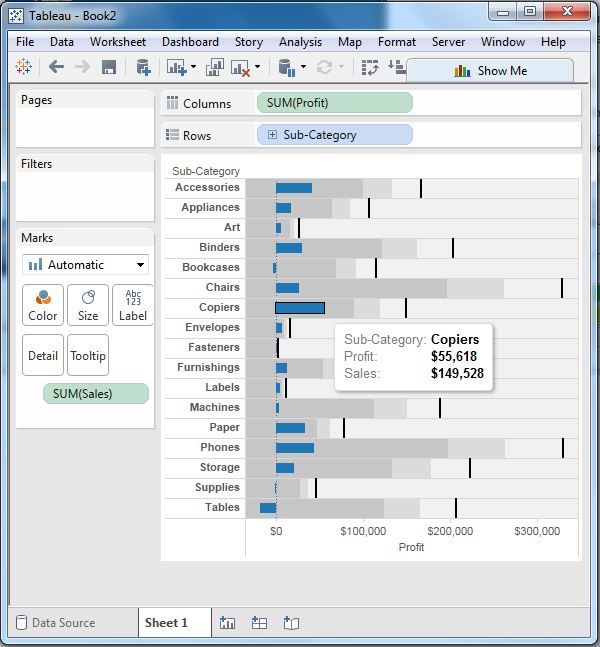
Tableau - Bullet Graph
A bullet chart is a variation of Bar chart. In this chart, we compare the value of one measure with another measure in the context of finding the variation in the first measure within a range of variations in the second measure. It is like two bars drawn upon one another to indicate their individual values at the same position in the graph. It can be thought of as combining two graphs as one to view a comparative result easily.
Creating Bullet Graph
Using the Sample-superstore, plan to find the size of profits for the respective sales figures in each Sub-Category. To achieve this objective, following are the steps.
Step 1 − Drag and drop the dimension Sub-Category from the data pane into the column shelf.
Step 2 − Drag and drop the measures Profit and Sales to the Rows shelf.
The following chart appears which shows the two measures as two separate categories of bar charts, each representing the values for sub-categories.
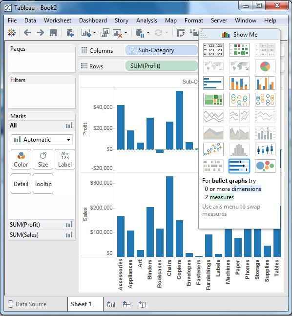
Step 3 − Drag the sales measure to the Marks card. Using Show Me, choose the bullet graph option. The following chart shows the bullet graph.