- Tableau Tutorial
- Tableau - Home
- Tableau - Overview
- Tableau - Environment Setup
- Tableau - Get Started
- Tableau - Navigation
- Tableau - Design Flow
- Tableau - File Types
- Tableau - Data Types
- Tableau - Show Me
- Tableau - Data Terminology
- Tableau Data Sources
- Tableau - Data Sources
- Tableau - Custom Data View
- Tableau - Extracting Data
- Tableau - Fields Operations
- Tableau - Editing Metadata
- Tableau - Data Joining
- Tableau - Data Blending
- Tableau Worksheets
- Tableau - Add Worksheets
- Tableau - Rename Worksheet
- Tableau - Save & Delete Worksheet
- Tableau - Reorder Worksheet
- Tableau - Paged Workbook
- Tableau Calculations
- Tableau - Operators
- Tableau - Functions
- Tableau - Numeric Calculations
- Tableau - String Calculations
- Tableau - Date Calculations
- Tableau - Table Calculations
- Tableau - LOD Expressions
- Tableau Sort & Filters
- Tableau - Basic Sorting
- Tableau - Basic Filters
- Tableau - Quick Filters
- Tableau - Context Filters
- Tableau - Condition Filters
- Tableau - Top Filters
- Tableau - Filter Operations
- Tableau Charts
- Tableau - Bar Chart
- Tableau - Line Chart
- Tableau - Pie Chart
- Tableau - Crosstab
- Tableau - Scatter Plot
- Tableau - Bubble Chart
- Tableau - Bullet Graph
- Tableau - Box Plot
- Tableau - Tree Map
- Tableau - Bump Chart
- Tableau - Gantt Chart
- Tableau - Histogram
- Tableau - Motion Charts
- Tableau - Waterfall Charts
- Tableau Advanced
- Tableau - Dashboard
- Tableau - Formatting
- Tableau - Forecasting
- Tableau - Trend Lines
- Tableau Useful Resources
- Tableau - Question Answers
- Tableau - Quick Guide
- Tableau - Useful Resources
- Tableau - Discussion
Tableau - Histogram
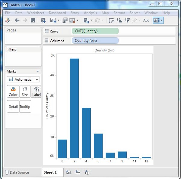
A histogram represents the frequencies of values of a variable bucketed into ranges. Histogram is similar to bar chart but it groups the values into continuous ranges. Each bar in histogram represents the height of the number of values present in that range.
Tableau creates a histogram by taking one measure. It creates an additional bin field for the measure used in creating a histogram.
Creating a Histogram
Using the Sample-superstore, plan to find the quantities of sales for different regions. To achieve this, drag the Measure named Quantity to the Rows shelf. Then open Show Me and select the Histogram chart. The following diagram shows the chart created. It shows the quantities automatically bucketed into values ranging from 0 to 4811 and divided into 12 bins.
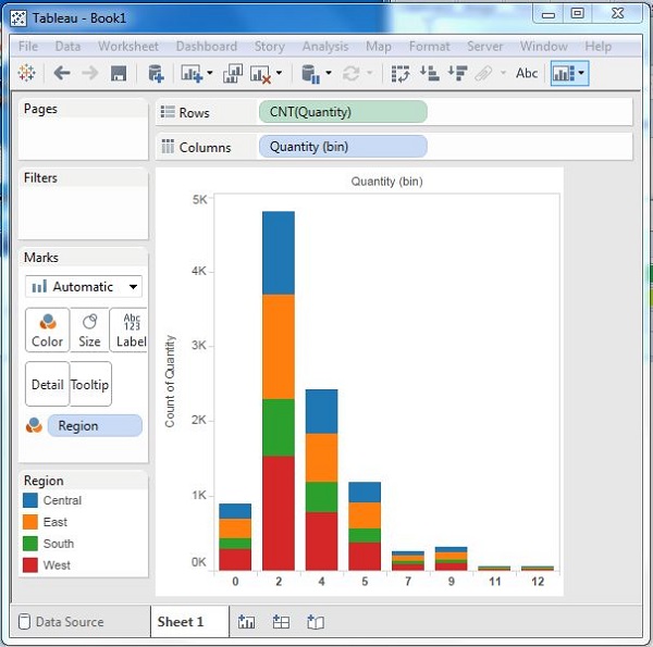
Creating a Histogram with Dimension
You can also add Dimensions to Measures to create histograms. This will create a stacked histogram. Each bar will have stacks representing the values of the dimension. Following the steps of the above example, add the Region Dimension to the color Shelf under Marks Card. This creates the following histogram where each bar also includes the visualization for different regions.