- Tableau Tutorial
- Tableau - Home
- Tableau - Overview
- Tableau - Environment Setup
- Tableau - Get Started
- Tableau - Navigation
- Tableau - Design Flow
- Tableau - File Types
- Tableau - Data Types
- Tableau - Show Me
- Tableau - Data Terminology
- Tableau Data Sources
- Tableau - Data Sources
- Tableau - Custom Data View
- Tableau - Extracting Data
- Tableau - Fields Operations
- Tableau - Editing Metadata
- Tableau - Data Joining
- Tableau - Data Blending
- Tableau Worksheets
- Tableau - Add Worksheets
- Tableau - Rename Worksheet
- Tableau - Save & Delete Worksheet
- Tableau - Reorder Worksheet
- Tableau - Paged Workbook
- Tableau Calculations
- Tableau - Operators
- Tableau - Functions
- Tableau - Numeric Calculations
- Tableau - String Calculations
- Tableau - Date Calculations
- Tableau - Table Calculations
- Tableau - LOD Expressions
- Tableau Sort & Filters
- Tableau - Basic Sorting
- Tableau - Basic Filters
- Tableau - Quick Filters
- Tableau - Context Filters
- Tableau - Condition Filters
- Tableau - Top Filters
- Tableau - Filter Operations
- Tableau Charts
- Tableau - Bar Chart
- Tableau - Line Chart
- Tableau - Pie Chart
- Tableau - Crosstab
- Tableau - Scatter Plot
- Tableau - Bubble Chart
- Tableau - Bullet Graph
- Tableau - Box Plot
- Tableau - Tree Map
- Tableau - Bump Chart
- Tableau - Gantt Chart
- Tableau - Histogram
- Tableau - Motion Charts
- Tableau - Waterfall Charts
- Tableau Advanced
- Tableau - Dashboard
- Tableau - Formatting
- Tableau - Forecasting
- Tableau - Trend Lines
- Tableau Useful Resources
- Tableau - Question Answers
- Tableau - Quick Guide
- Tableau - Useful Resources
- Tableau - Discussion
Tableau - Bar Chart
A bar chart represents data in rectangular bars with the length of the bar proportional to the value of the variable. Tableau automatically produces a bar chart when you drag a dimension to the Row shelf and measure to the Column shelf. We can also use the bar chart option present in the Show Me button. If the data is not appropriate for bar chart, then this option will be automatically greyed out.
In Tableau, various types of bar charts can be created by using a dimension and a measure.
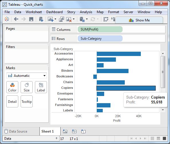
Simple Bar Chart
From the Sample-Superstore, choose the dimension, take profit to the columns shelf and Sub-Category to the rows shelf. It automatically produces a horizontal bar chart as shown in the following screenshot. In case, it does not, you can choose the chart type from the Show Me tool to get the following result.
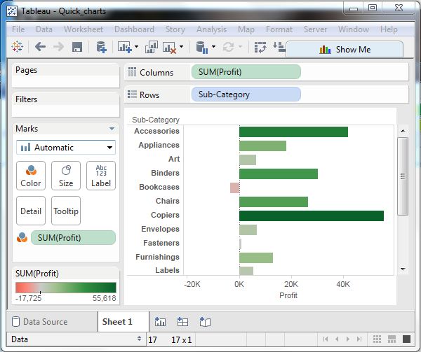
Bar Chart with Color Range
You can apply colors to the bars based on their ranges. The longer bars get darker shades and the smaller bars get the lighter shades. To do this, drag the profit field to the color palette under the Marks Pane. Also note that, it produces a different color for negative bars.
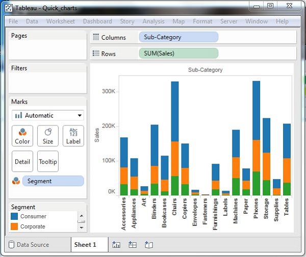
Stacked Bar Chart
You can add another dimension to the above bar chart to produce a stacked bar chart, which shows different colors in each bar. Drag the dimension field named segment to the Marks pane and drop it in colors. The following chart appears which shows the distribution of each segment in each bar.