- Tableau Tutorial
- Tableau - Home
- Tableau - Overview
- Tableau - Environment Setup
- Tableau - Get Started
- Tableau - Navigation
- Tableau - Design Flow
- Tableau - File Types
- Tableau - Data Types
- Tableau - Show Me
- Tableau - Data Terminology
- Tableau Data Sources
- Tableau - Data Sources
- Tableau - Custom Data View
- Tableau - Extracting Data
- Tableau - Fields Operations
- Tableau - Editing Metadata
- Tableau - Data Joining
- Tableau - Data Blending
- Tableau Worksheets
- Tableau - Add Worksheets
- Tableau - Rename Worksheet
- Tableau - Save & Delete Worksheet
- Tableau - Reorder Worksheet
- Tableau - Paged Workbook
- Tableau Calculations
- Tableau - Operators
- Tableau - Functions
- Tableau - Numeric Calculations
- Tableau - String Calculations
- Tableau - Date Calculations
- Tableau - Table Calculations
- Tableau - LOD Expressions
- Tableau Sort & Filters
- Tableau - Basic Sorting
- Tableau - Basic Filters
- Tableau - Quick Filters
- Tableau - Context Filters
- Tableau - Condition Filters
- Tableau - Top Filters
- Tableau - Filter Operations
- Tableau Charts
- Tableau - Bar Chart
- Tableau - Line Chart
- Tableau - Pie Chart
- Tableau - Crosstab
- Tableau - Scatter Plot
- Tableau - Bubble Chart
- Tableau - Bullet Graph
- Tableau - Box Plot
- Tableau - Tree Map
- Tableau - Bump Chart
- Tableau - Gantt Chart
- Tableau - Histogram
- Tableau - Motion Charts
- Tableau - Waterfall Charts
- Tableau Advanced
- Tableau - Dashboard
- Tableau - Formatting
- Tableau - Forecasting
- Tableau - Trend Lines
- Tableau Useful Resources
- Tableau - Question Answers
- Tableau - Quick Guide
- Tableau - Useful Resources
- Tableau - Discussion
Tableau - Waterfall Charts
Waterfall charts effectively display the cumulative effect of sequential positive and negative values. It shows where a value starts, ends and how it gets there incrementally. So, we are able to see both the size of changes and difference in values between consecutive data points.
Tableau needs one Dimension and one Measure to create a Waterfall chart.
Creating a Waterfall Chart
Using the Sample-superstore, plan to find the variation of Sales for each Sub-Category of Products. To achieve this objective, following are the steps.
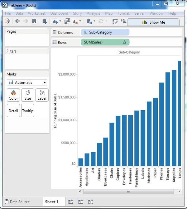
Step 1 − Drag the Dimension Sub-Category to the Columns shelf and the Measure Sales to the Rows shelf. Sort the data in an ascending order of sales value. For this, use the sort option appearing in the middle of the vertical axis when you hover the mouse over it. The following chart appears on completing this step.
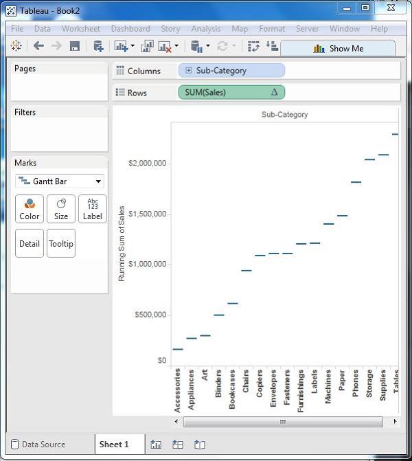
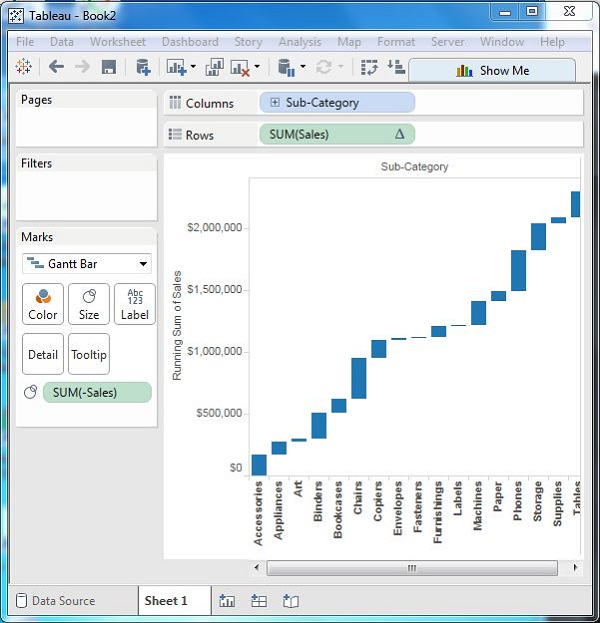
Step 2 − Next, right-click on the SUM (Sales) value and select the running total from the table calculation option. Change the chart type to Gantt Bar. The following chart appears.
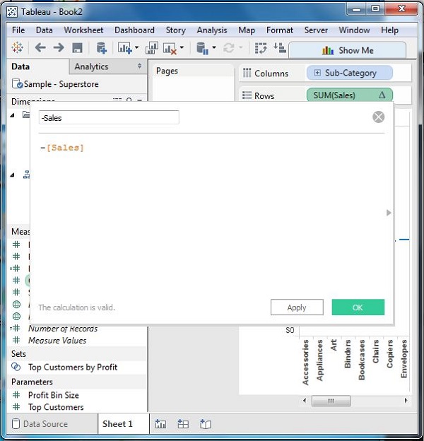
Step 3 − Create a calculated field named -sales and mention the following formula for its value.
Step 4 − Drag the newly created calculated field (-sales) to the size shelf under Marks Card. The chart above now changes to produce the following chart which is a Waterfall chart.
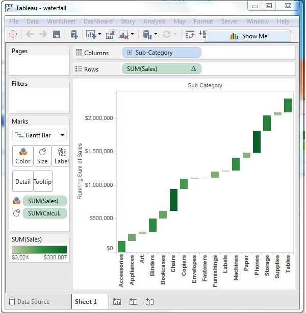
Waterfall Chart with Color
Next, give different color shades to the bars in the chart by dragging the Sales measure to the Color shelf under the Marks Card. You get the following waterfall chart with color.