- Tableau Tutorial
- Tableau - Home
- Tableau - Overview
- Tableau - Environment Setup
- Tableau - Get Started
- Tableau - Navigation
- Tableau - Design Flow
- Tableau - File Types
- Tableau - Data Types
- Tableau - Show Me
- Tableau - Data Terminology
- Tableau Data Sources
- Tableau - Data Sources
- Tableau - Custom Data View
- Tableau - Extracting Data
- Tableau - Fields Operations
- Tableau - Editing Metadata
- Tableau - Data Joining
- Tableau - Data Blending
- Tableau Worksheets
- Tableau - Add Worksheets
- Tableau - Rename Worksheet
- Tableau - Save & Delete Worksheet
- Tableau - Reorder Worksheet
- Tableau - Paged Workbook
- Tableau Calculations
- Tableau - Operators
- Tableau - Functions
- Tableau - Numeric Calculations
- Tableau - String Calculations
- Tableau - Date Calculations
- Tableau - Table Calculations
- Tableau - LOD Expressions
- Tableau Sort & Filters
- Tableau - Basic Sorting
- Tableau - Basic Filters
- Tableau - Quick Filters
- Tableau - Context Filters
- Tableau - Condition Filters
- Tableau - Top Filters
- Tableau - Filter Operations
- Tableau Charts
- Tableau - Bar Chart
- Tableau - Line Chart
- Tableau - Pie Chart
- Tableau - Crosstab
- Tableau - Scatter Plot
- Tableau - Bubble Chart
- Tableau - Bullet Graph
- Tableau - Box Plot
- Tableau - Tree Map
- Tableau - Bump Chart
- Tableau - Gantt Chart
- Tableau - Histogram
- Tableau - Motion Charts
- Tableau - Waterfall Charts
- Tableau Advanced
- Tableau - Dashboard
- Tableau - Formatting
- Tableau - Forecasting
- Tableau - Trend Lines
- Tableau Useful Resources
- Tableau - Question Answers
- Tableau - Quick Guide
- Tableau - Useful Resources
- Tableau - Discussion
Tableau - Pie Chart
A pie chart represents data as slices of a circle with different sizes and colors. The slices are labeled and the numbers corresponding to each slice is also represented in the chart. You can select the pie chart option from the Marks card to create a pie chart.
Simple Pie Chart
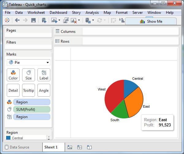
Choose one dimension and one measure to create a simple pie chart. For example, take the dimension named region with the measure named profit. Drop the Region dimension in the colors and label marks. Drop the Profit measure into the size mark. Choose the chart type as Pie. The following chart appears which shows the 4 regions in different colors.
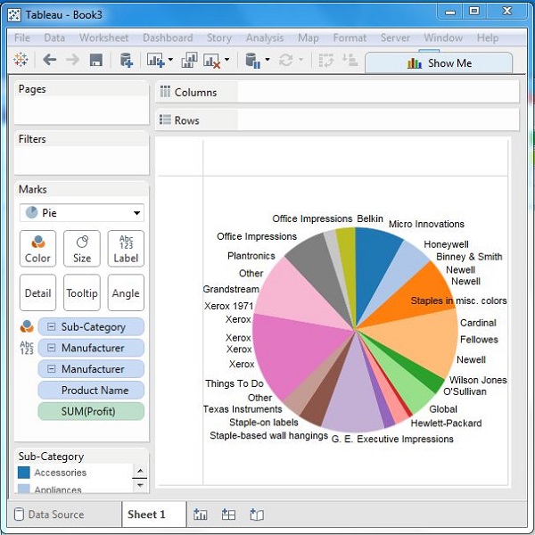
Drill-Down Pie Chart
You can choose a dimension with hierarchy and as you go deeper into the hierarchy, the chart changes reflect the level of the dimension chosen. In the following example, we take the dimension Sub-Category which has two more levels - Manufacturer and Product Name. Take the measure profit and drop it to the Labels mark. The following pie chart appears which shows the values for each slice.

Going one more level into the hierarchy, we get the manufacturer as the label and the above pie chart changes to the following one.