- Tableau Tutorial
- Tableau - Home
- Tableau - Overview
- Tableau - Environment Setup
- Tableau - Get Started
- Tableau - Navigation
- Tableau - Design Flow
- Tableau - File Types
- Tableau - Data Types
- Tableau - Show Me
- Tableau - Data Terminology
- Tableau Data Sources
- Tableau - Data Sources
- Tableau - Custom Data View
- Tableau - Extracting Data
- Tableau - Fields Operations
- Tableau - Editing Metadata
- Tableau - Data Joining
- Tableau - Data Blending
- Tableau Worksheets
- Tableau - Add Worksheets
- Tableau - Rename Worksheet
- Tableau - Save & Delete Worksheet
- Tableau - Reorder Worksheet
- Tableau - Paged Workbook
- Tableau Calculations
- Tableau - Operators
- Tableau - Functions
- Tableau - Numeric Calculations
- Tableau - String Calculations
- Tableau - Date Calculations
- Tableau - Table Calculations
- Tableau - LOD Expressions
- Tableau Sort & Filters
- Tableau - Basic Sorting
- Tableau - Basic Filters
- Tableau - Quick Filters
- Tableau - Context Filters
- Tableau - Condition Filters
- Tableau - Top Filters
- Tableau - Filter Operations
- Tableau Charts
- Tableau - Bar Chart
- Tableau - Line Chart
- Tableau - Pie Chart
- Tableau - Crosstab
- Tableau - Scatter Plot
- Tableau - Bubble Chart
- Tableau - Bullet Graph
- Tableau - Box Plot
- Tableau - Tree Map
- Tableau - Bump Chart
- Tableau - Gantt Chart
- Tableau - Histogram
- Tableau - Motion Charts
- Tableau - Waterfall Charts
- Tableau Advanced
- Tableau - Dashboard
- Tableau - Formatting
- Tableau - Forecasting
- Tableau - Trend Lines
- Tableau Useful Resources
- Tableau - Question Answers
- Tableau - Quick Guide
- Tableau - Useful Resources
- Tableau - Discussion
Tableau - Show Me
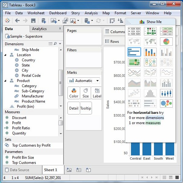
As an advanced data visualization tool, Tableau makes the data analysis very easy by providing many analysis techniques without writing any custom code. One such feature is Show Me. It can be used to apply a required view to the existing data in the worksheet. Those views can be a pie chart, scatter plot, or a line chart.
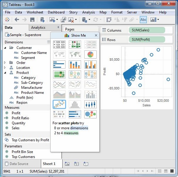
Whenever a worksheet with data is created, it is available in the top right corner as shown in the following figure. Some of the view options will be greyed out depending on the nature of selection in the data pane.
Show Me with Two Fields
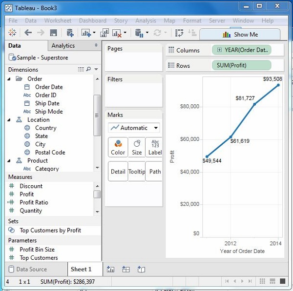
The relation between two fields can be visually analyzed easily by using various graphs and charts available in Show Me. In this case, we choose two fields and apply a line chart. Following are the steps −
Step 1 − Select the two fields (order date and profit) to be analyzed by holding the control key.
Step 2 − Click the Show Me bar and choose line chart.
Step 3 − Click the Mark Label button on the scrollbar.
The following diagram shows the line chart created using the above steps.
Show Me with Multiple Fields
We can apply a similar technique as above to analyze more than 2 fields. The only difference in this case will be the availability of fewer views in active form. Tableau automatically greys out the views that are not appropriate for the analysis of the fields chosen.
In this case, choose the field’s product name, customer name, sales and profit by holding down the control key. As you can observe, most of the views in Show Me are greyed out. From the active views, choose Scatter View.
The following diagram shows the Scatter View chart created.