- CSS Tutorial
- CSS - Home
- CSS - Introduction
- CSS - Syntax
- CSS - Selectors
- CSS - Inclusion
- CSS - Measurement Units
- CSS - Colors
- CSS - Backgrounds
- CSS - Fonts
- CSS - Text
- CSS - Images
- CSS - Links
- CSS - Tables
- CSS - Borders
- CSS - Border Block
- CSS - Border Inline
- CSS - Margins
- CSS - Lists
- CSS - Padding
- CSS - Cursor
- CSS - Outlines
- CSS - Dimension
- CSS - Scrollbars
- CSS - Inline Block
- CSS - Dropdowns
- CSS - Visibility
- CSS - Overflow
- CSS - Clearfix
- CSS - Float
- CSS - Arrows
- CSS - Resize
- CSS - Quotes
- CSS - Order
- CSS - Position
- CSS - Hyphens
- CSS - Hover
- CSS - Display
- CSS - Focus
- CSS - Zoom
- CSS - Translate
- CSS - Height
- CSS - Hyphenate Character
- CSS - Width
- CSS - Opacity
- CSS - Z-Index
- CSS - Bottom
- CSS - Navbar
- CSS - Overlay
- CSS - Forms
- CSS - Align
- CSS - Icons
- CSS - Image Gallery
- CSS - Comments
- CSS - Loaders
- CSS - Attr Selectors
- CSS - Combinators
- CSS - Root
- CSS - Box Model
- CSS - Counters
- CSS - Clip
- CSS - Writing Mode
- CSS - Unicode-bidi
- CSS - min-content
- CSS - All
- CSS - Inset
- CSS - Isolation
- CSS - Overscroll
- CSS - Justify Items
- CSS - Justify Self
- CSS - Tab Size
- CSS - Pointer Events
- CSS - Place Content
- CSS - Place Items
- CSS - Place Self
- CSS - Max Block Size
- CSS - Min Block Size
- CSS - Mix Blend Mode
- CSS - Max Inline Size
- CSS - Min Inline Size
- CSS - Offset
- CSS - Accent Color
- CSS - User Select
- CSS Advanced
- CSS - Grid
- CSS - Grid Layout
- CSS - Flexbox
- CSS - Visibility
- CSS - Positioning
- CSS - Layers
- CSS - Pseudo Classes
- CSS - Pseudo Elements
- CSS - @ Rules
- CSS - Text Effects
- CSS - Paged Media
- CSS - Printing
- CSS - Layouts
- CSS - Validations
- CSS - Image Sprites
- CSS - Important
- CSS - Data Types
- CSS3 Tutorial
- CSS3 - Tutorial
- CSS - Rounded Corner
- CSS - Border Images
- CSS - Multi Background
- CSS - Color
- CSS - Gradients
- CSS - Box Shadow
- CSS - Box Decoration Break
- CSS - Caret Color
- CSS - Text Shadow
- CSS - Text
- CSS - 2d transform
- CSS - 3d transform
- CSS - Transition
- CSS - Animation
- CSS - Multi columns
- CSS - Box Sizing
- CSS - Tooltips
- CSS - Buttons
- CSS - Pagination
- CSS - Variables
- CSS - Media Queries
- CSS - Functions
- CSS - Math Functions
- CSS - Masking
- CSS - Shapes
- CSS - Style Images
- CSS - Specificity
- CSS - Custom Properties
- CSS Responsive
- CSS RWD - Introduction
- CSS RWD - Viewport
- CSS RWD - Grid View
- CSS RWD - Media Queries
- CSS RWD - Images
- CSS RWD - Videos
- CSS RWD - Frameworks
- CSS References
- CSS - Questions and Answers
- CSS - Quick Guide
- CSS - References
- CSS - Color References
- CSS - Web browser References
- CSS - Web safe fonts
- CSS - Units
- CSS - Animation
- CSS Resources
- CSS - Useful Resources
- CSS - Discussion
CSS Masking - mask-border-slice Property
The CSS property mask-border-slice divides the source image into regions. The regions that the source image is divided in is useful in forming the components of the mask border.
The mask-border-slice CSS property can be specified as one to four values. Each value is a <number-percentage>. Negative values are not allowed and considered as invalid and values greater than their corresponding dimension is clamped to 100%. Following rules are in consideration while applying the value:
If one value / position is specified, all four slices at the same distance from their corresponding sides, is created.
If two values / positions are specified, the first value creates slice from the top and bottom and the second value creates slice from the left and right sides, respectively.
If three values / positions are specified, the first value creates slice from the top, the second value creates slice from the left and right sides, and the third value value creates slice from bottom side, respectively.
If four values / positions are specified, they create slices from the top, right, bottom, and left sides, in the order that is specified (clockwise).
Note: The value fill is optional and can be used at any place in the declaration.
In total, nine regions are created by the slicing process, which is, four corners, four edges, and a middle region. The four slices lines are responsible for setting a given distance from their corresponding sides and controlling the size of the regions. Refer the following diagram for location of each region:
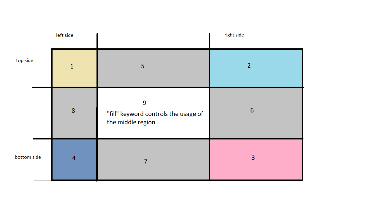
The diagram illustrated above, shows various zones.
Zone 1-4 are the corner regions. Each of these regions is used once to form the corners of the final border image.
Zone 5-8 are the edge regions. Each of these regions is repeated, scaled, or modified in the final border image to match the element's dimensions.
Zone 9 is the middle region. By default it is discraded, but it used to set the background image, when the keyword fill is applied.
The properties mask-border-repeat, mask-border-width, and mask-border-outset, determine how these regions are applied to form the final mask border.
Possible values
The CSS property mask-border-slice can have following values:
<number>: For raster images, the edge offset is represented in pixels and for vector images, it is coordinates. The number is relative to the element's size , and not to the size of the source image, in case of vector images. Hence percentage values are preferred in such cases.
<percentage>: The edge offset of the source image's size is represented in percentage values; where the width of the image is for the horizontal offsets and height of the image is for the vertical offsets.
fill: The middle region is preserved. The width and height of the image is sized such that it matches the top and left image regions, respectively.
Applies to
All HTML elements. And in case of SVG, it applies to the container element excluding the <defs> element and all graphics elements
Syntax
mask-border-slice = [ <number> | <percentage> ] {1,4} fill?
Note: The chromium-based browsers support the old version of this property mask-box-image-slice with a prefix, i.e., -webkit.
-webkit-mask-border-slice = 20 fill;
CSS mask-border-slice - Basic Example
The following example demonstrates the use of the CSS property mask-border-slice, where an image is passed as the mask border and is sliced based upon the number-percentage values passed.
<html>
<head>
<style>
   .with-mask {
      -webkit-mask-box-image: url("images/logo.png")
        30 10% /          /* slice */
        10px /             /* width */
        2px                /* outset */
        space;            /* repeat */


      mask-border: url("images/logo.png")
        30 10% /        /* slice */
        10px /           /* width */
        2px              /* outset */
        space;          /* repeat */
  }
</style>
</head>
<body>
   <h1>The mask-border-slice Property</h1>

   <h3>With mask-border-slice</h3>
   <div class="with-mask">
   <img src="images/orange-flower.jpg" alt="mask border image" width="300" height="200">
   </div>

   <h3>Without mask-border-slice</h3>
   <img src="images/orange-flower.jpg" alt="mask border image" width="300" height="200">
</body>
</html>
To Continue Learning Please Login