- CSS Tutorial
- CSS - Home
- CSS - Introduction
- CSS - Syntax
- CSS - Selectors
- CSS - Inclusion
- CSS - Measurement Units
- CSS - Colors
- CSS - Backgrounds
- CSS - Fonts
- CSS - Text
- CSS - Images
- CSS - Links
- CSS - Tables
- CSS - Borders
- CSS - Border Block
- CSS - Border Inline
- CSS - Margins
- CSS - Lists
- CSS - Padding
- CSS - Cursor
- CSS - Outlines
- CSS - Dimension
- CSS - Scrollbars
- CSS - Inline Block
- CSS - Dropdowns
- CSS - Visibility
- CSS - Overflow
- CSS - Clearfix
- CSS - Float
- CSS - Arrows
- CSS - Resize
- CSS - Quotes
- CSS - Order
- CSS - Position
- CSS - Hyphens
- CSS - Hover
- CSS - Display
- CSS - Focus
- CSS - Zoom
- CSS - Translate
- CSS - Height
- CSS - Hyphenate Character
- CSS - Width
- CSS - Opacity
- CSS - Z-Index
- CSS - Bottom
- CSS - Navbar
- CSS - Overlay
- CSS - Forms
- CSS - Align
- CSS - Icons
- CSS - Image Gallery
- CSS - Comments
- CSS - Loaders
- CSS - Attr Selectors
- CSS - Combinators
- CSS - Root
- CSS - Box Model
- CSS - Counters
- CSS - Clip
- CSS - Writing Mode
- CSS - Unicode-bidi
- CSS - min-content
- CSS - All
- CSS - Inset
- CSS - Isolation
- CSS - Overscroll
- CSS - Justify Items
- CSS - Justify Self
- CSS - Tab Size
- CSS - Pointer Events
- CSS - Place Content
- CSS - Place Items
- CSS - Place Self
- CSS - Max Block Size
- CSS - Min Block Size
- CSS - Mix Blend Mode
- CSS - Max Inline Size
- CSS - Min Inline Size
- CSS - Offset
- CSS - Accent Color
- CSS - User Select
- CSS Advanced
- CSS - Grid
- CSS - Grid Layout
- CSS - Flexbox
- CSS - Visibility
- CSS - Positioning
- CSS - Layers
- CSS - Pseudo Classes
- CSS - Pseudo Elements
- CSS - @ Rules
- CSS - Text Effects
- CSS - Paged Media
- CSS - Printing
- CSS - Layouts
- CSS - Validations
- CSS - Image Sprites
- CSS - Important
- CSS - Data Types
- CSS3 Tutorial
- CSS3 - Tutorial
- CSS - Rounded Corner
- CSS - Border Images
- CSS - Multi Background
- CSS - Color
- CSS - Gradients
- CSS - Box Shadow
- CSS - Box Decoration Break
- CSS - Caret Color
- CSS - Text Shadow
- CSS - Text
- CSS - 2d transform
- CSS - 3d transform
- CSS - Transition
- CSS - Animation
- CSS - Multi columns
- CSS - Box Sizing
- CSS - Tooltips
- CSS - Buttons
- CSS - Pagination
- CSS - Variables
- CSS - Media Queries
- CSS - Functions
- CSS - Math Functions
- CSS - Masking
- CSS - Shapes
- CSS - Style Images
- CSS - Specificity
- CSS - Custom Properties
- CSS Responsive
- CSS RWD - Introduction
- CSS RWD - Viewport
- CSS RWD - Grid View
- CSS RWD - Media Queries
- CSS RWD - Images
- CSS RWD - Videos
- CSS RWD - Frameworks
- CSS References
- CSS - Questions and Answers
- CSS - Quick Guide
- CSS - References
- CSS - Color References
- CSS - Web browser References
- CSS - Web safe fonts
- CSS - Units
- CSS - Animation
- CSS Resources
- CSS - Useful Resources
- CSS - Discussion
CSS grid - grid-row-end
CSS grid-row-end property determines the rows where a grid item should end within the grid rows by specifying a line, a span, or relying on automatic placement. It defines inline-end edge of the grid area.
Possible Values
auto − It automatically determines the position of the grid item within the grid layout. Deafult span of 1.
<custom-ident> − If there's a line labelled with '<custom-ident>-start' or '<custom-ident>-end,' the grid item will be positioned along that line.
<integer> && <custom-ident>? − If a name is given, only lines with that name are considered. If there are insufficient lines with that name, all grid lines are processed as if they have that name in order to determine the correct position. An <integer> value of 0 is not valid.
span && [ <integer> || <custom-ident> ] − When a name is specified as a custom-ident, only lines with that name get considered.If there insufficient lines with that name, we consider all the grid lines on the relevant side of the grid to have that name for counting purposes. If the <integer> is not specified, the default value is 1. Negative numbers or 0 are not allowed.
When using named grid areas, implicit lines are created. The grid-row-end: foo; specifies the end edge of the named region, unless explicitly specified by lines such as foo-end.
When you define a named grid area, it automatically creates corresponding named lines for the end of that area. So, if you set the grid-row-end attribute to foo, the element will be positioned at the end edge of the identified grid area, unless you have explicitly defined lines named foo-end.
Applies to
Grid items and absolutely-positioned boxes whose containing block is a grid container.
DOM Syntax
object.style.gridRowEnd = "auto|<custom-ident>|<integer> && <custom-ident>?|span && [ <integer> || <custom-ident> ]";
CSS grid-row-end - auto Value
The folllowing example demonstartes that grid-row-end: auto property automatically places grid items in the same order in which they appear in the code −
<html>
<head>
<style>
   .grid-container {
      display: grid;
      grid-template-columns: auto auto auto;
      color: white;
      text-align: center;
      background-color: lightgreen;
   }
   .grid-container > div {
      background-color: red;
      margin: 5px;
      padding: 5px;
   }
   .grid-column-item1 {
      grid-row-end: auto;
   }
</style>
</head>
<body>
   <div class="grid-container">
      <div class="grid-column-item1">Grid item 1</div>
      <div>Grid item 2</div>
      <div>Grid item 3</div>
      <div>Grid item 4</div>
      <div>Grid item 5</div>
      <div>Grid item 6</div>
   </div>
</body>
</html>
CSS grid-row-end - <custom-ident>
The grid-template-rows: [a] 50px [b] 50px [c] 50px; property creates three rows named a,b, and c.
The following example demonstrates that grid-row-end: c property specifies the ends edge of the first grid item will end at the start edge of the third row. −
<html>
<head>
<style>
   .grid-container {
      display: grid;
      grid-template-rows: [a] 50px [b] 50px [c] 50px;
      grid-template-columns: auto auto;
      background-color: lightgreen;
      padding: 5px;
   }
   .grid-container > div {
      background-color: red;
      border: 2px solid blue;
      padding: 10px;
      text-align: center;
   }
   .grid-item {
      grid-row-end: c;
   }
</style>
</head>
<body>
   <div class="grid-container">
      <div class="grid-item">Grid Item 1</div>
      <div>Grid Item 2</div>
      <div>Grid Item 3</div>
      <div>Grid Item 4</div>
      <div>Grid Item 5</div>
   </div>
</body>
</html>
CSS grid-row-end - <integer> && <custom-ident>?
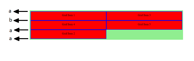
The grid-template-rows: [a] 50px [b] 50px [a] 50px [a]; property creates three rows named a and b.
The grid-row-end: 3 a; property, indicates that the second grid item ends at the third 'a' named line, which is the fourth grid line.
The following diagram demonstrates the column layout with line:
<html>
<head>
<style>
   .grid-container {
      display: grid;
      grid-template-rows: [a] 50px [b] 50px [a] 50px [a];
      grid-template-columns: auto auto;
      background-color: lightgreen;
      padding: 5px;
   }
   .grid-container > div {
      background-color: red;
      border: 2px solid blue;
      padding: 10px;
      text-align: center;
   }
   .grid-item {
      grid-row-end: 3 a;   /* The third `a` named line, which is the fourth grid line.*/
   }
</style>
</head>
<body>
   <div class="grid-container">
      <div>Grid Item 1</div>
      <div class="grid-item">Grid Item 2</div>
      <div>Grid Item 3</div>
      <div>Grid Item 4</div>
      <div>Grid Item 5</div>
   </div>
</body>
</html>
CSS grid-row-end - span Value
The folllowing example demonstartes that grid-row-end: span 3 property specifies the first grid item spans three rows −
<html>
<head>
<style>
   .grid-container {
      display: grid;
      grid-template-columns: auto auto auto;
      color: white;
      text-align: center;
      width: 360px;
      background-color: lightgreen;
   }
   .grid-container > div {
      background-color: red;
      margin: 5px;
      padding: 5px;
   }
   .grid-column-item1 {
      grid-row-end: span 3;
   }
</style>
</head>
<body>
   <div class="grid-container">
      <div class="grid-column-item1">Grid item 1</div>
      <div>Grid item 2</div>
      <div>Grid item 3</div>
      <div>Grid item 4</div>
      <div>Grid item 5</div>
      <div>Grid item 6</div>
   </div>
</body>
</html>
To Continue Learning Please Login