- CSS Tutorial
- CSS - Home
- CSS - Introduction
- CSS - Syntax
- CSS - Selectors
- CSS - Inclusion
- CSS - Measurement Units
- CSS - Colors
- CSS - Backgrounds
- CSS - Fonts
- CSS - Text
- CSS - Images
- CSS - Links
- CSS - Tables
- CSS - Borders
- CSS - Border Block
- CSS - Border Inline
- CSS - Margins
- CSS - Lists
- CSS - Padding
- CSS - Cursor
- CSS - Outlines
- CSS - Dimension
- CSS - Scrollbars
- CSS - Inline Block
- CSS - Dropdowns
- CSS - Visibility
- CSS - Overflow
- CSS - Clearfix
- CSS - Float
- CSS - Arrows
- CSS - Resize
- CSS - Quotes
- CSS - Order
- CSS - Position
- CSS - Hyphens
- CSS - Hover
- CSS - Display
- CSS - Focus
- CSS - Zoom
- CSS - Translate
- CSS - Height
- CSS - Hyphenate Character
- CSS - Width
- CSS - Opacity
- CSS - Z-Index
- CSS - Bottom
- CSS - Navbar
- CSS - Overlay
- CSS - Forms
- CSS - Align
- CSS - Icons
- CSS - Image Gallery
- CSS - Comments
- CSS - Loaders
- CSS - Attr Selectors
- CSS - Combinators
- CSS - Root
- CSS - Box Model
- CSS - Counters
- CSS - Clip
- CSS - Writing Mode
- CSS - Unicode-bidi
- CSS - min-content
- CSS - All
- CSS - Inset
- CSS - Isolation
- CSS - Overscroll
- CSS - Justify Items
- CSS - Justify Self
- CSS - Tab Size
- CSS - Pointer Events
- CSS - Place Content
- CSS - Place Items
- CSS - Place Self
- CSS - Max Block Size
- CSS - Min Block Size
- CSS - Mix Blend Mode
- CSS - Max Inline Size
- CSS - Min Inline Size
- CSS - Offset
- CSS - Accent Color
- CSS - User Select
- CSS Advanced
- CSS - Grid
- CSS - Grid Layout
- CSS - Flexbox
- CSS - Visibility
- CSS - Positioning
- CSS - Layers
- CSS - Pseudo Classes
- CSS - Pseudo Elements
- CSS - @ Rules
- CSS - Text Effects
- CSS - Paged Media
- CSS - Printing
- CSS - Layouts
- CSS - Validations
- CSS - Image Sprites
- CSS - Important
- CSS - Data Types
- CSS3 Tutorial
- CSS3 - Tutorial
- CSS - Rounded Corner
- CSS - Border Images
- CSS - Multi Background
- CSS - Color
- CSS - Gradients
- CSS - Box Shadow
- CSS - Box Decoration Break
- CSS - Caret Color
- CSS - Text Shadow
- CSS - Text
- CSS - 2d transform
- CSS - 3d transform
- CSS - Transition
- CSS - Animation
- CSS - Multi columns
- CSS - Box Sizing
- CSS - Tooltips
- CSS - Buttons
- CSS - Pagination
- CSS - Variables
- CSS - Media Queries
- CSS - Functions
- CSS - Math Functions
- CSS - Masking
- CSS - Shapes
- CSS - Style Images
- CSS - Specificity
- CSS - Custom Properties
- CSS Responsive
- CSS RWD - Introduction
- CSS RWD - Viewport
- CSS RWD - Grid View
- CSS RWD - Media Queries
- CSS RWD - Images
- CSS RWD - Videos
- CSS RWD - Frameworks
- CSS References
- CSS - Questions and Answers
- CSS - Quick Guide
- CSS - References
- CSS - Color References
- CSS - Web browser References
- CSS - Web safe fonts
- CSS - Units
- CSS - Animation
- CSS Resources
- CSS - Useful Resources
- CSS - Discussion
CSS - Easing functions
CSS easing function is used to control the speed of a transition or animation between two states of an element. It defines the rate of change of a property over time, affecting the acceleration and deceleration during the animation.
Following are some noteworthy points:
The transition between two values can be applied in various contexts, including animations, to control the rate at which values change.
This allows for dynamic adjustment of animation speed throughout the duration.
CSS <transitions> and <animations> properties can be customized with loosening functions to specify this behavior.
Types Of Easing Functions
There are three main types of easing functions that can be used in CSS as listed below:
Linear functions (linear),
Cubic Bezier functions (includes ease, ease-in, ease-out and ease-in-out),
Staircase functions (steps).
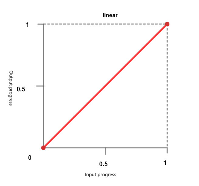
Linear Functions
With the linear timing function, the animation is going through the keyframes at a constant speed. Following keywords can be passed :
linear - The animation progresses at a constant speed.
linear-easing-function - This describes the linear() function, which is used to manage the progress of animations or transitions. It uses a list of stops, linear-stop-list, where each point is specified as a number between 0 and 1. This can have <number> or <percentage> values.
Cubic Bezier Functions
This feature in CSS defines Bézier curves that affect the progression of the animation or transition with four control points: a start point, an end point and two control points.
It helps create custom easing effects. A cubic Bézier function is defined by four control points, and it allows for precise control over the acceleration and deceleration of an animation. The predefined keyword values include:
ease - This term represents a gradual initial interpolation followed by a rapid acceleration and a gradual deceleration towards the end. This term corresponds to the relaxation function cubic-bezier(0.25, 0.1, 0.25, 1.0).
ease-in - This term means that the interpolation starts gradually and then becomes faster and faster until it suddenly stops at the end. This keyword corresponds to the easing function cubic-bezier(0.42, 0.0, 1.0, 1.0).
ease-out - This term indicates that the interpolation starts abruptly and then gradually slows down towards the end. This keyword corresponds to the easing function cubic-bezier(0.0, 0.0, 0.58, 1.0).
ease-in-out - This keyword represents an interpolation that starts slowly, speeds up, and then slows down toward the end. It uses the relaxation function cubic-bezier(0.42, 0.0, 0.58, 1.0) and behaves similarly to ease-in at the beginning and ease-out at the end.
<cubic-bezier()> - This function utilizes four <number> values to define the curve's shape. cubic-bezier(x1, y1, x2, y2)
X coordinates (x1 and x2) represent time ratio and are limited to values between 0 and 1 (the animation cannot begin sooner or last longer than specified), while Y coordinates (y1 and y2) represent the animation output and their values.
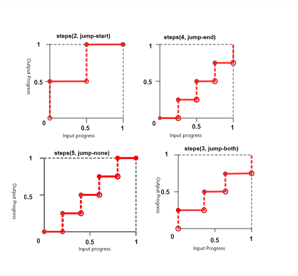
Steps Functions
Steps functions enable animation to jump between the specific number of frames in a non-continuous way. You can think of it as a "ticking" animation. It accepts following keywords:
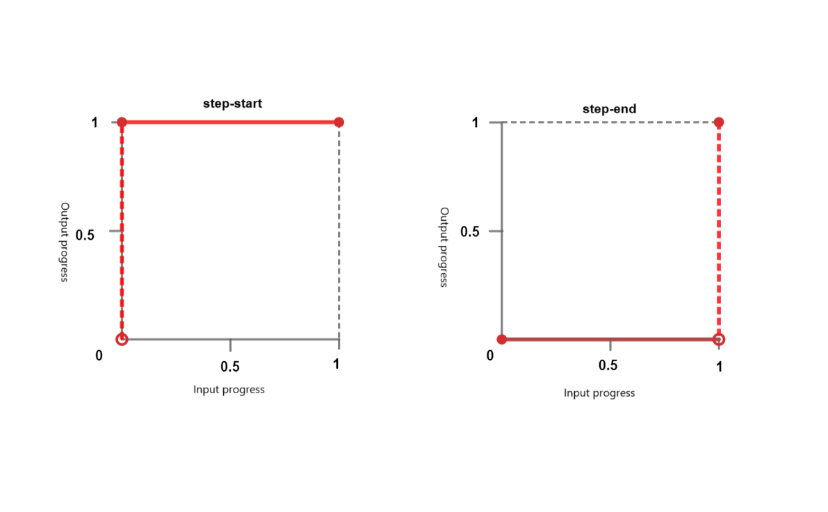
step-start - This keyword represents the easing functions steps(1, jump-start) or steps(1, start). It signals an abrupt jump to the final state of the interpolation and maintains this state until completion.
step-end - This keyword represents the easing functions steps(1, jump-end) or steps(1, end). It means that the interpolation retains its initial state until the end, where it quickly changes to the final state.
steps() - This function takes a positive <integer> and an optional <step-position>.
<integer> - Denotes the number of evenly spaced intervals or steps. It should be a positive integer greater than 0, unless the second parameter is jump-none, in which case it must be a positive integer greater than 1.
<step-position> - Specifies when the jump occurs — either at the start, at the end, both at the start and at the end, or neither. The available keyword values include:
jump-start - This means that the initial jump occurs right at the beginning, essentially at point 0, with no time spent at the 0% mark.
jump-end - This means that the last jump occurs exactly at the end, essentially at point 1, with no time spent at the 100% mark. This is the default value if no <step-postion> is specified.
jump-none - This eliminates jumps both at the beginning and at the end and omits one step in the duration. Progress remains steady at both the 0% and 100% marks, with the duration determined by dividing the total duration by the number of steps (1/n).
jump-both- This involves jumps at both the beginning and end, occurring at both the 0 and 1 points. This effectively adds a step at both ends, with no time spent at the 0% and 100% marks.
start - is the equivalent term for jump-start.
end- is the equivalent term for jump-end
Syntax
/* linear function and keyword */
/* linear(<point-list>) */
linear(1, -0.5, 0)
linear

/* cubic-bezier function and keywords */
/* cubic-bezier(<x1>, <y1>, <x2>, <y2>) */
cubic-bezier(0.25, 0.1, 0.25, 1)
ease
ease-in
ease-out
ease-in-out

/* steps function and keywords */
/* steps(<number-of-steps>, <direction>) */
steps(4, end)
steps(10, jump-both)
step-start
step-end
CSS easing-function - linear-easing
The following example creates a red box that moves horizontally using a linear-easing function. The animation has a duration of 4 seconds and repeats infinitely, resulting in a continuous back-and-forth movement of the box.
<html>
<head>
<style>
   .box {
      width: 100px;
      height: 100px;
      margin: 150px;
      background-color: red;
      text-align:center;
      font-size:20px;
      position: relative;
      display: flex;
  	   justify-content: center;
  	   align-items: center;
      animation: move 4s linear infinite;
   }
   @keyframes move {
      0% {
         left: 5%;
      }
      100% {
         left: 60%;
      }
   }
</style>
</head>
<body>
   <div class="box">Linear Easing Function</div>
</body>
</html>
CSS easing-function - linear-easing With Values
The following example demonstrates various linear-easing function which accepts values.
The animation starts at position 0 and moves straight forward to 0.25. Following that, it keeps going in a straight line until it hits 1. The animation's progression during its runtime is shown by the notation linear(0, 0.25 75%, 1).
<html>
<head>
<style>
   .box {
      width: 100px;
      height: 100px;
      margin: 150px;
      background-color: red;
      text-align:center;
      display: flex;
      justify-content: center;
      align-items: center;
      font-size:20px;
      position: relative;
      animation: move 4s linear infinite;
   }
   .linear-demo-1 {
      animation-name: linear-custom;
      animation-timing-function: linear(0, 0.25 75%, 1);
   }
    @keyframes linear-custom {
      from {transform: translateX(0);}
      to {transform: translateX(350px);}
   }
</style>
</head>
<body>
<div class="box linear-demo-1">Linear Custom</div>
</body>
</html>
CSS easing-function - cubic-bezier
The following example demonstrates various cubic-bezier functions.
The ease-in box starts slow and speeds up, the ease-out box starts fast and slows down, and the ease-in-out box starts slow, speeds up in the middle, and then slows down toward the end of the animation.
<html>
<head>
<style>
   .box {
      width: 100px;
      height: 100px;
      background-color: #0077FF;
      margin: 20px auto;
      animation-duration: 4s;
      animation-iteration-count: infinite;
      text-align: center;
      font-size: 20px;
      display: flex;
      justify-content: center;
      align-items: center;
   }
   .ease-in-demo {
      animation-name: easeIn;
      animation-timing-function: ease-in;
   }
   .ease-out-demo {
      animation-name: easeOut;
      animation-timing-function: ease-out;
   }
   .ease-in-out-demo {
      animation-name: easeInOut;
      animation-timing-function: ease-in-out;
   }
   @keyframes easeIn {
      from {transform: translateX(0);}
      to {transform: translateX(400px);}
   }
   @keyframes easeOut {
      from {transform: translateX(0);}
      to {transform: translateX(400px);}
   }
   @keyframes easeInOut {
      from {transform: translateX(0);}
      to {transform: translateX(400px);}
   }
</style>
</head>
<body>
   <div class="box ease-in-demo">Ease-in</div>
   <div class="box ease-out-demo">Ease-out</div>
   <div class="box ease-in-out-demo">Ease-in-out</div>
</body>
</html>
CSS easing-function - cubic-bezier With Values.
The following example demonstrates various cubic-bezier functions with values.
With this configuration, an animation effect is produced in which every box has a different motion behavior as it progresses 300 pixels to the right from its initial location using a different cubic-bezier timing function.
<html>
<head>
<style>
   .box {
      width: 120px;
      height: 110px;
      background-color: #e3bd56;
      margin: 20px auto;
      animation-duration: 4s;
      animation-iteration-count: infinite;
      text-align: center;
      font-size: 20px;
      left:10px;
      display: flex;
      justify-content: center;
      align-items: center;
   }
   .cubic-bezier-demo-1 {
      animation-name: cubicBezier1;
      animation-timing-function: cubic-bezier(0.25, 0.1, 0.25, 1);
   }
   .cubic-bezier-demo-2 {
      animation-name: cubicBezier2;
      animation-timing-function: cubic-bezier(0.42, 0, 0.58, 1);
   }
   .cubic-bezier-demo-3 {
      animation-name: cubicBezier3;
      animation-timing-function: cubic-bezier(0.55, 0.055, 0.675, 0.19);
   }
   .cubic-bezier-demo-4 {
      animation-name: cubicBezier4;
      animation-timing-function: cubic-bezier(0.95, 0.05, 0.795, 0.035);
   }
   @keyframes cubicBezier1 {
      from {transform: translateX(0);}
      to {transform: translateX(300px);}
   }
   @keyframes cubicBezier2 {
      from {transform: translateX(0);}
      to {transform: translateX(300px);}
   }
   @keyframes cubicBezier3 {
      from {transform: translateX(0);}
      to {transform: translateX(300px);}
   }
   @keyframes cubicBezier4 {
      from {transform: translateX(0);}
      to {transform: translateX(300px);}
   }
</style>
</head>
<body>
   <div class="box cubic-bezier-demo-1">Cubic Bezier (0.25, 0.1, 0.25, 1)</div>
   <div class="box cubic-bezier-demo-2">Cubic Bezier (0.42, 0, 0.58, 1)</div>
   <div class="box cubic-bezier-demo-3">Cubic Bezier (0.55, 0.055, 0.675, 0.19)</div>
   <div class="box cubic-bezier-demo-4">Cubic Bezier (0.95, 0.05, 0.795, 0.035)</div>
</body>
</html>
CSS easing-function - step-easing
The following example demonstrates the various step-easing functions.
<html>
<head>
<style>
   body {
      display: flex;
      justify-content: space-around;
      align-items: center;
      height: 100vh;
      margin: 0;
      display: flex;
      justify-content: center;
      align-items: center;
   }
   .box {
      width: 100px;
      height: 50px;
      background-color: red;
      display: flex;
      justify-content: center;
      align-items: center;
      text-align: center;
      font-size: 16px;
      margin: 10px;
      animation: move 6s infinite;
   }
   .jump-start {
      animation-timing-function:steps(6, jump-start);
   }
   .jump-end {
      animation-timing-function:steps(6, jump-end);
   }
   .jump-both {
      animation-timing-function:steps(6, jump-both);
   }
   .jump-none {
      animation-timing-function:steps(6, jump-none);
   }
   .step-start {
      animation-timing-function: step-start;
   }
   .step-end {
      animation-timing-function: step-end;
   }
   .start {
      animation-timing-function: steps(6, start);
   }
   .end {
   animation-timing-function: steps(6, end);
   }
   @keyframes move {
      0%, 100% {
      transform: translateY(0);
      }
      50% {
      transform: translateY(250px);
      }
   }
</style>
</head>
<body>
<div class="box jump-start">Jump-start</div>
<div class="box jump-end">Jump-end</div>
<div class="box jump-both">Jump-both</div>
<div class="box jump-none">Jump-none</div>
<div class="box step-start">Step-start</div>
<div class="box step-end">Step-end</div>
<div class="box start">Start</div>
<div class="box end">End</div>
</body>
</html>
To Continue Learning Please Login