- Home
- Adjusted R-Squared
- Analysis of Variance
- Arithmetic Mean
- Arithmetic Median
- Arithmetic Mode
- Arithmetic Range
- Bar Graph
- Best Point Estimation
- Beta Distribution
- Binomial Distribution
- Black-Scholes model
- Boxplots
- Central limit theorem
- Chebyshev's Theorem
- Chi-squared Distribution
- Chi Squared table
- Circular Permutation
- Cluster sampling
- Cohen's kappa coefficient
- Combination
- Combination with replacement
- Comparing plots
- Continuous Uniform Distribution
- Continuous Series Arithmetic Mean
- Continuous Series Arithmetic Median
- Continuous Series Arithmetic Mode
- Cumulative Frequency
- Co-efficient of Variation
- Correlation Co-efficient
- Cumulative plots
- Cumulative Poisson Distribution
- Data collection
- Data collection - Questionaire Designing
- Data collection - Observation
- Data collection - Case Study Method
- Data Patterns
- Deciles Statistics
- Discrete Series Arithmetic Mean
- Discrete Series Arithmetic Median
- Discrete Series Arithmetic Mode
- Dot Plot
- Exponential distribution
- F distribution
- F Test Table
- Factorial
- Frequency Distribution
- Gamma Distribution
- Geometric Mean
- Geometric Probability Distribution
- Goodness of Fit
- Grand Mean
- Gumbel Distribution
- Harmonic Mean
- Harmonic Number
- Harmonic Resonance Frequency
- Histograms
- Hypergeometric Distribution
- Hypothesis testing
- Individual Series Arithmetic Mean
- Individual Series Arithmetic Median
- Individual Series Arithmetic Mode
- Interval Estimation
- Inverse Gamma Distribution
- Kolmogorov Smirnov Test
- Kurtosis
- Laplace Distribution
- Linear regression
- Log Gamma Distribution
- Logistic Regression
- Mcnemar Test
- Mean Deviation
- Means Difference
- Multinomial Distribution
- Negative Binomial Distribution
- Normal Distribution
- Odd and Even Permutation
- One Proportion Z Test
- Outlier Function
- Permutation
- Permutation with Replacement
- Pie Chart
- Poisson Distribution
- Pooled Variance (r)
- Power Calculator
- Probability
- Probability Additive Theorem
- Probability Multiplecative Theorem
- Probability Bayes Theorem
- Probability Density Function
- Process Capability (Cp) & Process Performance (Pp)
- Process Sigma
- Quadratic Regression Equation
- Qualitative Data Vs Quantitative Data
- Quartile Deviation
- Range Rule of Thumb
- Rayleigh Distribution
- Regression Intercept Confidence Interval
- Relative Standard Deviation
- Reliability Coefficient
- Required Sample Size
- Residual analysis
- Residual sum of squares
- Root Mean Square
- Sample planning
- Sampling methods
- Scatterplots
- Shannon Wiener Diversity Index
- Signal to Noise Ratio
- Simple random sampling
- Skewness
- Standard Deviation
- Standard Error ( SE )
- Standard normal table
- Statistical Significance
- Statistics Formulas
- Statistics Notation
- Stem and Leaf Plot
- Stratified sampling
- Student T Test
- Sum of Square
- T-Distribution Table
- Ti 83 Exponential Regression
- Transformations
- Trimmed Mean
- Type I & II Error
- Variance
- Venn Diagram
- Weak Law of Large Numbers
- Z table
- Statistics Useful Resources
- Statistics - Discussion
Statistics - Scatterplots
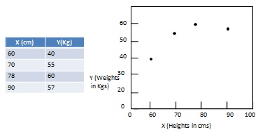
A scatterplot is a graphical way to display the relationship between two quantitative sample variables. It consists of an X axis, a Y axis and a series of dots where each dot represents one observation from a data set. The position of the dot refers to its X and Y values.
Patterns of Data in Scatterplots
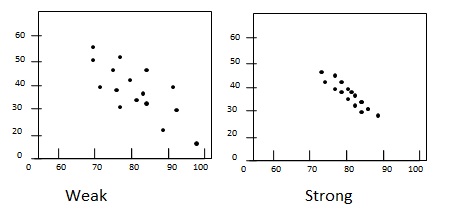
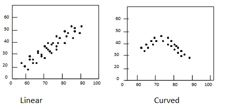
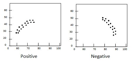
Scatterplots are used to analyze patterns which generally varies on the basis of linearity, slope, and strength.
Linearity - data pattern is either linear/straight or nonlinear/curved.
Slope - direction of change in variable Y with respect to increase in value of variable X. If Y increases with increase in X, slope is positive otherwise slope is negative.
Strength - Degree of spreadness of scatter in the plot. If dots are widely dispersed, the relationship is consider weak. If dot are densed around a line then the relationship is said to be strong.