- Home
- Adjusted R-Squared
- Analysis of Variance
- Arithmetic Mean
- Arithmetic Median
- Arithmetic Mode
- Arithmetic Range
- Bar Graph
- Best Point Estimation
- Beta Distribution
- Binomial Distribution
- Black-Scholes model
- Boxplots
- Central limit theorem
- Chebyshev's Theorem
- Chi-squared Distribution
- Chi Squared table
- Circular Permutation
- Cluster sampling
- Cohen's kappa coefficient
- Combination
- Combination with replacement
- Comparing plots
- Continuous Uniform Distribution
- Continuous Series Arithmetic Mean
- Continuous Series Arithmetic Median
- Continuous Series Arithmetic Mode
- Cumulative Frequency
- Co-efficient of Variation
- Correlation Co-efficient
- Cumulative plots
- Cumulative Poisson Distribution
- Data collection
- Data collection - Questionaire Designing
- Data collection - Observation
- Data collection - Case Study Method
- Data Patterns
- Deciles Statistics
- Discrete Series Arithmetic Mean
- Discrete Series Arithmetic Median
- Discrete Series Arithmetic Mode
- Dot Plot
- Exponential distribution
- F distribution
- F Test Table
- Factorial
- Frequency Distribution
- Gamma Distribution
- Geometric Mean
- Geometric Probability Distribution
- Goodness of Fit
- Grand Mean
- Gumbel Distribution
- Harmonic Mean
- Harmonic Number
- Harmonic Resonance Frequency
- Histograms
- Hypergeometric Distribution
- Hypothesis testing
- Individual Series Arithmetic Mean
- Individual Series Arithmetic Median
- Individual Series Arithmetic Mode
- Interval Estimation
- Inverse Gamma Distribution
- Kolmogorov Smirnov Test
- Kurtosis
- Laplace Distribution
- Linear regression
- Log Gamma Distribution
- Logistic Regression
- Mcnemar Test
- Mean Deviation
- Means Difference
- Multinomial Distribution
- Negative Binomial Distribution
- Normal Distribution
- Odd and Even Permutation
- One Proportion Z Test
- Outlier Function
- Permutation
- Permutation with Replacement
- Pie Chart
- Poisson Distribution
- Pooled Variance (r)
- Power Calculator
- Probability
- Probability Additive Theorem
- Probability Multiplecative Theorem
- Probability Bayes Theorem
- Probability Density Function
- Process Capability (Cp) & Process Performance (Pp)
- Process Sigma
- Quadratic Regression Equation
- Qualitative Data Vs Quantitative Data
- Quartile Deviation
- Range Rule of Thumb
- Rayleigh Distribution
- Regression Intercept Confidence Interval
- Relative Standard Deviation
- Reliability Coefficient
- Required Sample Size
- Residual analysis
- Residual sum of squares
- Root Mean Square
- Sample planning
- Sampling methods
- Scatterplots
- Shannon Wiener Diversity Index
- Signal to Noise Ratio
- Simple random sampling
- Skewness
- Standard Deviation
- Standard Error ( SE )
- Standard normal table
- Statistical Significance
- Statistics Formulas
- Statistics Notation
- Stem and Leaf Plot
- Stratified sampling
- Student T Test
- Sum of Square
- T-Distribution Table
- Ti 83 Exponential Regression
- Transformations
- Trimmed Mean
- Type I & II Error
- Variance
- Venn Diagram
- Weak Law of Large Numbers
- Z table
- Statistics Useful Resources
- Statistics - Discussion
Statistics - Boxplots
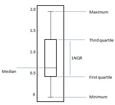
The box plot is a standardized way to display the distribution of data based on following five number summary.
Minimum
First Quartile
Median
Third Quartile
Maximum
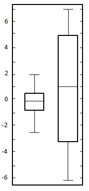
For a uniformly distributed data set,in box plot diagram, the central rectangle spans the first quartile to the third quartile (or the interquartile range, IQR). A line inside the rectangle shows the median and "whiskers" above and below the box show the locations of the minimum and maximum values. Such box plot displays the full range of variation from min to max, the likely range of variation, the IQR, and the median.
Problem Statement:
Create a box plot for the following two datasets.
| 0.22 |
| -0.87 |
| -2.39 |
| -1.79 |
| 0.37 |
| -1.54 |
| 1.28 |
| -0.31 |
| -0.74 |
| 1.72 |
| 0.38 |
| -0.17 |
| -0.62 |
| -1.10 |
| 0.30 |
| 0.15 |
| 2.30 |
| 0.19 |
| -0.50 |
| -0.09 |
| -5.13 |
| -2.19 |
| -2.43 |
| -3.83 |
| 0.50 |
| -3.25 |
| 4.32 |
| 1.63 |
| 5.18 |
| -0.43 |
| 7.11 |
| 4.87 |
| -3.10 |
| -5.81 |
| 3.76 |
| 6.31 |
| 2.58 |
| 0.07 |
| 5.76 |
| 3.50 |
Solution:
Here both datasets are uniformly balanced around zero so mean is around zero. In first data set variation ranges approximately from -2.5 to 2.5 whereas in second data set ranges approximately from -6 to 6. Draw the chart as shown below: