- SAP Lumira - Home
- SAP Lumira - Overview
- SAP Lumira - Data Sources
- SAP Lumira - Data Acquisition
- SAP Lumira - Editing Acquired Data
- SAP Lumira - Viewing Connections
- SAP Lumira - Working with Excel Files
- SAP Lumira - Working with CSV Files
- SAP Lumira - Connecting HANA Views
- SAP Lumira - Download from HANA
- SAP Lumira - Universe as a Data Src
- SAP Lumira - Using Query with SQL
- SAP Lumira - Working Modes
- SAP Lumira - Prepare Phase
- SAP Lumira - Visualize Phase
- SAP Lumira - Compose Phase
- SAP Lumira - Share Phase
- SAP Lumira - New Document
- SAP Lumira - Creating Charts
- SAP Lumira - Chart Types
- SAP Lumira - Conditional Formatting
- SAP Lumira - Preparing Data in Tab
- SAP Lumira - Editing Data
- SAP Lumira - Numbers & Dates
- SAP Lumira - Enriching Data
- SAP Lumira - Working with Datasets
- SAP Lumira - Visualizing Data
- SAP Lumira - Legend Colors
- SAP Lumira - Creating Stories
- SAP Lumira - Slideshows
- SAP Lumira - Customizing Stories
- Lumira - Charts, Stories & Datasets
- SAP Lumira - Publishing Datasets
- SAP Lumira - Questions Answers
- SAP Lumira - Quick Guide
- SAP Lumira - Useful Resources
- SAP Lumira - Discussion
SAP Lumira - Visualize Phase
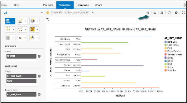
This is used to create different type of charts and visualizations on the dataset available in Prepare tab. Main areas under Visualize tab are −
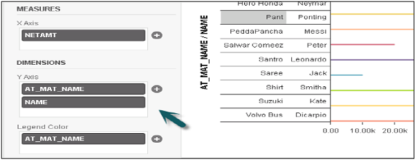
Dimensions and Measures Panel
On the left side, you have the dimensions and measures acquired in the dataset and are available to create visualizations.
You can directly drag the objects from this panel to the chart pane to create the charts on X and Y axes. At the top, you have Horizontal and Vertical Orientation to change the display of objects in this panel.

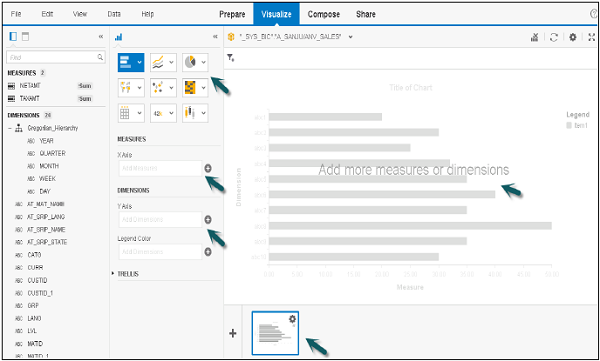
Chart Canvas
This is used to create or modify a visualization. You can directly drag attributes and measures to chart canvas or can add to chart builder.
You can add various tools like −
- Sorted by Dimensions
- Add or Edit a ranking by measures
- Clear Chart
- Fit chart to frame
- Reprompt
- Refresh
- Settings
- Maximize
- Undo
- Redo
Visualization Tools
Let us see the various tools used for visualization.
Step 1 − Go to File → Preferences → Charts → Charts Canvas Layout
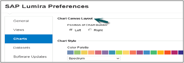
Step 2 − You can select Chart Style, Template, Font Zoom, etc.
Chart Picker
You can select different types of chart from this panel. You have an option to select various types of charts in Lumira.
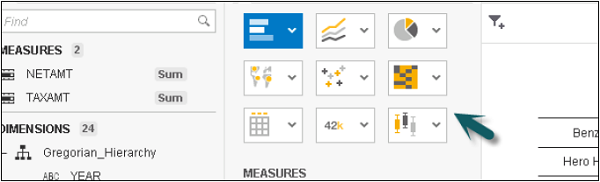
Chart Shelves
Chart Shelves are used to add measures and dimensions to a visualization.