- Home
- Introduction
- Reporting and Dashboard Tools
- Different BO Tools Connection to HANA
- Creating a Relational Connection
- Creating an OLAP Connection
- HANA Modeling Views
- Input Parameters in HANA
- Using Attribute View
- Using Analytic View
- Using Calculation View
- Using Tables in HANA DB
- Connecting Webi to HANA
- Universe Development
- User Prompts and Filter in IDT
- Webi Report Development
- Lumira Connection to HANA
- Dashboard Development in Lumira
- Dashboard Designer Connection to HANA
- Dashboard Development in DD
- Connecting Crystal to HANA Views
- Crystal Report Development on HANA
- BW on HANA Connection
- Design Studio Connection with HANA
- Development in Design Studio
- Publishing BI Reports on HANA
- Benefits of Using HANA
- Connecting HANA with Other BI Tools
- Interview Questions
Dashboard Development in Lumira
When you select a dataset in Lumira from HANA Repository, it is added to the Prepare tab. You can make changes to the dataset and once it is finalized you can move to "Visualize" tab to create interactive charts in Lumira on top of HANA Modeling views.
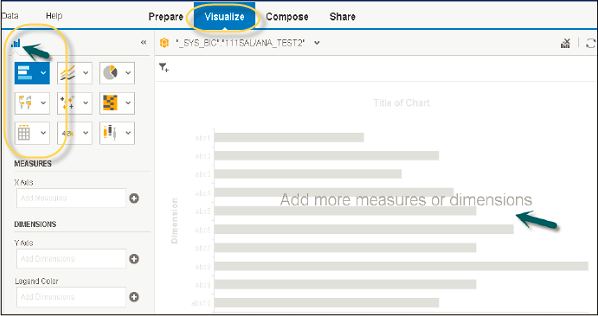
Follow are the steps to add a chart: Navigate to the "Visualize" tab and go to Chart Builder.
Select a chart type that you want to use in the Chart Builder. Bar Chart is the default chart type, but you can select any chart from the list.
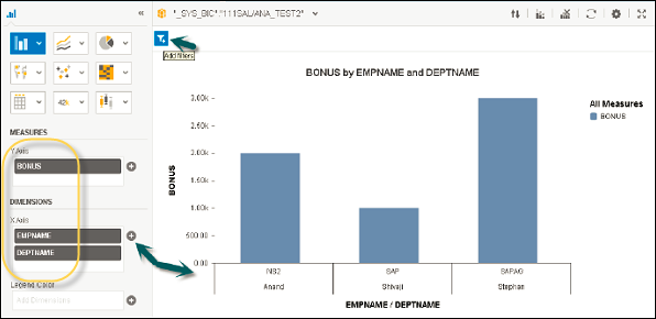
The next step is to choose a measure and drag it to an axis on the Chart Canvas. To add a measure or dimension to the corresponding axis, click the '+' sign next to the axis name.
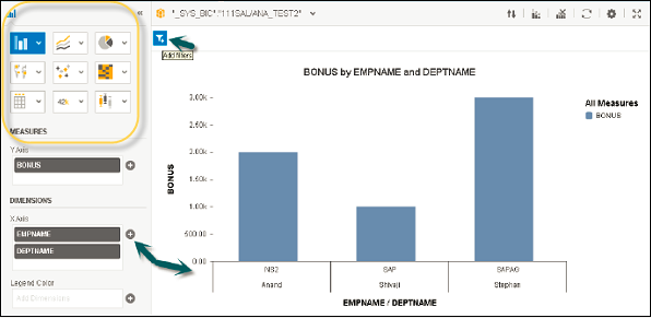
Select a dimension and add to the chart canvas or you can also drag it to the Chart Canvas. The text in the chart body guides you to the correct axis for the dimension.
Following chart types are available in SAP Lumira −
Comparison − These chart types are used to compare the difference between values. Common comparison chart types are −
- Bar Chart
- Column Chart
- Radar Chart
- Area Chart
- Heat map
Percentage − These are used to show a percentage of parts in a chart. Common percentage type charts are −
- Pie Chart
- Donut Chart
- Tree
- Funnel Chart
Correlation − These are used to show the relationship between different values. Common chart types are −
- Scatter Plot
- Bubble Chart
- Network Chart
- Numeric Point
- Tree
Trend − These are used to show the data patterns or possible patterns. Common chart types are −
- Line Chart
- Waterfall Chart
- Box Plot
- Parallel Coordinates Chart
Geographic − These are used to present the map of a country or globe present in the analysis. Common chart types are −
- Geo Bubble Chart
- Geo Choropleth Chart
- Geo Pie Chart
- Geo Map
