
Article Categories
- All Categories
-
 Data Structure
-
 Networking
-
 RDBMS
RDBMS
-
 Operating System
-
 Java
Java
-
 MS Excel
-
 iOS
iOS
-
 HTML
HTML
-
 CSS
CSS
-
 Android
-
 Python
-
 C Programming
-
 C++
C++
-
 C#
C#
-
 MongoDB
-
 MySQL
MySQL
-
 Javascript
-
 PHP
PHP
-
 Economics & Finance
How to increase the axes tick width using ggplot2 in R?
To increase the width of axes tick (both X-axis and Y-axis at the same time) using ggplot2 in R, we can use theme function with axis.ticks argument where we can set element_line argument size to a larger value.
For Example, if we have a data frame called df that contains a single column X and we want to create histogram of X with wider axes ticks then we can use the command given below −
ggplot(df,aes(X))+geom_histogram(bins=30)+theme(axis.ticks=element_line(size=2))
Example
Following snippet creates a sample data frame −
x<-rnorm(20000)
df<-data.frame(x)
head(df,20)
The following dataframe is created
            x
 1  0.92856209
 2 -0.46524489
 3  0.64398756
 4 -1.34904706
 5 -1.24865058
 6  1.35459661
 7 -1.09077357
 8 -0.07217955
 9 -0.30593246
10  0.04898870
11  0.07062218
12  0.49177492
13 -0.01993569
14 -0.12688569
15 -0.60574285
16 -0.35585400
17  0.77854580
18  0.27782081
19 -0.84785925
20 -0.61172538
To load ggplot2 package and create histogram of x on the above created data frame, add the following code to the above snippet −
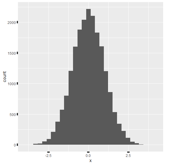
x<-rnorm(20000)
df<-data.frame(x)
library(ggplot2)
ggplot(df,aes(x))+geom_histogram(bins=30)
Output
If you execute all the above given snippets as a single program, it generates the following Output −

To create histogram of x with wider axes ticks on the above created data frame, add the following code to the above snippet −
x<-rnorm(20000)
df<-data.frame(x)
library(ggplot2)
ggplot(df,aes(x))+geom_histogram(bins=30)+theme(axis.ticks=element_line(size=3))
Output
If you execute all the above given snippets as a single program, it generates the following Output −

5K+ Views
