
Article Categories
- All Categories
-
 Data Structure
-
 Networking
-
 RDBMS
RDBMS
-
 Operating System
-
 Java
Java
-
 MS Excel
-
 iOS
iOS
-
 HTML
HTML
-
 CSS
CSS
-
 Android
-
 Python
-
 C Programming
-
 C++
C++
-
 C#
C#
-
 MongoDB
-
 MySQL
MySQL
-
 Javascript
-
 PHP
PHP
-
 Economics & Finance
Selected Reading
How to display axes ticks and labels inside the plot using ggplot2 in R?
To display axes ticks and labels inside the plot using ggplot2 in R, we can follow the below steps −
- First of all, create a data frame.
- Then, create a plot using ggplot2.
- After that create the same plot with theme function to change the position of axes ticks and labels.
Create the data frame
Let's create a data frame as shown below −
x<-rnorm(25)
y<-rnorm(25)
df<-data.frame(x,y)
df
On executing, the above script generates the below output(this output will vary on your system due to randomization) −
        x          y
1  -0.32440269 -0.04834967
2   0.18601873  0.65687041
3   1.09676421 -0.75804655
4   0.74079644  0.74106077
5  -0.67424527 -1.43896486
6   0.05632086 -1.21288835
7   1.10961907 -0.29095576
8   0.57023417 -0.07114903
9   1.06902216 -0.66997477
10  0.03866405 -0.68458427
11  1.68343934 -0.02548374
12  0.93441399  2.24699971
13 -1.72588785 -0.32661231
14 -1.28334099 -2.29908040
15 -2.79009683 -0.18447236
16 -1.28193698  0.67898876
17 -0.03086727 -0.24160637
18  0.30927995  0.25851751
19 -0.65546063 -0.64626923
20  0.34772500 -0.43015292
21 -0.91697804 -0.82363631
22  1.04227448 -1.38181399
23  2.28804989 -0.03521330
24 0.53844446 -0.14407149
25 -0.43108188 -1.72016137
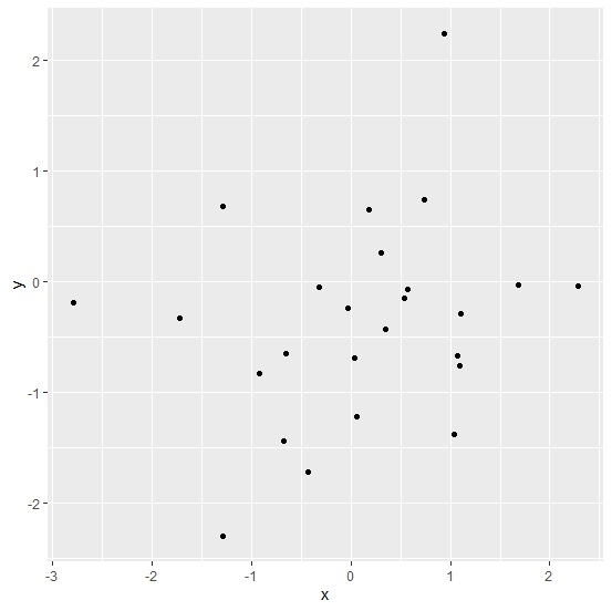
Create a plot using ggplot2
Loading ggplot2 package and creating scatterplot between x and y −
x<-rnorm(25)
y<-rnorm(25)
df<-data.frame(x,y)
library(ggplot2)
ggplot(df,aes(x,y))+geom_point()
Output

Updated on: 2026-03-11T22:50:58+05:30
647 Views

Advertisements