
Article Categories
- All Categories
-
 Data Structure
-
 Networking
-
 RDBMS
RDBMS
-
 Operating System
-
 Java
Java
-
 MS Excel
-
 iOS
iOS
-
 HTML
HTML
-
 CSS
CSS
-
 Android
-
 Python
-
 C Programming
-
 C++
C++
-
 C#
C#
-
 MongoDB
-
 MySQL
MySQL
-
 Javascript
-
 PHP
PHP
-
 Economics & Finance
Selected Reading
How to extract axes labels for the plot drawn using ggplot2 in R?
When we create a plot using ggplot2, the axes labels are automatically generated for both the axes. We might want to use those axes labels for report writing or some other purpose, therefore, extraction of those labels for a plot created by using ggplot2 package can be found by using the ggplot_build function as shown in the below example but we need to save the plot in an object.
Consider the below data frame −
Example
x<-rnorm(20)
y<-rnorm(20,5,0.32)
df<-data.frame(x,y)
df
Output
        x          y
1  -0.48260000   5.306990
2   1.46738002   5.065480
3  -0.41960276   4.833763
4   1.13728029   4.927692
5  -0.58233296   4.789553
6  -1.33506461   4.752065
7  -0.15042591   4.672583
8  -0.14903138   4.671353
9   1.00647384   5.090690
10 -0.18414152   4.815529
11 -2.20077514   4.353975
12  1.00566656   5.050006
13  0.14784372   5.067741
14  1.35535140   4.858750
15 -0.59944199   5.457906
16 -0.95290747   4.994523
17 -2.12832109   5.348286
18 -1.63202006   5.100371
19  0.07918045   4.869089
20 -1.23168746   4.617075
Loading ggplot2 package and creating scatterplot between x and y −
Example
library(ggplot2)
p<-ggplot(df,aes(x,y))+geom_point()
p
Output
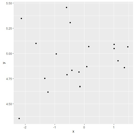
ggplot_build(p)$layout$panel_params[[1]]$y$get_labels()
[1] NA "4.50" "4.75" "5.00" "5.25" "5.50"
ggplot_build(p)$layout$panel_params[[1]]$x$get_labels()
[1] "-2" "-1" "0" "1" NA

Updated on: 2026-03-11T22:50:55+05:30
667 Views

Advertisements