
Article Categories
- All Categories
-
 Data Structure
-
 Networking
-
 RDBMS
RDBMS
-
 Operating System
-
 Java
Java
-
 MS Excel
-
 iOS
iOS
-
 HTML
HTML
-
 CSS
CSS
-
 Android
-
 Python
-
 C Programming
-
 C++
C++
-
 C#
C#
-
 MongoDB
-
 MySQL
MySQL
-
 Javascript
-
 PHP
PHP
-
 Economics & Finance
Selected Reading
How to create a line chart using ggplot2 with larger width in R?
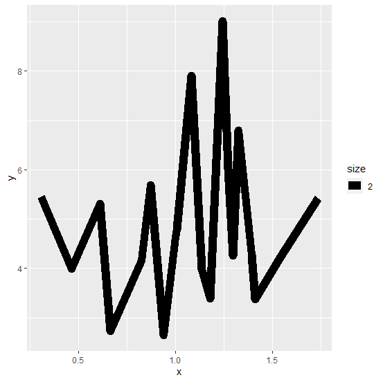
The width of the line chart can be increased by using size argument inside geom_line aesthetics of ggplot2. For example, if we have a data frame df that contains two numerical columns x and y, and we want to create a line chart between the two with larger width then it can be done as −
ggplot(df)+geom_line(aes(x,y,size=2))
Example
Consider the below data frame −
x<-rnorm(20,1,0.38)
y<-rnorm(20,5,1.47)
df<-data.frame(x,y)
df
Output
      x       y
1 1.0049532 4.790329
2 1.2701198 6.013440
3 0.6092557 5.308750
4 0.3055946 5.450709
5 1.1332979 3.970237
6 1.0800608 7.902160
7 0.8698150 5.691266
8 1.1752127 3.384137
9 0.6616497 2.724296
10 0.9367864 2.639873
11 1.5382767 4.217684
12 1.4085143 3.368657
13 1.2959630 4.251973
14 1.2404002 9.024287
15 0.8245613 4.157773
16 1.3915653 4.271487
17 1.3249538 6.792369
18 0.9989782 4.639817
19 1.7328304 5.421390
20 0.4621207 3.987451
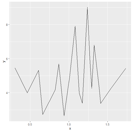
Loading ggplot2 package and creating line chart between x and y −
Example
> library(ggplot2)
> ggplot(df)+geom_line(aes(x,y))
Output
Creating line chart between x and y with larger width −
Example
ggplot(df)+geom_line(aes(x,y,size=2))
Output

Updated on: 2026-03-11T22:50:54+05:30
214 Views

Advertisements