- Trending Categories
Data Structure
Networking
RDBMS
Operating System
Java
iOS
HTML
CSS
Android
Python
C Programming
C++
C#
MongoDB
MySQL
Javascript
PHP
Physics
Chemistry
Biology
Mathematics
English
Economics
Psychology
Social Studies
Fashion Studies
Legal Studies
- Selected Reading
- UPSC IAS Exams Notes
- Developer's Best Practices
- Questions and Answers
- Effective Resume Writing
- HR Interview Questions
- Computer Glossary
- Who is Who
How to create gridlines that matches with Y-axis values in the plot created by using plot function in R?
When we create a plot in R and draw gridlines then the gridlines are drawn on the basis of the values provided inside the grid function, therefore, it may or may not match with the Y-axis labels. But it can be done, we just need to set the values inside the grid function to NULL.
Example
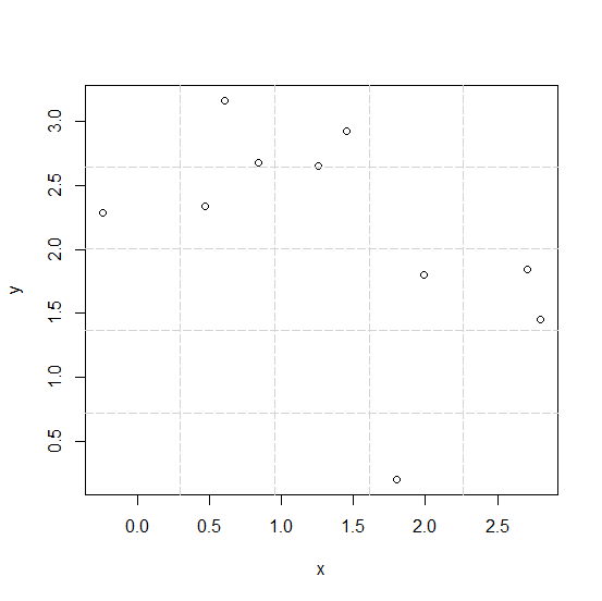
Consider the below plot −
x<-rnorm(10,1) y<-rnorm(10,2) plot(x,y) grid(5,5,lty=5)
Output
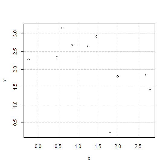
Creating the plot with gridlines that matches with Y-axis labels −
Example
plot(x,y) grid(NULL,NULL,lty=5)
Output
- Related Articles
- How to create a plot in R with gridlines using plot function?
- How to add a mathematical expression in axis label in a plot created by using plot function in R?
- How to change the background color of a plot created by using plot function in R?
- How to change the gridlines of Y-axis on a chart created by using ggplot2 in R?
- How to create a bar plot using ggplot2 with percentage on Y-axis in R?
- How to represent the legend in a plot created by using plot function with colored straight lines or stars in R?
- How to create a plot with reversed Y-axis labels in base R?
- How to change the Y-axis values in a bar plot using ggplot2 in R?
- How to create a plot in R with a different plot window size using plot function?
- How to reduce the size of the area covered by legend in R for a plot created by using plot function?
- How to create bar plot in base R with different limits for Y-axis?
- How to change legend values in a bar plot created by using ggplot2 in R?
- How to create horizontal line for a range of values in a plot created by using ggplot2 in R?
- How to change the color and size of the axes labels of a plot created by using plot function in R?
- How to create bar plot with log values using ggplot2 in R?

Advertisements