
Article Categories
- All Categories
-
 Data Structure
-
 Networking
-
 RDBMS
RDBMS
-
 Operating System
-
 Java
Java
-
 MS Excel
-
 iOS
iOS
-
 HTML
HTML
-
 CSS
CSS
-
 Android
-
 Python
-
 C Programming
-
 C++
C++
-
 C#
C#
-
 MongoDB
-
 MySQL
MySQL
-
 Javascript
-
 PHP
PHP
-
 Economics & Finance
Selected Reading
How to change the title of a graph to italic created by using plot function in R?
If a graph is created by specifying main title of the plot using the plot function then the default font is plain text. We might want to change the style of the font to italic so that the title gets a little more attraction of the viewers. This can be done by using font.main argument with plot function. The value 4 of font.main refers to the bold italic font and if we want to make it bold then we can use the value 3.
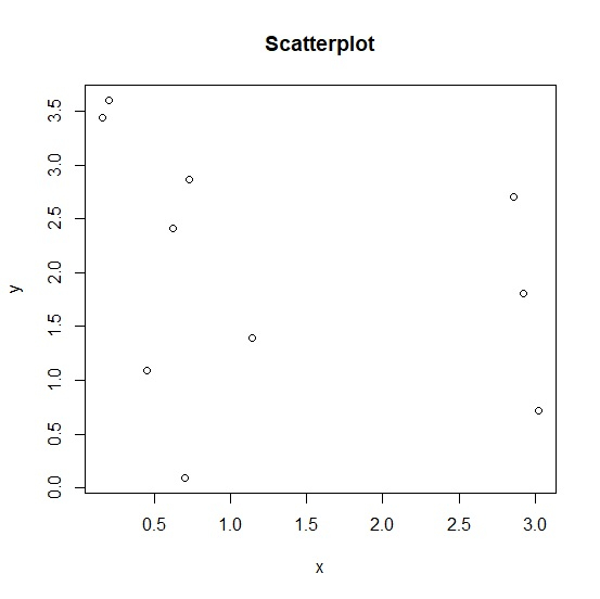
Consider the below vectors and create the scatterplot between the two with title of the plot −
Example
x<-rnorm(10,2,1.5)
y<-rnorm(10,2,1) plot(x,y,main="Scatterplot")
Output
Creating the same plot with title in italics −
Example
plot(x,y,main="Scatterplot",font.main=4)
output


Updated on: 2020-10-14T09:59:46+05:30
381 Views

Advertisements