- Trending Categories
Data Structure
Networking
RDBMS
Operating System
Java
iOS
HTML
CSS
Android
Python
C Programming
C++
C#
MongoDB
MySQL
Javascript
PHP
Physics
Chemistry
Biology
Mathematics
English
Economics
Psychology
Social Studies
Fashion Studies
Legal Studies
- Selected Reading
- UPSC IAS Exams Notes
- Developer's Best Practices
- Questions and Answers
- Effective Resume Writing
- HR Interview Questions
- Computer Glossary
- Who is Who
How to change the background color of a plot created by using plot function in R?
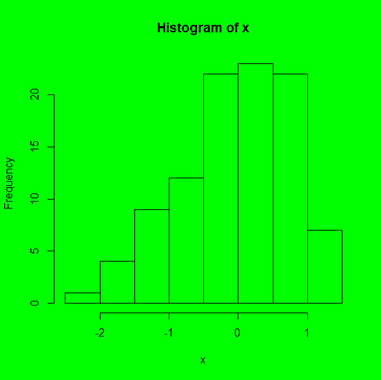
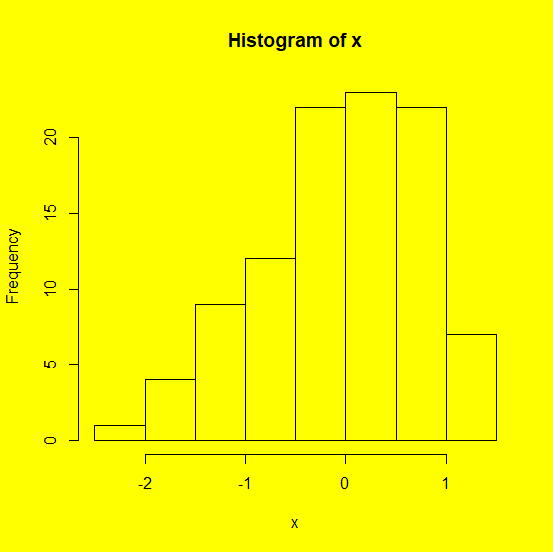
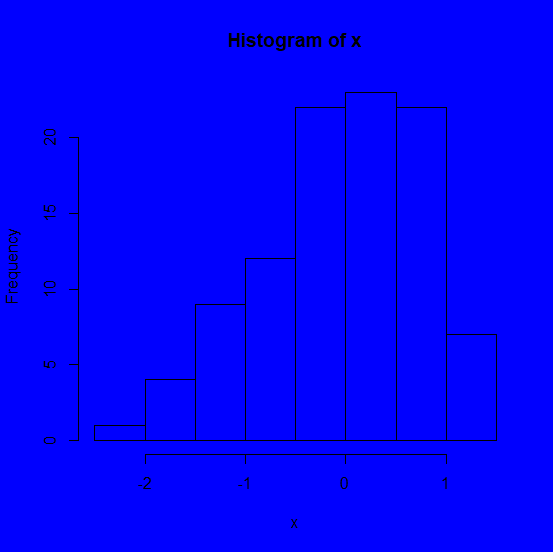
To change the focus of a plot we can do multiple things and one such thing is changing the background of the plot. If the background color of a plot is different than white then obviously it will get attention of the readers because this is unusual as most of the times the plots have white backgrounds, hence if we want to attract readers on the plot then we might use this technique. It can be done by using par(bg= "color_name").
Example
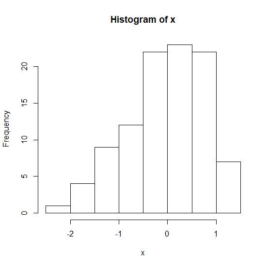
Creating a simple histogram −
> x<-rnorm(100) > hist(x)
Output
Example
Creating histogram with different background colors −
> par(bg="green") > hist(x)
Output
> par(bg="yellow") > hist(x)
Output
par(bg="blue") > hist(x)
Output
- Related Articles
- How to change the color and size of the axes labels of a plot created by using plot function in R?
- How to change the background color of base R plot region?
- How to change the title of a graph to italic created by using plot function in R?
- How to change the background color of legend in base R plot?
- How to change the position of the title of a plot which is created using plot function in R?
- How to reduce the size of the area covered by legend in R for a plot created by using plot function?
- How to change the partial plot background using ggplot2 in R?
- How to add a mathematical expression in axis label in a plot created by using plot function in R?
- How to change the color of line of a plot created for an xts object in R?
- How to change legend values in a bar plot created by using ggplot2 in R?
- How to change the angle of annotated text in plot created by using ggplot2 in R?
- How to represent the legend in a plot created by using plot function with colored straight lines or stars in R?
- How to create gridlines that matches with Y-axis values in the plot created by using plot function in R?
- How to change the color of bars of a bar plot using ggplot2 in R?
- How to change the thickness of the borders of bars in bar plot created by using ggplot2 in R?

Advertisements