- Trending Categories
Data Structure
Networking
RDBMS
Operating System
Java
MS Excel
iOS
HTML
CSS
Android
Python
C Programming
C++
C#
MongoDB
MySQL
Javascript
PHP
Physics
Chemistry
Biology
Mathematics
English
Economics
Psychology
Social Studies
Fashion Studies
Legal Studies
- Selected Reading
- UPSC IAS Exams Notes
- Developer's Best Practices
- Questions and Answers
- Effective Resume Writing
- HR Interview Questions
- Computer Glossary
- Who is Who
How to change the color and size of the axes labels of a plot created by using plot function in R?
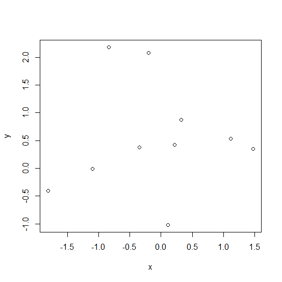
The default size of axes labels created by using plot function does not seem to be large enough and also it does not look appealing. Therefore, we might want to change their size and color because the appearance of a plot matters a lot. This can be done by setting colors with col.lab and size with cex.lab.
Example
> x<-rnorm(10) > y<-rnorm(10,0.5) > plot(x,y)
Output
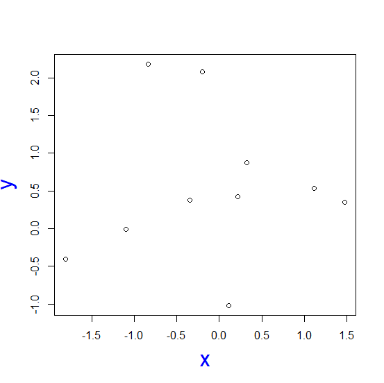
Changing the color of axes labels and the size of those axes labels −
> plot(x,y,col.lab="blue",cex.lab=2)
Output
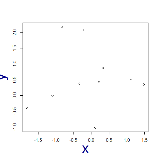
> plot(x,y,col.lab="dark blue",cex.lab=3)
Output
- Related Articles
- How to change the background color of a plot created by using plot function in R?
- How to change the axes labels using plot function in R?
- How to change the starting and ending points of axes labels using plot function in R?
- How to reduce the size of the area covered by legend in R for a plot created by using plot function?
- How to change the position of the title of a plot which is created using plot function in R?
- How to change the title of a graph to italic created by using plot function in R?
- How to display axes ticks and labels inside the plot using ggplot2 in R?
- How to change the color of line of a plot created for an xts object in R?
- How to extract axes labels for the plot drawn using ggplot2 in R?
- How to change the angle of annotated text in plot created by using ggplot2 in R?
- How to change the color of the axis, ticks and labels for a plot in matplotlib?
- How to exclude extra margin between points and the axes for a plot created by using ggplot2 in R?
- How to put labels on a scatterplot that is created plot function in R?
- How to change the thickness of the borders of bars in bar plot created by using ggplot2 in R?
- How to change the color of bars of a bar plot using ggplot2 in R?

Advertisements