- Trending Categories
Data Structure
Networking
RDBMS
Operating System
Java
MS Excel
iOS
HTML
CSS
Android
Python
C Programming
C++
C#
MongoDB
MySQL
Javascript
PHP
Physics
Chemistry
Biology
Mathematics
English
Economics
Psychology
Social Studies
Fashion Studies
Legal Studies
- Selected Reading
- UPSC IAS Exams Notes
- Developer's Best Practices
- Questions and Answers
- Effective Resume Writing
- HR Interview Questions
- Computer Glossary
- Who is Who
How to remove the border of the legend of a chart created by plot function in R?
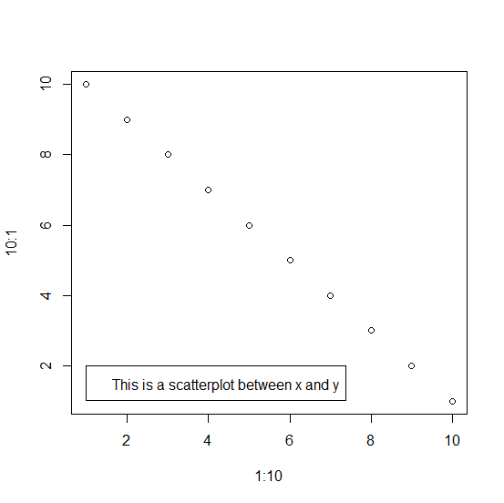
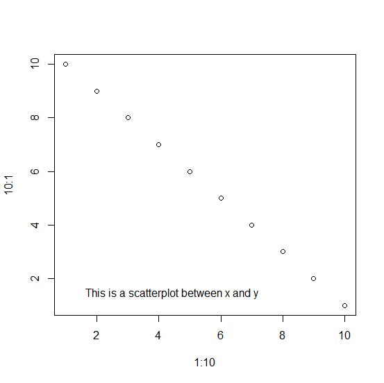
When we create a chart using plot function and add a legend to that chart, the output of the chart has the legend that is covered with borders. But this breaks the flow of the chart and the area covered by the order make the chart unattractive. Therefore, we can use bty="n" with the legend function and it will remove the border of the legend.
Example
Creating the chart with legend that has border −
plot(x=1:10,y=10:1) legend(1,2,"This is a scatterplot between x and y")
Output
Creating the chart with legend which does not have a border −
Example
plot(x=1:10,y=10:1) legend(1,2,"This is a scatterplot between x and y",bty="n")
Output
- Related Articles
- How to remove the boxes around legend of a plot created by ggplot2 in R?
- How to reduce the size of the area covered by legend in R for a plot created by using plot function?
- How to represent the legend in a plot created by using plot function with colored straight lines or stars in R?
- How to change the background color of a plot created by using plot function in R?
- How to change legend values in a bar plot created by using ggplot2 in R?
- How to change the color and size of the axes labels of a plot created by using plot function in R?
- How to remove ticks in a plot created by using gglot2 in R?
- How to change the title of a graph to italic created by using plot function in R?
- How to change the position of the title of a plot which is created using plot function in R?
- How to add a mathematical expression in axis label in a plot created by using plot function in R?
- How to change the gridlines of Y-axis on a chart created by using ggplot2 in R?
- How to add a horizontal line to the plot created by ggplot2 in R?
- How to create gridlines that matches with Y-axis values in the plot created by using plot function in R?
- Remove or adapt the border of the frame of legend using matplotlib
- How to change the font size of legend in base R plot?

Advertisements