
Article Categories
- All Categories
-
 Data Structure
-
 Networking
-
 RDBMS
RDBMS
-
 Operating System
-
 Java
Java
-
 MS Excel
-
 iOS
iOS
-
 HTML
HTML
-
 CSS
CSS
-
 Android
-
 Python
-
 C Programming
-
 C++
C++
-
 C#
C#
-
 MongoDB
-
 MySQL
MySQL
-
 Javascript
-
 PHP
PHP
-
 Economics & Finance
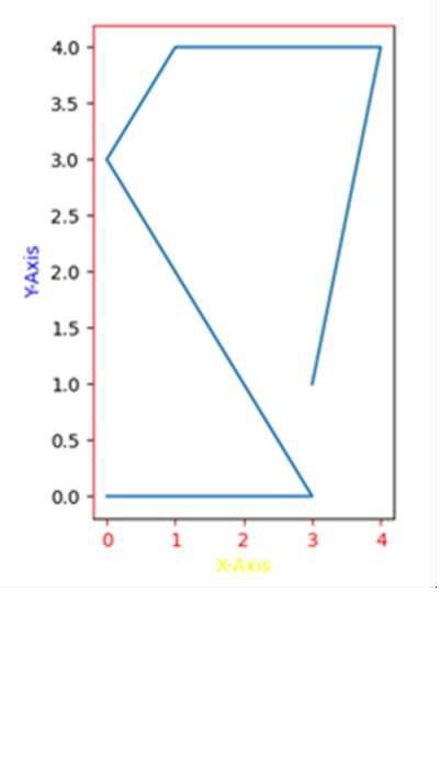
How to change the color of the axis, ticks and labels for a plot in matplotlib?
We can change the color of the axis, ticks and labels, using ax.spines['left'].set_color('red') and ax.spines['top'].set_color('red') statements.
To change the color of the axis, ticks, and labels for a plot in matplotlib, we can take the following steps −
Create a new figure, or activate an existing figure, using plt.figure().
Add an axis to the figure as part of a subplot arrangement, using plt.add_subplot(xyz) where x is nrows, y is ncols and z is the index. Here taking x = 1(rows), y = 2(columns) and z = 1(position).
Set up X-axis and Y-axis labels using set_xlabel and set_ylabel method for creating ax using add_subplot().
To set the color for X-axis and Y-axis, we can use the set_color() method (Set both the edgecolor and the facecolor).
To set the ticks color, use tick_params method for axes. Used arguments are axis =’x’ (or y or both) and color = ‘red’ (or green or yellow or ...etc.)
To set the color of axes, i.e., top, left, bottom and right, we can use ax.spines[‘top’], ax.spines[left].
Now, using the plt.plot() method, draw the lines.
To show the figures, use the plt.show() method.
Example
import matplotlib.pyplot as plt

fig = plt.figure()

ax = fig.add_subplot(121)

ax.set_xlabel('X-axis ')
ax.set_ylabel('Y-axis ')

ax.xaxis.label.set_color('yellow')        #setting up X-axis label color to yellow
ax.yaxis.label.set_color('blue')          #setting up Y-axis label color to blue

ax.tick_params(axis='x', colors='red')    #setting up X-axis tick color to red
ax.tick_params(axis='y', colors='black')  #setting up Y-axis tick color to black

ax.spines['left'].set_color('red')        # setting up Y-axis tick color to red
ax.spines['top'].set_color('red')         #setting up above X-axis tick color to red

plt.plot([3, 4, 1, 0, 3, 0], [1, 4, 4, 3, 0, 0])

plt.show()
Output

43K+ Views
